How To Build a Student-Friendly Course Menu in 9 Simple Steps
If you’ve ever built a course menu and thought, “Wait… where do students even start?”—yeah, you’re definitely not alone. I’ve seen (and made) menus that look fine on the instructor side, but for students they feel like a pile of links with no real direction.
What I’ve learned the hard way: a student-friendly course menu isn’t about being “pretty.” It’s about reducing decision fatigue. Students shouldn’t have to guess what a link means, how deep they need to go, or what they’re supposed to do next.
So in the next sections, I’ll walk you through a simple, repeatable approach I use to turn a messy course outline into a clear, navigable “menu” students can actually follow. And yes—I’ll include exact examples of what to write under each menu item.
Key Takeaways
- Use familiar labels and short descriptions under each menu item so students know what they’re clicking into.
- Organize your course menu with a clear hierarchy (modules → lessons → activities) and consistent naming.
- Write action-oriented instructions right on the menu (what to do first, what to submit, and what “done” looks like).
- Reduce confusion by testing your menu with real people and fixing the top 2–3 points of friction.
- Build “progress cues” into the menu (Start Here, Week/Module numbers, estimated time, and completion signals).
- Keep your menu scannable: limit long lists, use collapsible sections, and break content into manageable chunks.
- Make navigation predictable across every page (same menu placement, same labels, same order).
- Use accessibility-friendly formatting (readable fonts, contrast, keyboard-friendly links) so everyone can navigate.
- Track simple usability signals like click depth and time-to-first-content so you know where students get stuck.
- Collect feedback after launch and iterate—small menu tweaks can noticeably improve completion and engagement.

Build a Student-Friendly Course Menu
Creating a course menu students actually like starts with one thing: anticipating what they don’t know yet. They’re not “missing effort”—they’re missing context.
Here’s what I focus on first when I redesign a course menu:
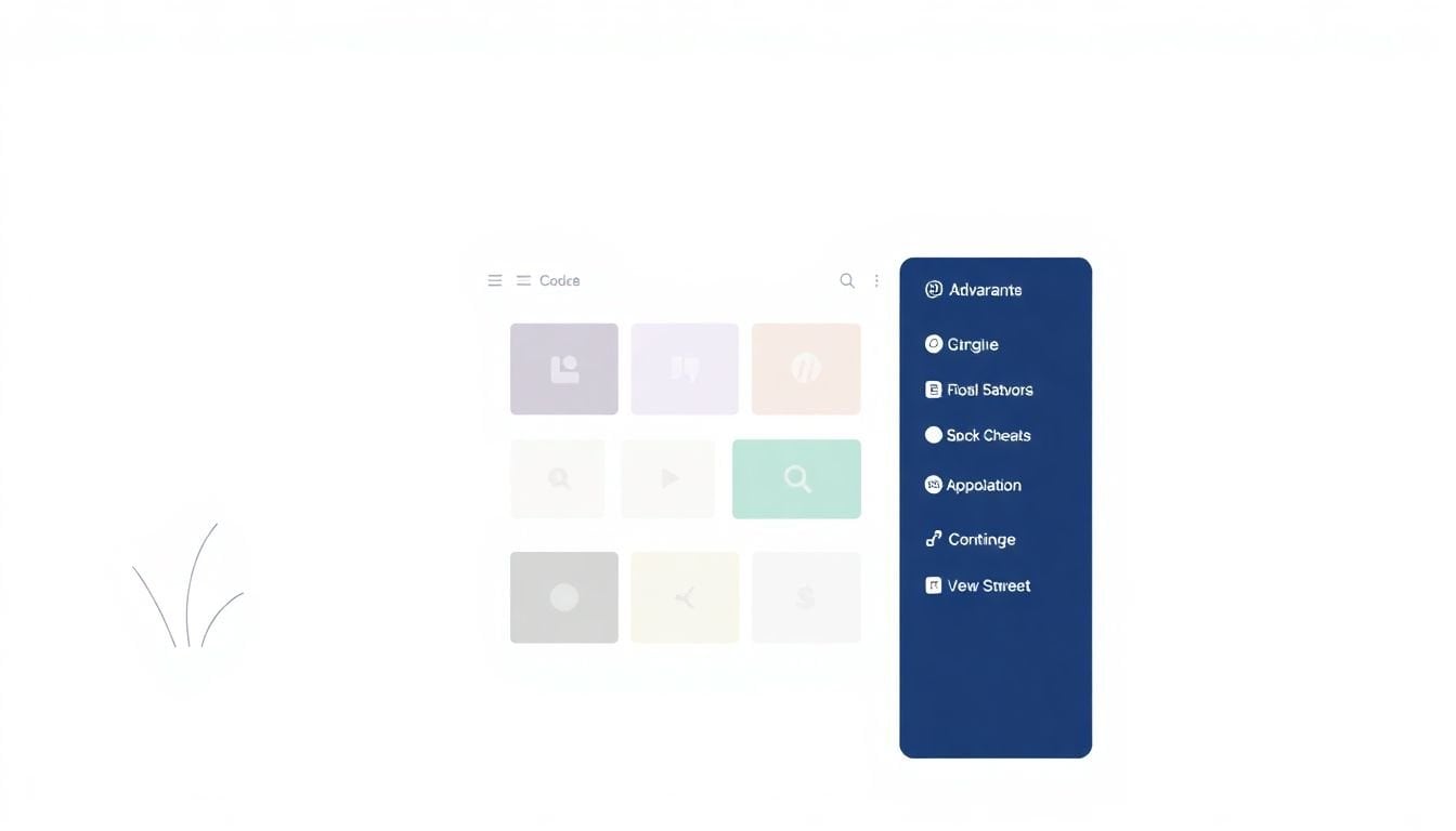
1) Make the menu scannable.
Use short titles, avoid jargon, and don’t make students decode what a link is. If you offer “Digital Skills,” label it like: Digital Skills (Beginner-Friendly) and use a small icon (video, quiz, worksheet) if your platform allows it.
2) Add a one-line “what you’ll do” description.
This is the part most instructors skip. But it’s the difference between “Assignments” and “Monthly projects + practice quizzes (about 20 minutes).”
Before: Assignments
After: Monthly projects + practice quizzes (about 20 minutes)
3) Include “Start here” guidance.
If there’s any place students should land first, it should be obvious. I like a menu item that says: Start Here: Your first lesson + quick setup. Keep it at the top.
4) Keep it consistent everywhere.
Same menu placement. Same order. Same naming style. If students learn your pattern once, they won’t fight your navigation the next 20 times.
5) Don’t forget accessibility.
Readable font size, good contrast, and buttons/links that work on mobile without squinting. In my experience, accessibility fixes also improve clarity—because clutter and tiny text are basically clarity killers.
6) Test with real humans.
I usually ask 3–5 people to follow the menu like they’re brand new. The goal isn’t to “teach them.” It’s to watch where they pause, click the wrong thing, or ask “wait, what do I do first?” Then I adjust the menu text in those exact spots.
Organize the Course Menu with Clear Structure
A clear structure is what prevents students from feeling lost. But “clear” doesn’t mean complicated. It means predictable.
When I organize a student-friendly course menu, I use a simple hierarchy:
- Modules (Week 1, Week 2, or Topic 1, Topic 2)
- Lessons inside each module
- Activities inside each lesson (video, reading, quiz, assignment)
That hierarchy keeps the “click path” short. Students don’t need to hunt around for the next step.
What I’ve noticed works:
1) Break long lists into modules.
Instead of showing 30 separate lessons in one giant scroll, group them. Students can handle “Week 1” much better than “Lesson 1, Lesson 2, Lesson 3…”
2) Use progressive labels.
If you’re using a sequence, show it. Example:
- Week 1: Foundations
- Week 1, Lesson 1: Setup + Basics
- Week 1, Lesson 1 Quiz: Check your understanding
3) Add progress cues students can feel.
Even simple cues help: “15–20 min,” “2 activities,” “1 quiz,” or “Estimated time: 25 minutes.” I’ve seen fewer “I didn’t know there was a quiz” messages when the menu tells students what’s coming.
4) Collapse where possible.
If your platform supports collapsible modules, use it. Students should see the big picture first, then expand only when they’re ready.
Provide Clear Instructions for Each Menu Item
This is where course menus either help students learn—or accidentally create chaos.
Here’s the rule I follow: every menu item should answer one question—“What do I do when I click this?”
Instead of relying on the student to guess, write instructions directly in the menu. You can keep it short. But make it specific.
Action-oriented examples (exact text students see):
- Before: Materials
After: Download the syllabus + course checklist (PDF) - Before: Lecture 1
After: Watch: Lesson 1 overview (10 min) + take notes on the worksheet - Before: Quiz
After: Lesson 1 Quiz (5 questions). Aim for 80%+—review explanations after. - Before: Assignment
After: Submit your Week 1 project (template included). Due Sunday 11:59 PM.
Also, break multi-step tasks right in the instructions.
For example:
“Do this in order: (1) Read the article, (2) complete the worksheet, (3) submit the short reflection.”
My quick testing method:
I’ll pick one module and ask a tester to complete it using only the menu. If they ask “Where is the worksheet?” or “Do I submit here or on the next page?”—that’s a menu problem, not a student problem. Fix the menu label/description first, then adjust the page layout if needed.
Assess Student Feedback and Navigation Friction
Before you tweak anything else, figure out where students get stuck.
I like to look for “navigation friction,” which shows up in a few predictable ways:
- Students click the wrong lesson twice
- They ask the same question in your comments or emails
- They don’t reach the first quiz/assignment
- They abandon the course right after the first module
What I actually do: I run a quick feedback loop after the first week. Not a fancy research project—just lightweight signals.
- Ask a 3-question survey (Google Form works): “Could you find Start Here?”, “Did you know what to do next?”, “What was confusing?”
- Check click depth (how many clicks to reach first lesson/quiz). If it’s more than 3–4 clicks, that’s often too many for new students.
- Measure time-to-first-content (how long from signup to first meaningful lesson). If it’s long, your menu probably isn’t clear enough.
And yes—student preferences matter, but not in the “random catering” way. It’s more like: are your learners mostly busy? Do they want short wins? Do they prefer videos or readings? Your menu should reflect that without forcing students to guess.
Use Simple, Visual, and Familiar Menu Formats
I’m a big fan of menus that look like something students already understand.
In practice, that means:
- Clean typography (no tiny text, no low-contrast gray-on-gray)
- Consistent layout (same headings, same order every time)
- Familiar icons (video camera for video, checklist for assignments, “quiz” icon for assessments)
If your platform supports it, consider short visual cues like:
- Estimated time: “15 min”
- Type tags: “Video,” “Reading,” “Quiz,” “Assignment”
- Difficulty labels (only if you use them consistently): “Beginner,” “Intermediate”
One thing I’ve learned: visual doesn’t mean complicated. If you add icons, keep them meaningful and consistent. Too many visual styles can make the menu look like a dashboard instead of a guide.
Also, don’t hide the important stuff behind mystery meat labels. “Resources” is vague. “Download syllabus + templates” is clear.
Thoughtful Placement and Consistent Navigation
Even the best menu text won’t help if students can’t find it when they need it.
Here’s what “good placement” looks like in a course:
- Menu or navigation should be visible on mobile without constant scrolling.
- Keep the menu in the same location across pages (students shouldn’t have to hunt).
- Use clear “next step” cues inside modules (for example, “Next: Lesson 2 Video”).
If you’re using links inside the menu, make sure they go to the right place every time. Sounds obvious, but I’ve found plenty of courses where “Quiz” takes students to a page with instructions but not the actual quiz, which creates unnecessary back-and-forth.
In digital courses, you can also make navigation friendlier by linking menu items to the exact supporting details students need—like rubrics, templates, or submission instructions. When students see those links right next to the assignment, you cut down on “Where’s the rubric?” messages.
For more on making course navigation feel organized, you can also check this resource: https://createaicourse.com/course-syllabus-format/.
Offer Customization and Flexible Learning Paths
Not everyone learns the same way, and students don’t all have the same schedule. Your menu should give them options without turning your course into a choose-your-own-adventure nightmare.
Here are a few flexible patterns that work well:
- “Track” menus: Beginner vs. Advanced paths (but keep the core structure consistent).
- Optional enrichment: label extras as “If you want more” so students don’t feel forced.
- Different formats: same lesson, video + reading, with a menu tag like “Video (10 min)” or “Reading (15 min).”
What I like to do is include a small “learning path” note under Start Here, like:
“If you’re brand new: do Lessons 1–3 in order. If you already know the basics: start at Lesson 4.”
That kind of guidance reduces cognitive load. Students don’t need to decide everything from scratch.
Maintain Consistency and Simplicity Across Modules
Consistency is what makes students feel safe. If every module looks slightly different, students start treating the menu like a puzzle instead of a guide.
Here’s how I keep things simple across modules:
- Use the same naming pattern for every item (e.g., “Lesson X Video,” “Lesson X Quiz,” “Lesson X Assignment”).
- Keep labels short and descriptions standardized (type + what to do + estimated time if you have it).
- Limit new formats (don’t introduce a brand-new submission method in Week 6 unless you absolutely have to).
- If you add something new, explain it in the menu item itself: “New: optional practice set (no grading).”
One practical tip: if you introduce a new menu item type (like “Practice Set”), use it in at least 2–3 places quickly. Students learn patterns faster when they see them more than once.
If you want a deeper look at building cohesive structure, this guide is useful: https://createaicourse.com/course-structure/.
Leverage Student Feedback for Continuous Improvement
Menus aren’t “set it and forget it.” They’re part of the student experience, and students will tell you where it breaks.
I recommend a simple feedback loop:
- Collect feedback early (first module or first week).
- Tag feedback by menu problem type (unclear labels, wrong link, missing instructions, too many steps).
- Make one change at a time so you can tell what actually helped.
Want an easy way to structure feedback? Ask:
- “Could you find Start Here?”
- “Did the menu explain what to do next?”
- “What item felt confusing or missing?”
Then update the menu text where confusion happens. In my experience, the biggest wins usually come from rewriting the menu titles and descriptions—not from redesigning the entire course.
If you want more ideas around keeping students engaged (and getting better feedback), this is a solid starting point: https://createaicourse.com/student-engagement-techniques/.
FAQs
Use clear labels, group content into logical modules, and add a short “what to do” description under each menu item. If a student can’t tell what happens after clicking, the menu needs better instructions.
Use a hierarchy like modules → lessons → activities. Keep naming consistent (Lesson X Video, Lesson X Quiz, etc.) and avoid dumping every lesson into one long list.
Add progress cues (Week/Module numbers, estimated time, “what you’ll do”) and use clear tags for video/reading/quiz/assignment. Small clarity upgrades beat flashy extras almost every time.
Use responsive design, make links and buttons easy to tap, and ensure good contrast. Also include descriptive link text and make sure keyboard navigation works for menus and accordions.