
How to Design a Self-Service Knowledge Base in 6 Easy Steps
Nothing’s more annoying than hunting for the right help article… and still not finding it. I’ve been on both sides of this—when I can’t get an answer quickly, I’m the first person to bounce to a competitor or open a ticket. And when I’m building a knowledge base, I want the opposite: answers that are obvious, searchable, and actually useful.
So in this post, I’m going to walk you through how I design a self-service knowledge base that works in the real world: clear content, a logical structure, a search experience that doesn’t frustrate people, and a maintenance plan so it doesn’t rot over time. Keep reading—by the end, you’ll have a practical 6-step workflow you can follow.
Let’s build something your users will trust (and use) instead of something they tolerate.
Key Takeaways
Key Takeaways
- Start with the questions users actually type. Pull the top 50–100 search terms and ticket reasons, then turn each into a “direct answer first” article. Set a goal like 80% of top searches should land on a relevant article within 1 click.
- Make articles skimmable. Aim for 2–3 sentence paragraphs, bold subheadings, and step-by-step sections. If you use a template, keep the same structure on every article so people learn how to read it fast.
- Write like a human. Use “you” and “we,” avoid jargon, and define any unavoidable terms in plain language. In my experience, this alone improves both comprehension and the “Was this helpful?” responses.
- Design for self-service behavior (especially on mobile). Use larger fonts, short lines, and sticky navigation where possible. Test on at least iPhone Safari + Android Chrome and make sure buttons/links are easy to tap.
- Use analytics to find gaps and fix them. Track search success rate, deflection rate, and top unresolved searches. A simple KPI target: reduce “no results” searches by 30–50% over 60 days.
- Add multimedia only where it reduces confusion. For step-heavy tasks, use short screen recordings (30–90 seconds) and screenshots at each decision point. Always include captions and descriptive alt text.
- Train your team with a style guide + checklist. I recommend a one-page checklist: title style, first-paragraph answer, step formatting, screenshots requirement, and “last updated” rules. Consistency matters more than you think.
- Use examples, but keep them honest. Share scenario-based examples (internal or anonymized) that match your product. If you don’t have real stories, label them as “example scenario” instead of pretending they’re customer quotes.
- Turn feedback into a maintenance loop. Add thumbs-up/down and a short comment prompt. Then triage: “wrong steps,” “unclear language,” and “outdated info.” Aim to review feedback weekly for your top 20 articles.
- Keep content current with scheduled reviews. Set review cadences by risk: security/auth articles every 30–60 days, policy articles quarterly, and low-risk how-tos every 6–12 months. Add a visible “Last updated” date.

Step 1: Craft Content That Clearly Answers Your Users’ Questions
Before you write anything, I like to start with one simple question: what do people need to do right now? If someone searches “how to reset my password,” your first job is to answer that directly—no warm-up paragraphs.
What I do first (inputs)
- Top searches from your help center search box (or your web analytics).
- Top ticket reasons (even just the categories).
- Common “stuck” moments from support notes: “can’t find the email,” “code expired,” “wrong login page.”
What you build (actions)
- Write a “direct answer first” lead. Example: “To reset your password, go to Settings > Reset Password, then enter the email you used to sign up.”
- Follow with steps. Use numbered steps. Each step should be one action, not a paragraph of instructions.
- Add one troubleshooting section. For password resets, that might be: “No reset email,” “Reset link expired,” “I’m locked out.”
- Include one example screenshot per tricky step. Not every step—just the parts where people usually hesitate.
Acceptance criteria (how you know it’s good)
- A user can complete the task in under 5 minutes without contacting support.
- Your article matches the search intent (try searching your own keyword in the help center—do you land on the right page?).
- When people rate the article, the “helpful” score trends up after publishing.
One quick note: the best examples are the ones that feel true. If you’ve got internal support logs, you can anonymize them and use the scenario. If you don’t, label examples as “example scenario” so you don’t accidentally overpromise.
Step 2: Keep Your Content Short, Focused, and Easy to Read
People don’t open help articles to read. They open them to solve. That means your structure should do the heavy lifting.
Formatting rules I actually use
- Paragraphs: 2–3 sentences. If a paragraph needs more, split it.
- Subheadings: one idea each. Example: “Step 1: Open Settings” or “Troubleshooting: No reset email.”
- Bold key labels. If you’re telling them to click “Reset Password,” make that exact label bold.
- Numbered steps for actions. Bullets for lists and options.
A simple article template (copy/paste style)
- Title: “How to Reset Your Password” (not “Password Help”)
- Quick answer (2 sentences): what to do first + where
- Steps (numbered): 5–8 steps max
- Troubleshooting: 2–4 common issues
- Related articles: “Change email,” “Update billing info,” etc.
And yes—use plain language. Instead of “Navigate your settings menu and select the reset option,” I’d write “Go to Settings, then tap Reset Password.” It’s faster to scan and way less ambiguous.
Step 3: Use Familiar Language and a Friendly Tone
If your help center sounds like a legal document, users will stop reading. In my experience, a friendly tone isn’t fluff—it reduces anxiety and helps people move forward when something goes wrong.
How to make it feel human
- Use “you” and “we.” Example: “If you don’t see the email, here’s what to try.”
- Ask the question they’re thinking. “Stuck on this step?” then give the fix immediately.
- Avoid jargon. If you must use it, define it in one sentence.
- Write like you’re guiding one person. Not “The user must…”
Also, ground your tone in real pain points. People get annoyed when the process fails—so acknowledge it and give a clear next step. Something like: “If the reset link says it’s expired, request a new one—this happens when the link is older than the time window.” That feels supportive because it’s specific.
Step 4: Design for Self-Service Demand (Not Just “Content”)
Self-service isn’t a nice-to-have anymore. People expect to solve issues without waiting. And honestly, that expectation is only getting stronger.
Here’s what I pay attention to when planning a knowledge base: your users aren’t browsing for fun. They’re trying to get unstuck. That means your structure should support quick decisions—categories that make sense, navigation that doesn’t hide the right answer, and a search experience that gets them to the right article fast.
It helps to look at where self-service is common. Industries like retail and healthcare often see faster adoption because users need answers quickly and don’t want to wait on support. If your product has similar “time-sensitive” moments (billing issues, account access, login problems), you’ll want your knowledge base to handle those first.
Step 5: Leverage Analytics to Improve Your Knowledge Base
Writing articles is only half the job. The other half is making sure they actually work. This is where analytics becomes your roadmap.
Track these signals (minimum set)
- Search success rate: % of searches that lead to a click on a relevant article.
- No-results rate: % of searches returning nothing.
- Top “unresolved” searches: queries with clicks but low time-on-page or low helpful ratings.
- Deflection rate: % of issues handled without opening a ticket.
- Time-to-resolution: average time from first article view to “resolved.” (If you can’t measure this directly, use proxy signals like ticket creation rate after article views.)
What to do with the data
If you see a pattern like lots of people searching “how to delete an account” but your help center has no good guide, that’s a content gap you should fix immediately. Then watch whether:
- Searches for that term drop over the next 2–6 weeks
- Clicks increase on the new article
- Helpful ratings go up
- Ticket volume for that issue category decreases
That’s the loop: search → content → measurement → improvement.
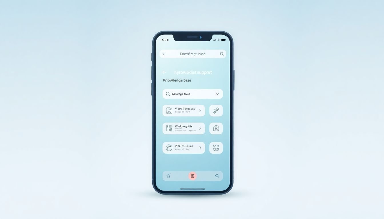
Step 6: Optimize for Mobile + Search + Maintenance (One Workflow, Three Checks)
When I say “mobile optimization,” I’m not talking about changing the font color. I mean making sure people can complete the task on a small screen without zooming, hunting, or giving up.
Mobile checklist
- Readable font size (no tiny text)
- Clear headings that work as a skim layer
- Buttons/links that are tappable (no “fat-finger” frustration)
- Short paragraphs so users don’t lose their place
- Test on real devices: at least iPhone Safari and Android Chrome
And yes—nearly 81% of customers try to fix issues on their own before reaching out. Most of them will do it on their phones. If your content doesn’t work there, it doesn’t work.
Search checklist (make it feel effortless)
- Autocomplete suggestions based on popular queries
- Spell correction (people type fast and incorrectly)
- Filters when you have distinct content types (e.g., “Account,” “Billing,” “Technical”)
- Related query prompts when results are weak
Also, encourage users to search the exact action: “reset password,” “delete account,” “change email.” If your search can’t interpret vague terms, you’ll end up with irrelevant results—and people will blame you.
Search success example (what “good” looks like)
- User searches: “reset pw”
- Autocomplete offers: “Reset Password”
- Spelling correction maps “pw” to “password”
- Top result is the correct guide with steps + troubleshooting
- Optional: a “Still can’t log in?” callout links to the next-best article
Maintenance checklist (so it doesn’t go stale)
- Add a visible “Last updated” date
- Schedule reviews based on risk (auth/security first)
- Update screenshots whenever UI changes (outdated images are worse than no images)
- Review feedback weekly for your most viewed articles
Search-Friendly Details That Actually Help
People want that “click and find” feeling. If they type a question and get lost, they’ll leave. So don’t just turn on search—tune it.
Here’s what I recommend:
- Handle query variations: “reset password,” “forgot password,” “password reset” should all land on the same canonical article (or a tightly linked set).
- Use relevance tuning: prioritize titles and headings over random body text.
- Watch for repeated failure: if a query keeps producing low engagement, either the article doesn’t match intent or the content needs clearer steps.
Incorporate Multimedia to Boost Engagement (Use It Where It Cuts Confusion)
Sometimes words aren’t enough—but the trick is using multimedia with purpose.
- Screen recording: record the whole flow for login/password/account steps. Keep it short (30–90 seconds) and pause where users usually get stuck.
- Screenshots: add them at decision points (e.g., “Where the reset email button is”).
- Step-by-step charts: great for multi-step workflows like “set up 2FA.”
And please don’t skip accessibility basics. Captions help everyone, and descriptive alt text improves usability (and SEO).
Teach Your Team to Create Quality Content
Consistency doesn’t happen by accident. It’s built.
I recommend two things:
- A content checklist (template + quality bar). For example: title clarity, direct answer in first paragraph, numbered steps, troubleshooting section, screenshots where needed, and “last updated” date.
- A style guide for tone and formatting. Decide how you’ll write headings, how you’ll refer to product features, and how you’ll handle common terms (e.g., “Reset Password” vs “Change Password”).
Train your team on user intent too. If they understand what people are trying to accomplish, the writing gets better fast.
Use Customer Stories to Enhance Your Content (Without Making Things Up)
Stories help because they reduce uncertainty. But don’t fake them.
What I like is scenario-based examples drawn from real support patterns. For instance, you can say:
Example scenario: “A user can’t find the reset email. They double-check spam/junk, confirm the email address used for the account, then request a new reset. The link works on the second attempt.”
If you do have a real quote, anonymize it and keep it factual. That’s how you build trust without sounding like marketing.
Promote User Feedback to Refine Your Knowledge Base
Ratings and comments are gold—if you actually use them.
- Add thumbs up/down at the end of articles.
- Include a short prompt like: “What went wrong?” with options such as “Steps didn’t work,” “Missing details,” or “Outdated screenshot.”
- Triage feedback weekly for your top 20 most-viewed articles.
Then turn it into action: update content, improve navigation, or refine search relevance. Feedback shouldn’t just sit in a dashboard.
Keep Your Content Fresh and Up-to-Date
Outdated help is one of the fastest ways to lose trust. People don’t just get annoyed—they assume your product is broken.
- Schedule reviews for key articles (especially auth, billing, and permissions).
- When you update a process, revise the guide and add a clear note about what changed.
- Replace old screenshots immediately after UI updates.
Even a small note like “Updated on March 12: button moved to Settings > Security” can save users from a frustrating dead end.
FAQs
Write a short direct answer first, then use numbered steps. I’d also keep paragraph length tight (2–3 sentences) and include a “Troubleshooting” section for the top 2–4 failure points you see in support. Consistency helps too—use the same template across articles so readers know what to look for.
Keep categories simple and use familiar labels (Account, Billing, Getting Started, Troubleshooting). Add breadcrumbs if your structure is deeper than 2–3 levels. Also, make sure the top navigation points to your most important topics—don’t bury “Password” or “Billing” under vague headings.
Start with autocomplete and spell correction, then tune relevance so titles and headings matter more than long body text. If your platform supports it, add synonym mapping (e.g., “pw” → “password,” “delete” → “remove”). Most importantly, review search logs: if a query leads to poor engagement or no results, update content or improve the mapping.
Use visuals for the steps people get stuck on. A short screen recording can replace a wall of instructions for login and account flows. For complex workflows, add a simple step chart and label each stage. If you go interactive (like guided checklists), keep it optional and always provide a “printable” or text-only fallback for accessibility.