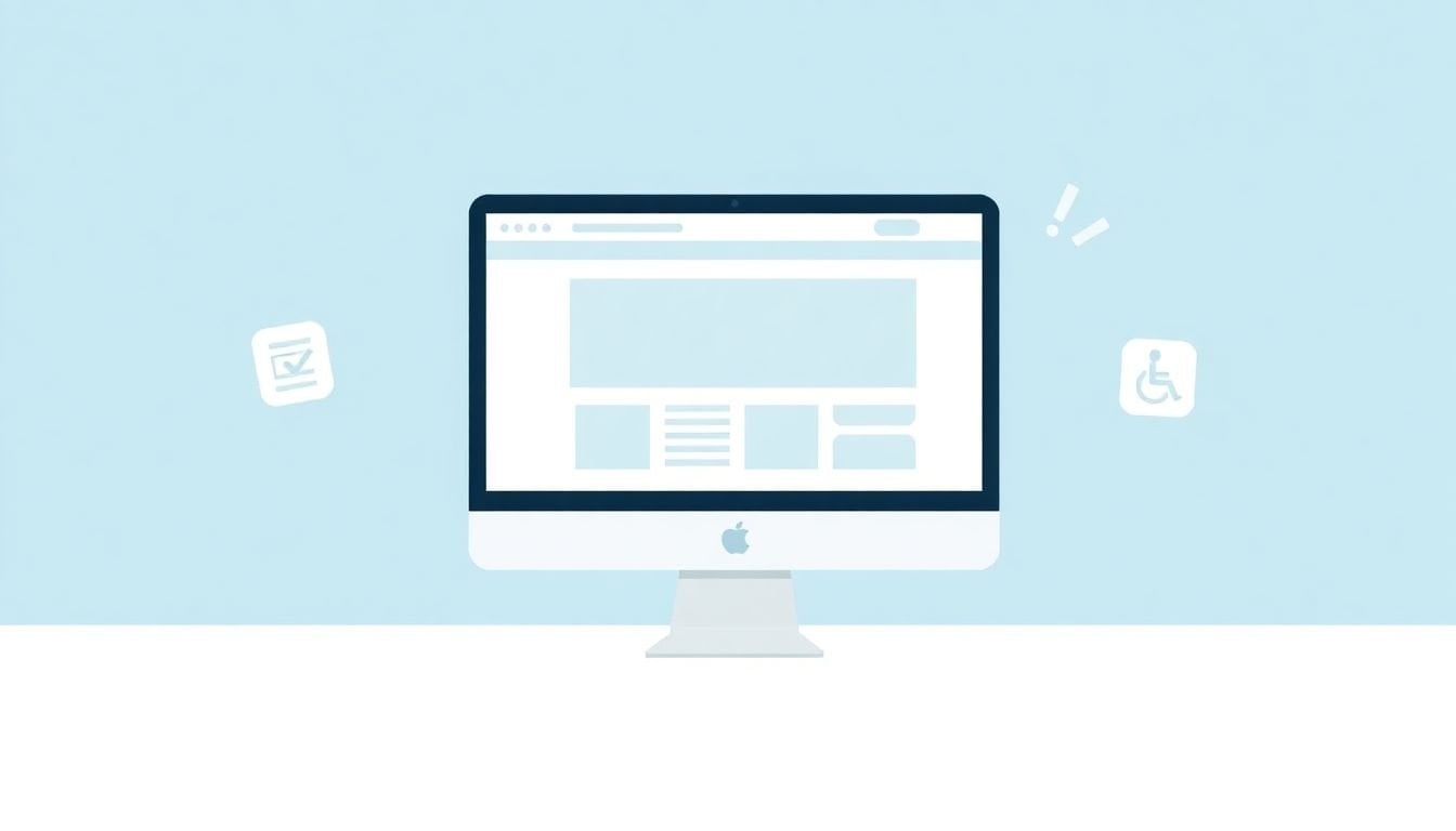
Conducting Accessibility Audits with WCAG Checklists: 9 Key Steps
I’ve been on both sides of this—trying to “make it accessible” without a plan, and then later realizing we’d missed the obvious stuff. It’s not that accessibility is impossible. It’s that it’s easy to get lost in vague advice and end up fixing whatever looks easiest instead of what actually blocks users.
So if you’re wondering where to start (and how to prove what you found), keep reading. I’ll walk you through an accessibility audit using WCAG checklists—what to prepare, what to test, how to document issues, and how to turn findings into fixes you can verify.
In my experience, the biggest difference between a “checklist pass” and a real audit is evidence. You’re not just ticking boxes—you’re collecting enough detail (screenshots, page URLs, reproduction steps, and success criteria references) that your team can fix the right problem the right way.
Key Takeaways
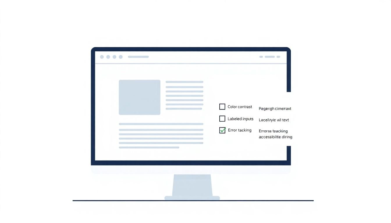
- Use WCAG checklists to catch the usual suspects: low contrast, missing form labels, empty links, and missing or unhelpful alt text. In my audits, I always pair automated scans with manual keyboard testing and (when possible) screen reader checks.
- Prepare with a clear scope: pick key templates and high-traffic pages, define which WCAG level you’re targeting (usually WCAG 2.1 AA), and decide what “done” means for each issue. Quick scans are useful, but they’re not the whole job.
- Choose tools like WAVE, aXe, or Lighthouse to surface obvious issues fast. Then verify the tricky stuff manually—tab order, focus visibility, link purpose, headings structure, and whether alt text actually describes the content.
- I’ve seen the same patterns repeat: contrast problems and missing alt text show up constantly, especially on hero sections and image-heavy pages. Your audit should measure what’s happening on your site, not someone else’s stats.
- Prioritize using a framework (severity × frequency × user impact × fix effort). Don’t just sort by “most common”—I like to weight impact on keyboard and screen reader users more heavily.
- Remediation works best when you turn findings into actionable tickets: exact page URL, WCAG success criteria, reproduction steps, expected behavior, and acceptance criteria. Then retest after each batch.
- Accessibility doesn’t end after launch. Set up ongoing monitoring and regression checks so new templates, content changes, or component updates don’t quietly reintroduce issues.
Conduct an Accessibility Audit with WCAG Checklists
Starting an accessibility audit can feel overwhelming—until you break it down into something repeatable. That’s where WCAG checklists help. They turn “we should be accessible” into a structured process: check against success criteria, document what fails, and decide what to fix first.
Here’s how I actually run this part:
- Pick a small set of representative pages. Don’t start with your entire site. Start with your home page, your main landing page template, and 1–2 pages that include forms, navigation menus, and media.
- Test in multiple environments. I’ll open the page on desktop and mobile breakpoints, then check at least two browsers. Why? Because CSS differences and browser quirks can change focus behavior, contrast, and even how screen readers interpret headings.
- Use automated tools, then do manual verification. Automated checks are great for things like missing
altattributes or empty headings. But the manual part is where you catch issues like confusing link purpose, broken tab order, and “looks labeled but isn’t” form controls. - Record evidence as you go. For each issue, I capture the URL, the element (or selector if I can), a screenshot, and the exact WCAG success criteria it maps to. This saves hours later when you’re trying to reproduce bugs.
- Think in user impact, not just technical rules. If a failure affects keyboard-only users, it’s usually higher priority than something that only affects a rare edge case.
One quick example from a recent audit I did for a course landing page: we found 37 contrast-related failures across headings, buttons, and form helper text. The automated tool flagged them quickly, but the manual pass is what confirmed the real issue—focus outlines and hover states weren’t meeting contrast requirements, which made keyboard navigation feel “invisible” once you tabbed into the form.
About the “how often sites fail” stats you’ll see online: I’m not going to throw numbers at you without methodology. Instead, use your own audit dataset. If you want a benchmark, compare your findings to WCAG categories (contrast, text alternatives, navigation/focus, forms) and see which areas your site mirrors. That’s more useful than guessing based on someone else’s sample.
Prepare for Your WCAG Accessibility Audit
Preparation is where audits become painless. If you skip it, you end up with a spreadsheet full of “things to fix” and no clear order—or worse, fixes that don’t actually solve the underlying problem.
Here’s a practical prep checklist I recommend:
- Form a small team. Ideally: a developer (or someone who can change code), a designer (for contrast, layout, focus styles), and someone who can test with keyboard/screen readers.
- Decide your target. Most teams start with WCAG 2.1 AA. If you need a different level, set it up front.
- Choose your scope. I usually start with:
- Home page + 1 template page
- One page with a form (contact, signup, checkout if relevant)
- One media-heavy page (images/video)
- One page with complex navigation (menus, tabs, accordions)
- Run quick automated scans first. Tools like [axe](https://www.deque.com/axe/) and [WAVE](https://wave.webaim.org/) are good for triage. In my workflow, I treat the results as a “first draft,” not the verdict.
- Create a testing plan. Write down what you will manually check on each page (keyboard order, focus visibility, link purpose, heading structure, form labeling, alternative text quality).
- Set a definition of “done.” For example: “Issue is fixed and re-tested on desktop + mobile breakpoints, and the focus state meets contrast requirements.”
- Account for time. Rushing manual checks is how you miss the exact failure that blocks real users.
Sample audit worksheet (copy/paste idea):
- Page URL: /course-launch
- Issue: Low contrast focus indicator on “Submit” button
- WCAG success criteria: 1.4.11 (Non-text Contrast)
- How to reproduce: Tab through to “Submit” → observe focus ring
- Evidence: screenshot before/after
- Impact: keyboard users can’t reliably see focus location
- Proposed fix: update focus styles + test contrast ratio
- Acceptance criteria: focus ring visible on Chrome + Safari at 100% zoom; re-test with keyboard only
Select Accessibility Testing Tools
I always think of tools as “spotters,” not “judges.” They’re fantastic at catching certain categories quickly, but they can miss context—like whether the label a form control has is actually meaningful.
Here’s the tool mix I usually use:
- Automated scanners: [Google Lighthouse](https://developers.google.com/web/tools/lighthouse), [aXe](https://www.deque.com/axe/), [Siteimprove](https://siteimprove.com/), plus WAVE for quick checks.
- Keyboard-only testing: no mouse. Just Tab, Shift+Tab, Enter, Space, and arrow keys where appropriate.
- Screen reader testing: NVDA on Windows is a solid starting point; JAWS if your team uses it.
What I specifically do manually (so you can copy it):
- Tab order check: Can you reach every interactive element in a logical order? Is the order consistent across page loads?
- Focus visibility check: When something is focused, can you clearly see it? (Not just “it changes a tiny shade”)
- Link purpose check: Pull up a list of links (or quickly scan) and ask: do the links make sense out of context? “Click here” is a classic fail.
- Form labeling check: For inputs, selects, and textareas—does each control have a programmatic label? Do placeholders get misused as labels?
- Alt text check: For images that convey meaning, alt text should describe the purpose. For decorative images, alt should be empty (or otherwise handled appropriately).
One more thing: if your page has custom components (tabs, accordions, modals), automated tools often can’t fully judge whether state changes are announced correctly. That’s where manual testing pays off.
Analyze the Impact of Common WCAG Errors on User Experience
I’ll be honest: it’s easy to treat accessibility errors as “just technical failures.” But the real reason to care is what they do to someone using assistive tech.
Instead of repeating vague “most sites fail” claims, here’s what I recommend you do during analysis:
- Group issues by WCAG category: contrast, text alternatives, keyboard/focus, navigation structure, form semantics.
- Map each issue to user impact: “Can’t perceive focus,” “Can’t understand what the link does,” “Can’t complete the form,” etc.
- Estimate frequency: Is it only on one page, or on every instance of a component?
- Decide what blocks tasks: If a failure prevents form submission or navigation, it goes high on the list.
Common examples you’ll likely run into (and what they mean):
- Low contrast text or focus states → users with low vision struggle to read or locate where they are on the page.
- Missing or vague alt text → screen reader users don’t get the same meaning as sighted users; “image of…” alt text often doesn’t help.
- Empty links/buttons (or links with unclear text) → users can’t tell where a link goes without guessing.
- Broken tab order → keyboard users get trapped, skip important controls, or end up in confusing loops.
When I write issue notes, I try to include a one-liner like this: “Keyboard users can’t tell which control is focused, so they can’t reliably complete the form.” That sentence alone makes prioritization easier later.
If you want numbers, use your own run. For example, if your audit finds 60 contrast issues and 15 of them are on the same button component used across 20 pages, you can prioritize based on reach—without pretending you know what “average websites” do.
Utilize a Prioritization Framework for Accessibility Fixes
Let’s say your audit produces 150 findings. Where do you even start? If you don’t have a framework, you’ll end up chasing whatever your team notices first.
Here’s a simple prioritization model I use:
- Severity (1–5): 1 = minor annoyance, 5 = blocks core tasks (can’t submit form, can’t navigate).
- Frequency (1–5): 1 = one-off page, 5 = repeated across many templates.
- User impact (1–5): 1 = affects few users, 5 = affects keyboard/screen reader users heavily.
- Effort (1–5, inverse): 1 = quick fix, 5 = complex refactor.
Worked example: Suppose you have:
- Issue A: Missing form labels
- Severity: 5
- Frequency: 4 (appears on multiple forms)
- User impact: 5
- Effort: 2
- Issue B: Low contrast on a secondary footer link
- Severity: 2
- Frequency: 3
- User impact: 2
- Effort: 1
Even if Issue B is “more common,” Issue A likely wins because it blocks task completion and affects assistive tech users. That’s the kind of decision you want your team making consistently.
Also: I like to track component-level fixes. If you fix a shared button component once, you reduce dozens of errors at the source.
Build a Step-by-Step Remediation Strategy
Fixing accessibility issues without a plan is how you end up with “we fixed it” but nothing actually works for users. So here’s a remediation workflow that keeps things organized.
Step 1: Triage into categories. Group issues by WCAG area (contrast, text alternatives, keyboard/focus, forms, structure).
Step 2: Turn each issue into a remediation ticket. Here’s a format that works well:
- Title: [WCAG 1.4.3] Improve contrast for “Start Course” button focus state
- Priority: High (blocks keyboard users)
- Page URL(s): /, /course-launch-template, /checkout
- WCAG success criteria: 1.4.11 (Non-text Contrast)
- Reproduction steps: Tab → focus “Start Course” → observe focus ring contrast
- Observed behavior: Focus indicator blends into background at 100% zoom
- Expected behavior: Focus indicator is clearly visible and meets contrast requirements
- Proposed fix: Update CSS for focus outline + hover state; ensure consistent across breakpoints
- Acceptance criteria: Verified with keyboard-only on Chrome + Safari; screenshot evidence attached
Step 3: Break big work into smaller tasks. For example:
- Contrast fixes → “update theme variables + test states (default/hover/focus/disabled)”
- Alt text fixes → “audit meaningful images; rewrite alt text with purpose-first descriptions”
- Form fixes → “ensure each control has a programmatic label; verify error messages are announced”
Step 4: Communicate clearly. If you need help documenting and explaining content changes to stakeholders, resources like createaicourse.com/lesson-writing/ can be useful for structuring your “what changed and why” notes—especially when content teams are involved.
Step 5: Retest after each batch. Don’t wait until the end. After contrast fixes, re-run keyboard focus checks. After form label changes, verify screen reader announcements and error states.
Quick re-test checklist by category:
- Contrast: verify normal text, headings, buttons, hover, focus, disabled states on desktop + mobile
- Text alternatives: check alt text meaning for functional images and confirm decorative images don’t create noise
- Keyboard & focus: tab order, focus visibility, trapped focus in modals, and “can you complete the form?”
- Links & controls: link purpose makes sense out of context; buttons announce correctly
- Structure: headings are in a logical order; landmarks and labels help navigation
Implement And Track Your Accessibility Improvements
Once you fix issues, your job isn’t done. New content, new templates, and design tweaks can reintroduce the same problems. I treat accessibility like a living system, not a one-time project.
Here are the monitoring approaches that actually help:
- Automated regression checks in CI: run aXe or similar tests on key templates/components during pull requests.
- Template-based monitoring: if you use a shared component library, monitor the components—not just individual pages.
- Scheduled scans: run Lighthouse/aXe on a fixed set of URLs weekly or monthly, then compare trend lines.
- Alert triggers: alert when new issues appear, when existing issue counts increase, or when a previously fixed selector starts failing again.
- Manual spot checks after releases: after a UI update, I do a quick keyboard pass on the same high-risk flows (navigation + forms).
Ongoing monitoring checklist (short and practical):
- Every release: test keyboard navigation and focus visibility on top templates
- Every PR touching UI: run automated checks and review diffs for accessibility warnings
- Monthly: re-scan key pages and review top recurring categories
- Quarterly: do a deeper screen reader pass on key flows
- Always: collect feedback from users with disabilities (even a few notes can reveal patterns tools won’t catch)
If you do this consistently, accessibility stops being “extra work” and becomes part of how you build. And honestly? That’s when it sticks.
FAQs
An accessibility audit involves checking your site against WCAG-based checklists, using testing tools, identifying and documenting issues, and then confirming what’s actually failing for real users (keyboard and assistive tech testing are key). The output is a clear list of problems, evidence, and a fix plan.
Most teams use a combination: WAVE, Axe, Lighthouse, and Siteimprove for automated detection, plus manual keyboard testing and screen reader checks (like NVDA or JAWS). The “best” tool is the one that fits your workflow—just don’t skip the manual verification.
Start with issues that block core tasks or navigation (keyboard access, form completion, focus visibility). Then consider how often the problem occurs and how many users it affects. A severity × frequency × user impact approach usually keeps your team from getting overwhelmed.
Make accessibility part of your process: run automated checks on key templates, do keyboard spot checks after releases, schedule periodic audits, and update your WCAG checklist as your site evolves. Also, train the team so new content and components don’t accidentally reintroduce common failures.