
How to Write Clear Alt Text for Complex Data Visuals in 6 Steps
I’ll be honest: I used to write alt text for charts the way most people do—copying labels, rattling off numbers, and hoping it “counts.” It doesn’t. What I noticed after testing with a screen reader on a few real dashboards is that long, label-heavy alt text turns into noise fast. You want the listener to get the point on the first pass, not decode the chart.
So here’s how I approach it when the visual is complex (multi-series lines, stacked bars, heatmaps, you name it). The goal is simple: describe what’s happening in a way that matches the chart’s purpose—like you’re telling a short story about the data.
Key Takeaways
Key Takeaways
- Start with the “so what.” What’s the main trend, comparison, or pattern? Say that first, then add only the details that support the claim.
- Keep it readable. Aim for about 125 characters when possible, but don’t sacrifice clarity just to hit a number.
- Tailor to chart type. Line charts get trend + spikes, bar charts get category comparisons, scatter plots get clusters/outliers, heatmaps get hotspots.
- When there are too many series, pick the decision-relevant ones. If your chart has 10 lines and your report only discusses 2, don’t alt-text everything.
- Use context. An alt text that works in a research report might need a different emphasis in a slide deck or marketing page.
- Use numbers when they matter. Percent change, time range, top/bottom values—include what helps someone understand the takeaway.
- Test it. I’ve found that reading alt text aloud (and then listening with a screen reader) catches vague wording and missing context quickly.

Write Clear Alt Text for Complex Data Visuals
When I’m writing alt text for charts, I treat it like a quick briefing. Not a transcript. Not an index of every label. A briefing.
Here’s the structure I use:
- What is it? (line chart, stacked bar, heatmap, etc.)
- What’s the time range / unit? (2019–2024, dollars, percentages, rates)
- What’s the main story? (steady increase, biggest jump, concentrated hotspot)
- What detail matters most? (the spike year, the top category, the outlier)
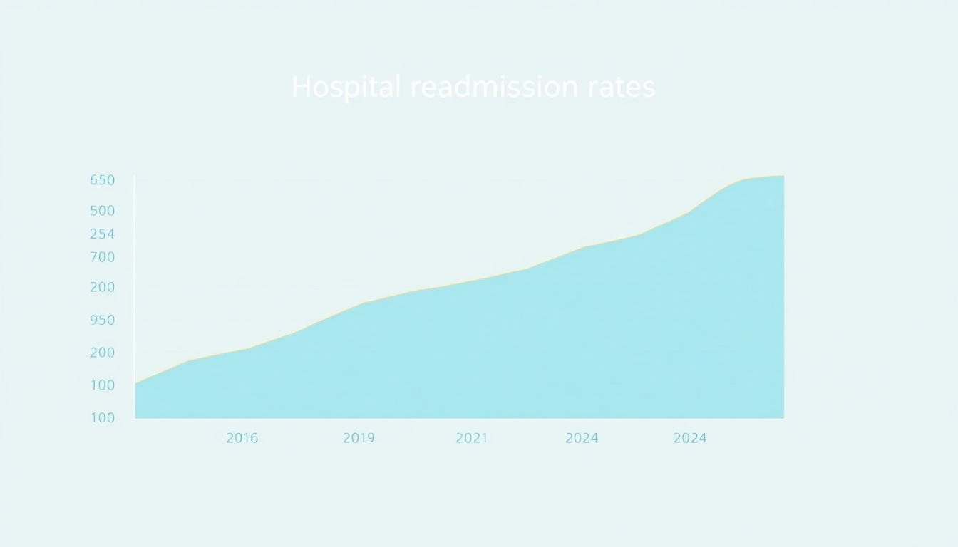
For example, if you have a line chart showing rising hospital readmission rates from 2019 to 2024, I’d describe the overall direction first, then call out the most important change. Why? Because that’s what most readers will focus on visually anyway.
Instead of copying axis labels, try something like: “Line chart of hospital readmission rates rising from 2019–2024, with the largest spike between 2020 and 2021.”
And for a bar chart showing revenue growth from $5 million in 2021 to $12 million in 2023, the listener should immediately understand the magnitude and the timeframe: “Bar chart shows revenue rising from $5M (2021) to $12M (2023), a 140% increase, with the biggest jump from 2022 to 2023.”
Follow Core Principles for Writing Alt Text
There are a few non-negotiables if you want alt text to actually help.
- Be specific, but don’t dump data. If your chart has 30 points, you can’t list them all in alt text. Pick the trend and the decision-relevant highlights.
- Use straightforward language. “Year-over-year growth” is fine once, but “Revenue increased from $5M in 2021 to $12M in 2023, up 140%” is clearer.
- Lead with the takeaway. If your first sentence is “This chart illustrates…” you’re wasting the listener’s attention.
- Match the chart’s purpose. If the chart supports a claim in the surrounding paragraph, the alt text should reinforce that claim—not compete with it.
One thing I learned the hard way: the same alt text can feel “wrong” depending on what comes right before it. If your page already says “Readmission rates jumped in 2021,” your alt text can focus on the magnitude and context instead of repeating the obvious.
Know What to Include for Different Chart Types
Different chart types demand different kinds of summaries. Here are the ones I write most often, plus what I include (and what I usually leave out).
Line charts (trends + spikes)
Include: overall direction, the biggest change, and the timeframe. Leave out: every tick mark.
Example rewrite:
Original (too generic): “Hospital readmission rates over time.”
Better: “Line chart of hospital readmission rates increasing steadily from 2019–2024, with the biggest jump between 2020 and 2021.”
Bar charts (category comparisons)
Include: what categories are being compared and which is highest/lowest (plus any key differences). Leave out: repeating the category names if they’re already in nearby text and legend.
Example rewrite:
Original (label dump): “Bars for 2021, 2022, 2023 showing $5M, $7M, $12M.”
Better: “Bar chart shows revenue rising from $5M (2021) to $12M (2023), with the largest increase from 2022 to 2023.”
Pie charts (proportions)
Include: the largest slice and the major shares that explain the story. Leave out: tiny slices unless they change the conclusion.
Example rewrite:
Original (overly detailed): “Pie chart with slices: 10%, 15%, 25%, 50%.”
Better: “Pie chart shows one category making up 50% of the total, with the next-largest at 25%; the remaining categories are smaller shares.”
Scatter plots (clusters + outliers)
Include: the overall relationship (positive/negative/no clear correlation), plus clusters or outliers. Leave out: every point.
Example: “Scatter plot shows a positive relationship between ad spend and conversions, with a cluster around moderate spend and one outlier with unusually high conversions.”
Heatmaps (hotspots + patterns)
Include: where the highest/lowest values are (which rows/columns), and what pattern stands out (bands, diagonal, pockets). Leave out: every cell.
Example: “Heatmap of customer support tickets by region and month: highest volume concentrates in the upper-left cells (Jan–Mar) and a darker diagonal band appears from Q2 to Q4.”
Maps (locations + what’s changing)
Include: what the colors represent, the top regions (or the region(s) you’re making a point about), and any direction of change. Leave out: listing every region’s value unless it’s the actual point.
Example: “Choropleth map of unemployment rates: the highest rates cluster in the northern regions, while the lowest rates appear in the south.”
Multi-series charts (the “don’t list everything” problem)
This is where a lot of alt text goes off the rails.
Here’s my decision rule: if your surrounding text only argues about 2–3 series, alt text those series and summarize the rest. If the chart is meant to compare all series equally, then focus on rankings (highest, lowest, crossover points) instead of every line.
For instance, if your chart has “Product A, B, C, D” lines and your report says “Product A outperformed after 2022,” your alt text should mention A’s shift, the timeframe, and the comparison—without turning into a dataset dump.
Axes, units, and scale (yes, sometimes you must mention them)
Screen reader users don’t see the axis labels. If the unit or scale is essential to interpreting the chart, include it. If it’s redundant because the page already states it clearly, you can skip it.
Example: If the y-axis is “Readmission rate per 1,000 discharges,” and that changes interpretation, I’d include it in alt text. If it’s just “Percent,” and the page already says “percent,” I don’t repeat it.
Error bars and confidence intervals
If your chart includes uncertainty (error bars, bands, confidence intervals), don’t ignore it. But also don’t describe every bar.
Include: whether the bars overlap (or whether uncertainty is large) if that affects the conclusion.
Example: “Line chart with error bands: the two groups overlap most months, suggesting differences are not consistently statistically clear.”
Missing data and “no data” states
If the chart has gaps because data is missing, that’s important context. I’ll often mention “data is missing for March” or “no observations shown for Q3” because otherwise a screen reader user might assume the line dropped.
How to Handle Extremely Complex Visuals
If the visual is too complex to summarize in one alt-text sentence, that’s not a failure—it’s a signal you need a better accessibility approach.
Here’s what I do when I’m stuck:
- Write an alt text “headline” first. One sentence that captures the main point.
- Add a short adjacent summary. A caption or paragraph right under the chart can hold the details you can’t fit into alt text.
- Break the story into sections. For example: “Overall trend,” “Top performers,” “Notable change points.”
- Consider an interactive or detailed table. If users genuinely need to explore values, a linked data table or interactive version is better than stuffing alt text with numbers.
I’ve used this approach on real heatmaps and multi-series dashboards. The “headline” alt text helps screen reader users understand what they’re looking at, and the nearby summary gives the rest of the context without overwhelming anyone.
Also, if you’re referencing a detailed dataset, you can point people to it. For example: a detailed data report (or table) gives users the option to go deeper.
Adjust Alt Text for Different Contexts
One of the biggest mistakes I see (and made myself) is writing alt text that ignores context.
Ask yourself: What does the reader need right now? Not “what does the chart contain,” but “what does the chart help them decide or understand?”
- Report context: emphasize the trend, magnitude, and key change points.
- Presentation context: emphasize the claim you’re making on that slide (what supports your argument).
- Marketing context: emphasize outcomes (growth, improvement, wins) and avoid neutral “data dump” phrasing.
Example: if the chart is about hospital readmission rates, and the slide is about “healthcare cost pressure,” your alt text can connect the spike years to the broader message (like “readmission spike aligns with cost increase period”)—but only if that relationship is actually supported by the content around it.
Best Practices for Writing Effective Alt Text
Here’s my practical checklist. I literally run through it every time:
- First sentence = takeaway. Trend, comparison, or proportion. No throat-clearing.
- Include the timeframe and unit if it changes meaning.
- Name the biggest change (spike year, crossover point, highest category, darkest hotspot).
- Skip repeated labels. If the legend or surrounding text already states “Revenue in millions,” you don’t need to restate it.
- Avoid “data dump” wording. Don’t list every value unless the chart’s purpose is to show exact numbers.
- Read it aloud. If it’s clunky when spoken, screen reader output will feel worse.
I also do a quick screen reader test when it matters. What I noticed: vague summaries like “shows an increase” get interpreted as meaningless. But when the alt text includes the timeframe and direction of change (“increased from 2019 to 2024”), users can follow along without guessing.
And yes—if you want a consistent writing structure for the rest of your content, it helps to have a framework. Here’s a useful internal reference: lesson planning.
Using Data and Examples to Humanize Your Descriptions
Numbers make alt text feel grounded. “Significant increase” is vague. “Up 25% in 2025” is actionable.
In my experience, the sweet spot is using just enough data to prove the point. For example:
- Vague: “Sales increased significantly in 2025.”
- Better: “Sales rose 25% in 2025 compared to 2024.”
Same idea for revenue: “Company revenue rose from $5 million in 2021 to $12 million in 2023, a 140% jump.”
If you have context about why the change happened (like a product launch, policy shift, or seasonal effect) and it’s mentioned elsewhere in your article, you can include it briefly. That’s how you turn a chart summary into something people can actually understand.
Want more writing practice beyond alt text? This guide to lesson writing has some solid tips you can adapt for clear descriptions.
FAQs
Write a one-sentence “headline” that states the main story (trend/comparison/proportion), then add 1–2 decision-relevant details like the biggest spike year or the highest category. Avoid listing every label or point.
Prioritize clarity and relevance. Lead with the takeaway, use plain language, include units/timeframes when they matter, and don’t repeat information that screen readers will already announce elsewhere (like surrounding headings or legends).
Use the chart’s “job” as your guide. Line charts: trend + spikes. Bar charts: category comparisons + biggest differences. Pie charts: proportions (usually largest slice + key shares). Scatter plots: clusters/outliers and the overall relationship. Heatmaps/maps: hotspots and the pattern that stands out.
Don’t force everything into alt text. Use a short headline in the alt attribute, then provide a nearby summary or caption that breaks the visual into sections (overall trend, key highlights, and any notable outliers). If the chart is meant for exploration, link to a detailed table or interactive version.