
How To Design Your Online School Homepage in 10 Simple Steps
When I was building a homepage for an online school, I kept running into the same problem: everything looked “nice,” but it didn’t move visitors toward enrollment. So I stopped guessing and started designing with a simple goal—make it obvious, fast, and reassuring within the first scroll. If you want a homepage that actually helps prospective students (and parents) decide, this 10-step process is the one I’d use again.
Key Takeaways
– Your homepage needs one clear job: tell visitors what you offer and what to do next (enroll, request info, or schedule a tour).
– Lead with a tight hero section (headline + short subhead + one primary CTA). Keep the rest scannable.
– Prioritize speed and SEO basics: compressed images, clean page structure, descriptive alt text, and mobile-first layout.
– Use real proof: testimonials, outcomes, and success stories that feel specific—not generic quotes.
– CTAs should be consistent and measurable. Track CTR, form starts, and conversion rate, then iterate with A/B tests.
– Make it work everywhere: responsive design, accessibility (contrast + readable fonts), and cross-browser testing.

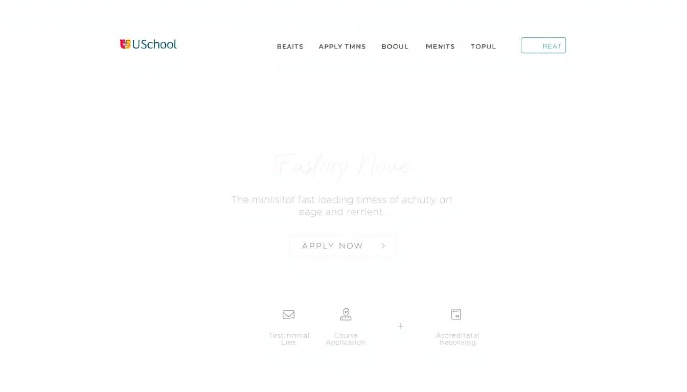
Step 1: Start With a Homepage Layout That’s Easy to Scan
Your homepage is the first impression for prospective students and parents. So yeah—clarity beats cleverness. In my experience, if someone can’t figure out what you do within a few seconds, they bounce. That’s why I like a clean, uncluttered layout with clear sections and obvious navigation.
Here’s what I aim for:
- One primary message (hero headline + subhead) near the top.
- Short sections under it (bullets, icons, or small cards).
- Visual trust (real campus, real teachers, real students—nothing overly stocky).
- Consistent styling (same fonts, same button styles, same spacing rhythm).
Also, don’t bury the “what do I do next?” part. Visitors shouldn’t need to scroll endlessly to find your enrollment path. If you’re doing it right, the main CTA should still make sense even if someone only sees the top half of the page.
Step 2: Define the Purpose (and Write a Core Message People Actually Get)
Before you design anything, I’d ask one question: what action should happen when someone lands here? Enroll? Request info? Schedule a tour? Pick one as the primary goal, and treat everything else as supporting content.
Then write a core message that fits in one or two lines. It should sound like you and match the program you sell.
Examples you can steal:
- K–12 online school: “Supportive online learning for students who need flexibility.”
- Adult ed: “Career-focused online courses built for working adults.”
- Bootcamp: “Job-ready skills with guided projects and real mentorship.”
After that headline, add a short paragraph that explains the value in plain language. No jargon. No buzzwords. Think: “explaining your school to a friend who wants to know if it’s legit.” And make sure every section supports that same purpose—courses, faculty, testimonials, FAQs, everything.
Step 3: Build a Hero Section That Gets Attention (Without Overloading It)
The hero section is your biggest chance to earn trust fast. Use a strong image or short video that matches your audience—students learning, teachers teaching, classroom energy, or your actual campus/community vibe.
What I noticed works best is keeping the hero text tight:
- Headline: the core message (clear, not vague).
- Subhead/tagline: one extra reason to believe (time flexibility, support model, outcomes).
- Primary CTA button: one action, one button style.
CTA copy ideas that fit different intents:
- “Enroll Now” (when you’re ready to accept applications immediately)
- “Request Info” (when you want lead forms and follow-up)
- “Schedule a Tour” (great for schools that offer live sessions or onboarding calls)
- “See Sample Lesson” (perfect for adult ed and bootcamps)
One more thing: make sure the hero looks good on mobile. If the headline wraps awkwardly or the button drops below the fold, you’ve basically lost half your audience.
Step 4: Keep It Fast and Make It Discoverable (SEO Basics)
I’m not going to pretend speed doesn’t matter. If your homepage feels slow, visitors assume you’re disorganized (even if your programs are great). So I focus on two things: performance and search visibility.
Performance quick wins:
- Compress images before uploading (tools like TinyPNG can help).
- Avoid giant hero images that aren’t optimized for the web.
- Limit heavy scripts and unnecessary plugins.
SEO quick wins that specifically affect school homepages:
- Use keywords naturally in headings and page copy (e.g., “online tutoring,” “K–12 online school,” “GED prep,” “coding bootcamp”).
- Write descriptive alt text for images (helps accessibility and image search).
- Keep your structure logical: H2 sections that match the content people want.
- Add a sitemap and submit it in Google Search Console.
One practical note: if you’re targeting parents/students, most of your organic traffic will be mobile. That means your homepage should load quickly on phones, not just on a desktop Wi-Fi connection.
Step 5: Test What Matters (Not Just What Looks Different)
After launch, I treat the homepage like a living page—not a “set it and forget it” project. Use analytics to find friction and run small tests you can actually measure.
KPIs I’d track for an online school homepage:
- CTA click-through rate (CTR): how often people click the primary button
- Form starts: how many users begin your enrollment/info form
- Completion rate: how many finish the form
- Scroll depth: whether people reach testimonials or program details
- Time on page / engagement: a sanity check for clarity
Mini A/B testing playbook (pick 1–2 at a time):
- Test 1: Hero headline
Change from a generic headline to an outcome-based one.
Example: “Flexible online learning” → “Flexible online learning with weekly live support.”
Metric: CTA CTR.
Run: 2–3 weeks (or until you have enough conversions to trust the data). - Test 2: Primary CTA wording
“Request Info” vs “Schedule a Tour” (depending on your audience).
Metric: form starts + form completion rate. - Test 3: Testimonial placement
Move testimonials closer to the hero (instead of mid-page).
Metric: scroll depth + CTR to the enrollment CTA. - Test 4: Hero image choice
Switch to a more relatable image (teacher-led moment vs generic classroom photo).
Metric: engagement + CTA CTR.
And don’t skip feedback. I like collecting short input from parents/students like: “What did you think this school was for?” If they misunderstand it, your message isn’t clear yet.
Step 6: Add Proof That Feels Real (Testimonials + Outcomes)
People don’t just want promises. They want proof. On school homepages, testimonials are powerful because they reduce the fear of making the wrong choice.
Here’s what I recommend:
- Use variety: written quotes, short video clips, and short “story” blocks.
- Include specifics: who the student is (age range or situation), what changed, and what outcome they got.
- Keep it fresh: rotate testimonials every few months if you can.
What a stronger testimonial looks like:
Instead of “Great school!” try something closer to: “My daughter struggled with consistency, but the weekly check-ins helped. She finished the term on time and is now confident asking questions.”
If you have outcomes, include them—graduation milestones, improved grades, completion rates, or acceptance into programs. It’s the difference between “trust me” and “here’s what happened.”
Step 7: Make CTAs Obvious (and Track Them)
Every page needs a next step. But on a homepage, you have to be careful: too many CTAs can dilute attention. I like a simple hierarchy.
My CTA placement rule (works well on school homepages):
- Above the fold: 1 primary CTA button (the one action that matches your main goal).
- Mid-page: 1 supporting CTA (only if it matches a different intent, like “See Sample Lesson”).
- Near FAQs: repeat the primary CTA in a calmer way (“Ready to talk? Request info”).
Button copy that tends to convert:
- Enroll-focused: “Enroll Now” / “Apply Today”
- Parent-focused: “Request Info” / “Talk to an Advisor”
- Trial-focused: “Watch a Sample Lesson” / “Get a Placement Plan”
Then track what matters. If your CTA isn’t getting clicks, don’t just change the color—check the message, the hero layout, and whether the CTA matches the page content.
Step 8: Put the Most Important Info Where People Look First
Most visitors skim. So give them the answers quickly. I usually include a “quick facts” section right after the hero or within the first scroll.
What to include depends on your program type:
- K–12 online school: grade levels, learning support model, live sessions (if you offer them), and how parents communicate.
- Adult ed: schedule flexibility, time commitment, outcomes/certifications, and who the course is for.
- Bootcamps: project-based learning, mentorship hours, tech stack, and job support (if applicable).
Use bullets or icons so it’s easy to scan. If you include stats (graduation rates, completion rates, student satisfaction scores), make them specific and current. A “Why Choose Us?” section with 3–5 points is a great way to stand out quickly.
Step 9: Keep Content Fresh With Real Updates (Events, Lessons, Spotlights)
Stale content makes a school feel inactive. That’s why I like adding small, real updates to the homepage—things that prove you’re actively teaching.
Good options:
- Upcoming events (info sessions, open houses, live Q&A)
- Student or teacher spotlights
- Recent blog posts (only if they’re actually helpful)
- Sample lessons or mini-courses (especially for bootcamps and adult ed)
And here’s the practical part: update on a schedule you can maintain. Even “monthly” is better than nothing. The goal isn’t to constantly post—it’s to give visitors a reason to believe you’re actively supporting learners.
Step 10: Optimize for Mobile + Accessibility (So Everyone Can Use It)
Mobile matters. If your site is hard to read or annoying to tap on a phone, you’re losing leads. I design mobile-first: big enough fonts, buttons with room to tap, and sections that stack cleanly.
Mobile checklist:
- Responsive layout (no horizontal scrolling)
- Legible font sizes
- Buttons that are easy to tap
- Images that don’t take forever to load
You can sanity-check with Google’s Mobile-Friendly Test. Then test on real devices if you can (even a couple of phones helps).
Accessibility is also non-negotiable. Use good contrast, descriptive alt text, and readable typography. It’s not just “nice to have”—it’s part of making your school feel welcoming and trustworthy.
Bonus Step: Keep Branding Consistent (So You Look Professional)
This one sounds simple, but it’s easy to mess up. Your website should feel like the same school as your flyers, email templates, and social pages.
Use your logo, colors, and fonts consistently across the homepage and inner pages. Also, don’t overload the page with random design elements. Clean and consistent beats flashy and chaotic every time.
Bonus Step: Test Across Browsers and Devices (No Surprises)
Someone will eventually view your homepage on a different browser or device. If it breaks, it’s not just annoying—it looks unprofessional.
I like using tools like BrowserStack to check how your layout behaves across common browsers and screen sizes. And yes, sometimes fixes are as small as updating code or switching to a reliable Web Design Framework that handles responsive details more gracefully.
FAQs
Pick one primary action that matches your sales process—enrollment, requesting info, or booking a tour. Then write your homepage sections so they all point back to that action (courses, admissions steps, testimonials, and FAQs).
Start with a clear hero image or video, then pair it with a concise headline and a single primary CTA. Keep your color scheme consistent and avoid clutter so the hero actually stands out.
Organize navigation around what people want most (programs, admissions, tuition, resources). Use clear labels and make sure key info is reachable without hunting.
CTAs guide visitors to the next step—enroll, request details, or talk to an advisor. When your CTA is clear and placed where people can find it, you reduce confusion and improve conversion.