How to Ensure Keyboard Navigation in Your LMS (10 Steps)
I get it. Trying to use an LMS with only a keyboard can feel like you’re walking a maze with the lights off. I’ve run into this a lot—especially in platforms where the UI is built around custom components (dropdowns made from <div>, “buttons” that aren’t real buttons, modals that steal focus and never give it back).
In my experience, the biggest pain points aren’t “screen reader basics.” It’s the practical stuff: focus order that jumps around, focus disappearing behind overlays, and interactive quiz/discussion controls that are visually obvious but not actually reachable with Tab. And yeah—sometimes the keyboard user hits a wall and can’t escape a dialog. That’s not just annoying; it kills the learning flow.
Here’s what I changed when I worked on LMS accessibility improvements: I tested key flows (course landing page → lesson → quiz → results → discussion thread) using Tab and Shift+Tab only, then fixed specific issues like focus traps in modals, missing focusable elements in quiz pagination, and “expand/collapse” controls that didn’t respond to Enter or Space. The result? Fewer “I can’t submit” tickets and a smoother experience for power users who prefer the keyboard.
Below are 10 steps I’d actually follow—each one tied to real LMS scenarios (quizzes, forums, file uploads, grade submission, and dynamic content), not generic accessibility advice.
Key Takeaways
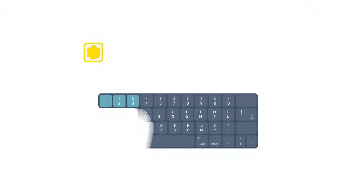
- Keyboard test the real paths. Don’t just click around with Tab—complete a lesson, open a quiz, navigate between questions, and submit an assignment. If you’re pressing Tab 100+ times just to reach the main content, the focus order is broken or too noisy.
- Make focus order predictable. Keep it top-to-bottom in the DOM, and ensure the “Start Quiz / Continue Lesson / Submit” actions are reachable early in the tab sequence.
- Use the correct elements. Replace clickable
<div>/<span>with real<button>,<a>, and properly labeled<input>. Your keyboard users—and screen readers—will thank you. - Don’t hide focus. In one LMS I reviewed, focus outlines were removed for custom styling, and users couldn’t tell where they were. Use a strong
:focusstyle and test it in every theme/color mode. - Fix keyboard traps in modals and menus. I’ve seen “close” buttons that aren’t focusable and dialogs that trap focus forever. Always provide an escape route (Esc + a real close button) and verify with Shift+Tab.
- Navigation menus must work with arrows/Enter/Esc. If your LMS has a sidebar or mega menu, submenu expansion needs keyboard support and focus needs to land in the right place.
- Use skip links. A “Skip to main content” link is a small change that saves a ton of Tab presses on course pages with repeated headers and toolbars.
- Manage focus for dynamic updates. When quiz feedback loads or a new lesson section appears, move focus to the updated heading or feedback container (and avoid yanking focus unexpectedly).
- Test every interactive widget. Quizzes, discussion thread controls, date pickers, file uploads, grade submission steps—these are where keyboard issues hide.
- Keep it simple, but be specific. Standard HTML + clear labels + fewer tab stops beats clever hacks. Accessibility shouldn’t require a workaround.
1. Make Sure Keyboard Navigation Works Smoothly in Your LMS
Start with the simplest test: keyboard only. I literally disconnect the mouse and run the core flow end-to-end.
Use Tab to move through menus, buttons, links, and interactive quiz controls. Then go backwards with Shift+Tab. If anything is reachable visually but not via keyboard, that’s an immediate fix.
Here’s a practical threshold I use: if it takes more than ~100 Tab presses to reach main course content on a typical page, something’s off. Usually it’s a focus order problem (too many hidden controls still focusable) or a header/toolbar that’s swallowing focus.
Also, focus on LMS-specific interactive elements:
- Quizzes: question navigation (Next/Previous), answer options, “Submit quiz”
- Videos: play/pause controls if they’re custom, plus any “Jump to timestamp” buttons
- Discussions: thread list, reply button, editor controls, and “Post reply”
- File uploads: upload button, choose file input, and “Remove file” actions
- Date pickers/calendars: focusable day cells and keyboard navigation within the widget
And yes, check modals/pop-ups. I’ve seen close buttons that look clickable but aren’t actually focusable. If users can’t close a dialog with the keyboard (or escape it with Esc), they’re stuck.
2. Create a Clear and Logical Flow for Keyboard Users
Tab order should feel like reading a book. In most LMS pages, that means top-to-bottom, then left-to-right within each row/section.
When I audit an LMS, I check three “anchor points” first:
- Main navigation (sidebar/top menu)
- Primary content (lesson body, quiz area, discussion thread)
- Secondary actions (support, logout, settings)
Headings and instructions matter more than people think. If the page has a “Start quiz” button but the focus lands on 12 unrelated controls first (like hidden filters, collapsed panels, or analytics widgets), keyboard users get lost.
About tabindex: I use it sparingly. In my experience, most issues come from trying to “fix” focus order with random positive tabindex values. Prefer the natural DOM order, and use tabindex="0" only when you genuinely need to make a non-interactive element focusable (and then ask: should it really be focusable?).
One quick walkthrough tip: ask a colleague to do the same flow, but have them say out loud what they expect each focused element to do. If their mental model doesn’t match what happens on Enter/Space, your labels and focus order need work.
3. Use Proper HTML Structure for Interactive Elements
This is where a lot of LMS keyboard problems start: “clickable” UI built with <div> and <span>. Visually it looks fine. Keyboard users? Not so much.
Use real elements:
- Buttons:
<button>for actions like “Next question”, “Submit”, “Save draft” - Links:
<a href="...">>for navigation like “View grades”, “Open discussion”, “Download rubric” - Form controls: proper
<input>,<textarea>, and<select>with labels
Here’s a pattern I’ve used repeatedly in LMS components because it just works:
Good:
<button type="button" aria-label="Next question" id="nextQuestion">Next</button>
Risky:
<div role="button" tabindex="0" onclick="nextQuestion()">Next</div>
That second one can be made accessible, but it’s easier to get wrong: key handling, focus styling, and Enter/Space behavior often end up inconsistent.
Also watch for this failure mode: disabled focus. If an element is visually present but you set tabindex="-1" (or you block focus with CSS/JS), keyboard users can’t reach it. In quizzes and grade submission screens, that usually shows up as “I can’t select an answer” or “I can’t reach Submit.”
Think of it like building doors and hallways. If you use proper doors (<button>/<a>), the keyboard can find them. If you draw doors on the wall (<div>), you’ll have to invent the whole door system yourself.
4. Keep Focus Indicators Clear and Visible
Focus indicators aren’t optional. If a keyboard user can’t see where focus is, they’re basically guessing.
In one LMS review, the design team replaced focus outlines with subtle shadows that barely showed up on light backgrounds. That’s when users started emailing support like “Tab doesn’t work.” It did. They just couldn’t tell where the focus landed.
So do this:
- Make focus styles high contrast (outline or underline that clearly stands out)
- Test in the most common UI states (hover, disabled, dark mode if you have it)
- Verify focus appears on every interactive element: sidebar items, quiz navigation, dropdowns, and “Post reply” buttons
A baseline CSS rule I like is:
:focus { outline: 3px solid #000; }
If you’re using custom components (autocomplete, accordions, collapsible course modules), double-check they apply focus styles to the actual focusable element—not a wrapper <div>.
5. Avoid Keyboard Traps and Dead Ends
A keyboard trap is when focus enters an area (like a modal) but can’t leave it using the keyboard. The user can Tab around inside, but they’ll never reach the “real page” again.
This shows up constantly in LMS pop-ups:
- “Confirm submit” dialogs after assignment upload
- Quiz feedback modals after finishing the last question
- Discussion “edit” popovers
- Calendar pickers with broken focus handling
Here’s what I check every time:
- When the modal opens, focus moves to the close button (or the primary action)
- Esc closes the modal
- Shift+Tab can move focus backwards out of the modal
- After closing, focus returns to a sensible trigger element (like the “Submit” button that opened the dialog)
If you use JavaScript focus trapping, make sure it’s not an infinite loop. A good “escape hatch” is required: close button + Esc. If you don’t provide that, keyboard users will get stuck. And I mean stuck—no “they should be able to figure it out.”
6. Build Accessible Navigation Menus
Menus are the backbone of an LMS. If the menu is broken for keyboard users, the rest of the site doesn’t matter.
Use semantic structure:
- Wrap your navigation in
<nav> - Use
<ul>and<li>for menu lists - Use real buttons for expand/collapse controls
Keyboard behavior expectations (the stuff I verify):
- Top-level items are focusable
- Submenus open with Enter or Space (and ideally arrow keys)
- When a submenu opens, focus moves to the first submenu item (not back to the top of the menu)
- Esc closes the submenu or menu
ARIA can help, but don’t treat it like a magic spell. Test with keyboard first. If focus doesn’t land where you think it should, ARIA won’t fix that.
One more LMS-specific detail: course pages often include a “module list” or “lesson sidebar.” Those expand/collapse controls should be reachable and should not hide focusable items without removing them from the tab order.
7. Add Skip Links and Shortcut Keys
Skip links are one of those small changes that make keyboard navigation feel dramatically less painful.
A skip link is a hidden link at the top of the page that becomes visible when focused. It lets users jump straight to the main content area—no endless Tab through headers and toolbars.
Example:
<a href="#maincontent" class="skip-link">Skip to main content</a>
Make sure it’s:
- Visible on focus (otherwise it’s useless)
- Pointing to a real anchor near your main heading/content
- Consistent across templates (course home, lesson page, quiz page, discussion page)
Shortcut keys can also help—especially for power users. The key is to avoid stealing keystrokes from typing fields. If you add shortcuts like “Q for quizzes,” only trigger them when focus is not inside an input/textarea.
In my projects, the combo of skip links + fewer focusable toolbar items made the biggest difference in “time to reach content.”
8. Manage Focus for Dynamic Content
LMS interfaces are full of dynamic updates: quiz questions change without a full page reload, feedback appears after submitting, discussion posts update, and file upload widgets show progress.
Keyboard users can get confused when the page changes but focus doesn’t. So when content changes, decide what the user should do next—and move focus accordingly.
Common LMS scenarios I’ve handled:
- Quiz question pagination: when Next loads the next question, move focus to the question heading or the first answer option
- After submitting: move focus to the results heading (“Quiz submitted”) or the status message
- Lesson completion: when a “complete” banner appears, don’t trap focus on it—send focus to the next actionable element (like “Continue to next lesson”)
- Modals/confirmations: focus the close button on open, return focus to the trigger on close
In code, the basic idea looks like this:
element.focus();
One important limitation: don’t move focus every time something animates or updates in the background. If your app loads suggestions or refreshes a sidebar, yanking focus can be worse than leaving it alone.
If you use ARIA live regions for announcements, keep them paired with sensible focus changes. Otherwise screen reader users might get announcements while keyboard users stare at an unchanged area.
9. Test Keyboard Navigation Regularly and Thoroughly
Keyboard testing isn’t a “once and done” task. LMS UIs change constantly—new widgets, new course templates, new quiz layouts.
Here’s the way I test so it’s actually useful:
- Run Tab and Shift+Tab through every interactive element on key pages
- Complete at least one full journey: course landing → lesson → quiz → results → discussion reply → assignment submission
- Count tab stops to the main action. If the “Submit” button is buried behind dozens of focusable controls, fix the layout or tab order
- Try keyboard-only interactions inside widgets: dropdowns, date pickers, file upload controls, accordion modules
I also like using tools like WAVE and Lighthouse because they catch obvious issues. But tools won’t tell you whether the quiz question navigation feels usable. Only keyboard testing will.
And yes—ask for feedback. Even one learner using keyboard-only can highlight problems you won’t notice during internal testing.
10. Follow Proven Best Practices to Keep It Simple
If there’s one theme across all of this, it’s consistency. Keyboard navigation should be predictable, not a choose-your-own-adventure.
- Stick to a logical focus order that matches the visual layout
- Use standard HTML controls for interactivity (buttons, links, inputs)
- Provide clear labels so users know what Enter/Space will do
- Reduce tab stops on high-traffic pages (course home, lesson page, grade submission)
- Make critical actions easy to reach—“Start quiz,” “Submit,” “Post reply,” and “Download feedback” should not require a keyboard marathon
One last thing I’ve learned the hard way: every time you build a custom widget, you inherit keyboard accessibility work. If you can use a native element instead, do it. It’s usually faster, cleaner, and more reliable.
Keep testing, keep iterating, and don’t treat keyboard access as a “nice to have.” For a lot of learners, it’s the only way they can use the LMS comfortably.
FAQs
Test your LMS with keyboard-only and actually complete key tasks (like starting a quiz, navigating questions, and submitting). Focus issues usually show up in real flows—not in isolated components. Also, get feedback from someone who relies on keyboard navigation so you can catch problems you might miss.
A logical flow follows the visual and DOM order of the page, so users can move step-by-step through navigation, content, and actions without surprises. Use structured markup (headings, labels, semantic sections) so the interface reads naturally even when you’re only using Tab.
Proper HTML helps assistive technologies understand what’s interactive and what each control does. When you use the right elements (buttons, links, labeled inputs), keyboard interaction and screen reader behavior are more consistent—so users aren’t forced to rely on guesswork.
Use semantic HTML like <nav> and