
How to Design Assessments for Color-Blind Learners in 8 Easy Steps
I’ve built and reviewed assessments where color was doing too much of the talking. And yeah—when the only difference between options is “this is red” vs “this is green,” some learners aren’t actually failing the question. They’re just guessing the visual cue.
One scenario I ran into: a multiple-choice item that showed a mini “traffic light” (red/green circles) to ask students which signal matched a safety rule. In my internal QA, a couple of testers with red-green color vision deficiency hesitated because the circles looked too similar. The question wasn’t hard—the presentation was. So we changed it: we kept the colors, but added clear shapes (circle vs triangle) and labels (“STOP” and “GO”) right next to each option. After that update, the confusion dropped immediately in the pilot.
Below are eight practical steps you can use to design assessments for color-blind learners—without making your test easier in a way that changes the skill being measured.
Key Takeaways
- Don’t rely only on color to communicate information. Add labels, symbols, or patterns so everyone can understand your assessment clearly.
- Use high-contrast color combinations and verify readability (text vs background) so learners aren’t forced to “decode” the palette.
- Pair colors with textures, shapes, and patterns—especially in charts, graphs, and answer choices.
- Label color-coded parts explicitly with text or icons (not just color) so the meaning is never ambiguous.
- Use lightness/darkness differences (not just hue) to make options distinguishable in grayscale.
- Test with color-blindness simulation tools and also check grayscale/monochrome views.
- Provide alternative formats for assessments (and for instructions/feedback), like transcripts, text alternatives, and audio guidance.
- Review accessibility regularly with a simple regression check so improvements don’t accidentally break later.
1. Build Assessments That Don’t Depend on Color
When I audit an assessment, I look for anything that communicates meaning “by color alone.” Buttons, legends, chart series, status messages—if the only cue is the color, you’ve created a problem for color-blind learners.
Instead of using a red/green distinction by itself, add a second cue. Shapes work great. Think: a red light isn’t just “red”—it’s a STOP circle. A green light isn’t just “green”—it’s a GO triangle. That way, even if the hue blends together, the shape and label carry the information.
Here’s a quick before/after example from the kind of item I mentioned earlier:
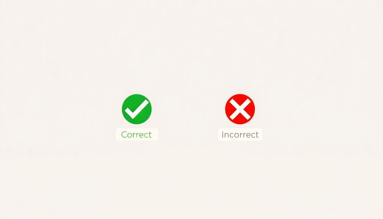
- Before: A 3-option multiple-choice item with two colored dots (red dot = “Incorrect,” green dot = “Correct”). No other labels.
- After: The same item now includes a checkmark/cross icon and the text “Correct” / “Incorrect” next to each option, plus a shape difference (circle vs square).
I also recommend checking your layout in black-and-white or grayscale. If the question becomes unclear in monochrome, it’s usually a sign you were leaning too hard on hue.
And yes—use color-blind simulators when you can. They won’t replace real testing, but they’ll catch obvious issues fast.
2. Pick Color Palettes That Stay Distinct (Even When Color Doesn’t)
High contrast matters, but it’s not only about “bright vs dull.” It’s about whether learners can separate elements by more than hue. In my experience, blue/yellow/orange combinations often hold up better for many learners with red-green color vision deficiency, simply because the lightness differences are clearer.
Try to avoid pairing colors that are commonly confused (like red and green) when they’re the only differentiator. If you need to use them, make sure there’s an additional cue: labels, icons, patterns, or borders.
Also, don’t forget the basics of readability: dark text on a light background or light text on a dark background usually works better than mid-tone combinations.
To sanity-check your choices, use tools like Contrasted and Color Oracle. A common guideline is a contrast ratio of at least 4.5:1 for text and background. (If you’re using smaller text or thin fonts, you may need even more contrast.)
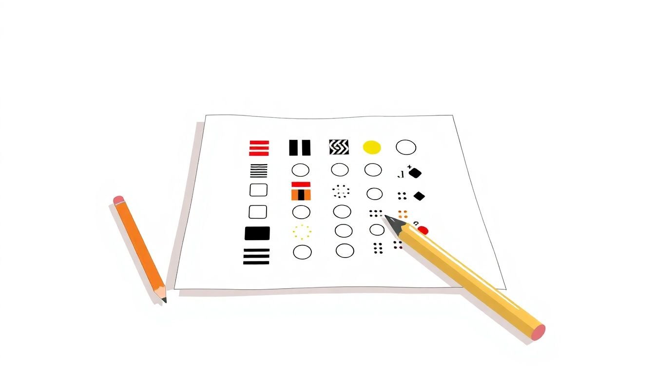
3. Add Patterns, Textures, and Shapes (Especially for Charts)
If your assessment includes any kind of visual comparison—graphs, bar charts, line charts, heatmaps—patterns and shapes aren’t optional. They’re how you keep the meaning intact when colors don’t separate cleanly.
For multiple-choice options, I like using:
- Different shapes: circle, triangle, square, star
- Different borders: solid vs dashed vs double
- Different fills: stripes vs dots vs solid
For charts, don’t rely on color shading alone. For example:
- Before: A bar chart where “Category A” is blue and “Category B” is orange.
- After: The same bar chart, but “Category A” uses a solid fill and “Category B” uses a diagonal stripe fill. The legend also includes labels like “A (solid)” and “B (stripes).”
One more thing I’ve learned the hard way: if the chart is small on a mobile screen, patterns can get muddy. So test at the same size your learners will actually see.
4. Label Color-Coded Elements (Text Beats Guessing)
If color is present, labels should be present too. Always.
Instead of “red = wrong, green = right,” explicitly add text next to the answer choices:
- “Correct” with a checkmark icon
- “Incorrect” with an X icon
Icons help, but text helps more—especially for learners who rely on screen readers or who just want immediate clarity. If you’re using a legend in a chart, include both the label and a non-color cue (like “A = solid bar,” “B = striped bar”).
Here’s a simple self-check I use: if someone couldn’t see the colors at all, could they still answer correctly? If the answer is “no,” you need more than color + layout.
5. Use Lightness and Darkness (Not Just Hue)
Changing brightness is one of the easiest fixes that actually works. Two colors can share a similar hue but still be clearly different in lightness, which makes them easier to distinguish in grayscale.
For example, if you’re tempted to use “light green vs dark green,” consider a light yellow paired with a deep orange instead—then confirm it still reads well in monochrome.
And yes, you should keep an eye on contrast ratios. If your text is small or your assessment is timed (so learners don’t have much time to “figure it out”), you’ll want stronger contrast than you think.
Quick workflow tip: export your item as a flat image and view it in grayscale. If the key differences disappear, that’s your cue to adjust lightness, add patterns, or add labels.
6. Test With Color-Blind Simulation Tools (And Check Grayscale)
I don’t consider accessibility “done” until I’ve run a quick simulation pass. Tools like Color Oracle and other color vision deficiency simulators help you see what could blur together for different types of CVD.
What I look for during testing:
- Do answer options become indistinguishable?
- Can learners still interpret chart legends?
- Do status messages (correct/incorrect) stay obvious?
- Does focus/selection styling still show up?
Also, check grayscale/monochrome. Even if a color-blind simulation looks “okay,” grayscale can reveal issues with lightness-based differentiation.
In a recent review I did, the red/green problem wasn’t obvious in full color. In monochrome, the two categories collapsed into almost the same shade. That one test saved us from shipping a confusing data interpretation item.
7. Offer Assistive Technology Support and Alternative Formats
“Alternative formats” isn’t just a nice-to-have—it’s how you make sure the assessment is usable with different access needs and different input methods.
Here are practical examples for assessments:
- Screen reader friendly: don’t put critical instructions only in images; use real text labels and meaningful alt text
- Audio instructions: provide a short audio version of directions for timed visual instructions
- Transcripts: for any video-based prompt, include a transcript or captions
- Large-print / high-zoom: offer versions that don’t break layout when zoomed to 200%
- Text alternatives for charts: include a brief description of what the chart shows, plus the exact values or a summary of relationships
If you’re using tools like Text-to-Speech, pair it with clear, structured text so learners aren’t decoding information from visuals alone.
The goal isn’t to “reduce difficulty.” It’s to remove irrelevant barriers so learners can demonstrate the skill you’re actually assessing.
8. Keep a Simple Accessibility Review Loop (So It Doesn’t Drift)
Accessibility isn’t a one-time checklist. I like to treat it like regression testing—because updates to templates, styles, or question banks can quietly break what used to work.
Here’s a maintenance plan you can actually stick to:
- Before launch: run your color-blind simulation + grayscale check on a sample set of items (not just one quiz)
- After updates: re-test any item types you touched (charts, legends, drag-and-drop, rubric scoring screens)
- Monthly/quarterly review: spot-check new questions for “color-only meaning” problems
- Collect feedback: recruit testers with different color vision deficiency types and run task-based reviews (have them complete real items and note where they got stuck)
If you track metrics, even informally, it gets easier to prioritize fixes. Watch for things like error rate by item type, average time-to-answer on visual questions, and which prompts cause the most “I’m not sure what this means” moments.
For standards, it helps to align with WCAG so you’re not guessing what “good” looks like.
When you build this into your process, accessibility stops being a scramble and becomes part of how you ship.
FAQs
Use patterns, textures, and labels alongside colors—especially for charts and answer choices. Then test with color blindness simulation tools and also check grayscale so you’re not relying on hue alone.
Choose high-contrast combinations (dark text on light backgrounds or the reverse) and don’t rely on hue alone. Also use differences in lightness—this helps in grayscale and for many common color vision deficiencies.
Add distinct shapes (circle/triangle/square), borders (solid/dashed), and fills (stripes/dots) to separate options and chart series. That way, learners can interpret meaning even when colors blend together.
Label color-coded elements clearly, include non-color cues (icons/patterns/shapes), test with simulation tools and grayscale views, and provide alternative formats when visuals are essential.