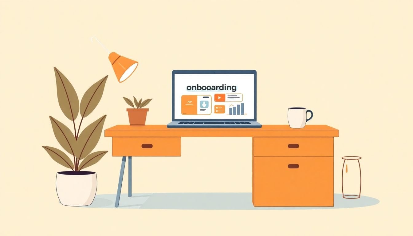
How to Create 7 Effective Steps for Engaging Orientation Modules
I’ve built and audited more onboarding modules than I’d like to admit. And yeah—when the content is just a pile of videos and policy PDFs, people don’t get excited. They get lost. Or worse, they rush through just to “get it done.”
So what I focus on instead is simple: interactive moments, role-relevant scenarios, and feedback that tells new hires what they’re doing right (and what to fix) immediately. Keep reading and I’ll walk you through 7 practical steps to create engaging orientation modules that actually hold attention and help people ramp up faster.
By the end, you’ll have a clearer blueprint you can use right away—plus a couple of worked examples you can steal.
Key Takeaways
- Design orientation modules with short, scannable sections plus interactive checks (quizzes, scenarios, branching choices) so learners stay mentally “on.”
- Use simulations and clickable scenarios to mirror real work—this improves retention more than passive slide decks.
- Layer multiple formats (visual, audio, hands-on) without bloating the module—give learners options, not endless content.
- Personalize by role using scenarios, decision trees, and role-based feedback so each learner gets what they need (not generic fluff).
- Follow online content best practices: clean navigation, progress indicators, readable typography, and accessibility basics like captions and contrast.
- For virtual onboarding, combine asynchronous modules with live touchpoints (Q&A, tours, mentorship) so remote hires still feel connected.
- Build a real onboarding process with automation timing, milestones, and measurable feedback loops (completion, time-to-competency, quiz accuracy).

Step 1: Create Engaging Orientation Modules
Let’s start with the foundation. If your module feels like a lecture, no amount of fancy interactivity will save it. In my experience, the biggest win is building modules that feel bite-sized and useful immediately.
Here’s how I’d structure an engaging orientation module (and I’ve reused this pattern a lot):
- Lead with a “why this matters” hook (10–20 seconds): One short scenario or problem statement. Example: “Your first customer email comes in—here’s how to respond in 3 steps.”
- Chunk the content into 3–5 screens: Each screen should answer one question. If it’s getting long, it’s probably two screens pretending to be one.
- Use real-world examples, not abstract definitions: Tie every concept back to a task they’ll do this week.
- Add 1 quick check per chunk: A poll, a 1-question quiz, or “choose the best next step.” (Not 10 questions at the end—spread them out.)
- End with a clear next action (CTA): What should they do next, today? “Complete the IT access checklist” or “Book your intro call with your manager.”
One detail people skip: accessibility and device reality. I always design assuming someone is on a phone. That means readable font sizes, captions on videos, and avoiding tiny buttons that are impossible to tap.
Mini-template you can copy: For each module, aim for 8–12 minutes total. Inside that, include:
- 2 minutes: hook + overview
- 5–7 minutes: 3 chunks of content (1 check per chunk)
- 1–2 minutes: summary + CTA + “what to expect next”
If you want a simple example of what “chunking” looks like, here’s a style I like:
- Chunk 1: “Where to find policies” + a 2-option poll (“HR portal or Help Center?”)
- Chunk 2: “How to submit a ticket” + a short quiz (choose correct category)
- Chunk 3: “What to do when you’re stuck” + a scenario question (“Who do you contact first?”)
What I noticed when I made this change: completion went up because people weren’t waiting until the end to prove they understood. They got feedback as they went.
Step 2: Use Interactive Learning Techniques
Interactive learning isn’t just “add a quiz.” It’s “force a decision” in situations that resemble the job. When learners choose an action, they’re building mental models instead of just consuming information.
Here are interactive techniques that actually work, with concrete examples:
- Clickable scenarios: Present a situation and ask what they’d do next. Example: “A customer asks for a refund—what’s your first step?”
- Branching decision trees: If they choose “refund,” show the refund policy steps. If they choose “escalate,” show the escalation criteria.
- Simulations: For IT, simulate troubleshooting flow: “No access to VPN” → test steps → result → next action.
- Drag-and-drop ordering: “Put these steps in the correct order” (great for onboarding checklists).
- Instant feedback quizzes: After each question, show a why, not just “correct/incorrect.”
- Badges tied to outcomes: Not “you clicked 10 times.” Tie it to meaningful completion, like “Completed Access Setup” or “Knows Escalation Path.”
- Peer interaction prompts: Discussion board questions that require a real contribution: “Share one tool you found helpful and why.”
On tools: I’ve used createaicourse.com specifically to speed up lesson preparation—like turning a rough onboarding outline into structured lesson content with prompts for interactive sections. The practical benefit is that it helps you draft the “decision points” and question scaffolding faster, so you can spend time polishing scenarios instead of staring at a blank page.
Engagement isn’t just “fun.” It’s measurable. If you can, track:
- Module completion rate (did they finish?)
- Quiz accuracy (did they learn?)
- Time-to-completion (are they stuck?)
- Drop-off screen (where do they bail?)
And yes—after you add interactivity, you’ll naturally want options for different learning styles. That’s where Step 3 comes in.
Step 3: Incorporate Diverse Learning Styles
Different people learn differently. But I don’t think you need to create three separate trainings for every topic. What works better is using a mix of formats inside the same module and letting learners choose the path that fits them.
Here’s a simple way to cover common learning preferences without bloating your course:
- Visual: diagrams, screenshots, short explainer videos, and “where to click” images.
- Auditory: narration, short audio summaries, or a podcast-style recap (even 2–3 minutes helps).
- Hands-on: practice exercises, scenario choices, and “do this now” tasks.
My go-to approach: For each module, include one “watch/listen” segment and one “do” segment. Then offer an optional “read more” or “download checklist” for people who prefer text.
Example of what this looks like in a real onboarding module:
- They watch a 90-second video: “How to log tickets.”
- They try a scenario: “Which category should this ticket be under?”
- They get a 30-second audio recap: “Remember: use the correct category to route faster.”
- They optionally open a one-page checklist: “Ticket submission quick guide.”
Also, feedback matters. If someone picks “I prefer hands-on,” don’t just log it—use it. For example, after they finish the module, show an extra practice task for that preference (or recommend it).

Step 4: Personalize Content for Different Roles
This is the step that makes onboarding feel “made for me.” If your sales hires are stuck learning the same troubleshooting basics as IT, you’ll lose them fast.
Here’s what I recommend: create role tracks with shared foundations plus role-specific scenarios.
What to customize (in order of impact):
- Scenarios: customer-facing for sales, access + incident flow for IT, stakeholder comms for project roles.
- Decision points: “Which team do you contact first?” should change by role.
- Feedback: the “why” behind correct/incorrect answers should match how that role works.
- Recommended next steps: different CTAs depending on role.
Worked example: Sales vs. IT onboarding scenario
Role: Sales — Scenario Module: “First customer complaint”
- Scenario: “A customer emails: ‘I was charged twice. Fix it.’ You have access to billing tools, but refunds require approval.”
- Decision point: “What do you do first?”
- Options: (A) Refund immediately without approval, (B) Verify account + open a billing ticket, (C) Ignore and escalate to legal.
- Correct feedback (B): “Good call. Verify the charge and open a billing ticket so the request routes correctly. Refund approval happens after review.”
- Incorrect feedback (A): “Not yet—refunds require approval. If you refund early, it can create compliance issues.”
- Mastery check: 2 questions total. Pass if they get 2/2 correct or 1/2 with a retry.
Role: IT — Scenario Module: “VPN access issue”
- Scenario: “A new hire can’t connect to VPN. They can log into email, but the VPN client shows ‘authentication failed.’”
- Decision point: “What should you check first?”
- Options: (A) Delete user and recreate from scratch, (B) Confirm account is provisioned and credentials are synced, (C) Disable MFA globally.
- Correct feedback (B): “Right. Authentication failures usually mean provisioning didn’t sync. Confirm account status and password/MFA sync before escalating.”
- Incorrect feedback (C): “Don’t disable MFA globally—risk is high. Fix the local sync first, then escalate if needed.”
- Mastery check: branching: if they pick the wrong step, show the “what you would see” outcome and force them to try again.
That’s the kind of personalization that makes orientation feel relevant. And it also gives you better data—because role-specific modules should produce better quiz accuracy in the first week.
Step 5: Follow Best Practices for Online Content
Online onboarding fails for boring reasons: too much text, confusing navigation, and accessibility issues. Here’s what I do to keep modules clean and learner-friendly.
- Write like you’re talking: short sentences, simple language, and fewer “corporate” words.
- Use real formatting: bullet points, numbered lists, and headings that match what people are looking for.
- Keep paragraphs tight: aim for 1–3 lines per paragraph on mobile.
- Add progress indicators: show “Module 2 of 5” or “3 steps remaining.” It reduces drop-off.
- Make navigation obvious: consistent buttons (“Next,” “Back,” “Mark complete”).
- Accessibility checklist (don’t skip):
- Captions for video
- Color contrast that works for color-blind users
- Keyboard/screen reader friendly controls
- Readable font size (especially on phone)
- Reward progress: badges or certificates are fine—as long as they’re tied to meaningful completion.
- Update on a schedule: I like a quarterly review for compliance/policy changes and a monthly “quick edit” pass based on feedback.
One small but powerful trick: add a CTA at each step, not just at the end. For instance, after “Access setup,” the CTA is “Complete your first ticket submission.” That’s how you prevent learners from passively consuming.
Step 6: Develop Virtual Onboarding Strategies
Virtual onboarding can feel cold if you only ship modules. The fix is mixing asynchronous learning with human moments—especially early on.
What works well for remote teams:
- Live welcome touchpoint: a 20–30 minute “get to know you” call in week one.
- Q&A sessions: schedule them right after the most confusing modules (usually access tools and workflows).
- Virtual tours: even a simple interactive tour helps people orient. If you can do a 3D walkthrough, great.
- Mentorship: pair new hires with a buddy or mentor and give them a prompt. Example: “Ask your mentor about the one tool you wish you learned earlier.”
- Milestones: show progress markers like “Day 3: Access verified” or “Week 2: Completed first scenario.”
- Feedback requests: ask one targeted question after each module (“Was this relevant?” “What confused you?”).
And here’s where I’ll be blunt: if you don’t make room for questions, people assume they’re supposed to figure it out alone. That’s how confidence drops.
If you’re building virtual onboarding modules, using createaicourse.com for lesson preparation can help you draft interactive, remote-friendly lessons faster—especially when you’re turning onboarding checklists into structured steps and prompts for practice activities.
Blend live interactions with self-paced modules, and you get the best of both worlds: flexibility and connection.
Step 7: Build an Effective Onboarding Process
This is where everything becomes a system instead of a folder of training materials.
In my experience, the onboarding process should look like a 30-60-90 plan. Not just “watch these videos.” Here’s a straightforward map you can adapt:
- Days 1–7 (30% of content): access, basics, “how we work,” and first quick wins.
- Days 8–30 (50% of content): role training, scenario practice, and manager check-ins.
- Days 31–90 (20% of content): advanced scenarios, projects, and performance expectations.
Now add operational details:
- Define touchpoints: first-week goals, intro meetings, feedback sessions, and a mid-point review.
- Use automation with timing rules:
- Send module reminders 24 hours before a scheduled live session.
- Send “you’re almost done” nudges 2 hours after someone stops mid-module (if your platform supports it).
- Trigger a manager ping 48 hours after a learner completes a role scenario (so the manager can reinforce learning).
- Measure what matters: completion rate, quiz accuracy, time-to-competency, and the top 3 drop-off screens.
- Create a resource repository: policies, FAQs, how-to guides, and quick reference sheets that learners can open anytime.
- Feedback loops early: ask “What felt irrelevant?” and “What confused you?” in week one—not month three.
When you do this, onboarding stops being a checkbox exercise and becomes something that helps new hires feel prepared—and valued.
FAQs
Use short chunks, add interactive checks throughout (not just at the end), and include scenarios that match what they’ll do this week. In my experience, the “instant feedback” moment is what keeps people from drifting.
Try clickable scenarios, branching decision trees, simulations (especially for IT-style tasks), and quizzes that show an explanation right after the answer. Make learners choose an action—then show the outcome.
Mix formats inside the same module: visual explanations (screenshots/diagrams), brief narration or audio summaries, and hands-on practice (scenarios, drag-and-drop, or checklists). Offer optional “read/watch/do” paths so learners can choose what fits.