
Best Fonts for Course Slides: How to Choose & Pair Them Effectively
I used to think fonts were a “nice-to-have.” Then I taught a live workshop where half the room was looking at my slides through a projector that wasn’t super bright. I remember switching from a pretty display font to something simpler and immediately hearing people say, “Oh—now I can actually read it.” That’s when it clicked for me: your font choice affects understanding, not just aesthetics.
In my experience, the best course slides are the ones where learners don’t have to work to decode the text. If your audience is squinting, they’re not paying attention to your lesson. So in this post, I’m going to share the fonts I keep coming back to (and the pairings that reliably look good), plus some practical sizing and spacing targets you can copy without guessing.
Quick preview: I’ll cover solid go-to fonts, how to pair them (with a few “recipes” you can steal), and how to test your slides so they still look readable from the back of the room and on different screens.
Key Takeaways
- Stick with clean, familiar typefaces like Arial, Calibri, or Helvetica for body text. Decorative/script fonts are usually a readability trap on slides.
- Use a simple pairing: sans-serif headings + sans-serif or serif body (example: Arial/Helvetica for headings, Georgia/Merriweather for body) to create clear visual hierarchy.
- Use practical minimums: 24 pt for titles and 18–20 pt for body as a starting point—then adjust based on how dense your slide content is.
- Limit your slide typography to 2–3 font families max. Consistency is what makes your course feel polished.
- Match fonts to the “job” they’re doing: technical sections usually need neutral fonts; storytelling can get warmer; expressive fonts are best reserved for short labels or titles.
- Prioritize contrast: dark text on a light background (or the reverse) and avoid low-contrast gray-on-white. Keep formatting consistent so the eye knows where to go.
- Test in real conditions: laptop screen vs. projector, and at least one “far view” check (I literally step back and squint—because that’s what learners do).
- Good typography supports comprehension and retention by reducing effort spent decoding text. In course design, clearer reading usually means learners can focus on the concept, not the letters.

1. Best Fonts for Course Slides
Choosing the right font for your course slides isn’t just about style — it’s about making your content easy to read and actually usable in the moment. In practice, I usually reach for fonts that look “boring” in the best way: clean letterforms, consistent spacing, and reliable readability.
My go-to sans-serif options are Arial, Calibri, and Helvetica. They’re popular for a reason: they don’t fight your layout. They also tend to render predictably in PowerPoint/Google Slides, which matters when you’re presenting on different devices.
If you want something a little more modern, Open Sans or Roboto are great. I’ve used them for online courses where learners scroll on phones and tablets, and they hold up well without feeling cramped.
What I avoid (especially for body text): script, display, and ultra-thin fonts. They might look cool on a title slide, but when you shrink them down to fit real course content, they get harder to scan. And scanning is the whole game.
Copy/paste sizing targets I use (starting points):
- Titles/headings: 24–32 pt (bigger if your slide has lots of visual elements)
- Body text: 18–20 pt minimum
- Captions/labels: 16–18 pt only if the slide is uncluttered
One more thing: consistency. If you pick Arial for headings, don’t randomly swap to Times New Roman halfway through the lesson. Your learners notice that kind of “style drift,” even if they can’t explain why.
2. Top Font Pairings for Effective Course Materials
Font pairing isn’t about finding the “prettiest” combination. It’s about creating a clear hierarchy so people can instantly tell what’s important. Once you get that right, the rest is just tweaking.
Here are the pairings that work especially well for course slides:
-
Classic hierarchy (sans + serif): Helvetica/Arial for headings + Georgia/Merriweather for body.
Why it works: the sans-serif headings feel crisp and directive, while the serif body can make longer sentences easier to follow.
-
Modern clean (sans + sans): Lato for headings + Roboto for body.
Why it works: both are legible on screens, and the weight differences create strong structure without looking mismatched.
-
Title pop (bold sans + neutral sans): Montserrat for titles + Open Sans for descriptions/body.
Why it works: Montserrat gives you that confident title look, and Open Sans keeps everything readable when you add bullet points.
My “pairing recipes” (with real slide layouts)
-
Lesson objective slide: Montserrat (title, ~30 pt, bold) + Open Sans (1–2 bullets, ~20 pt, line-height ~1.2–1.3).
Keep it short—this slide should be skimmed, not studied.
-
Concept explanation slide: Roboto (heading, ~26–28 pt) + Georgia (body, ~19–20 pt).
Use 3–5 bullets max. If you need more text, it’s probably a second slide.
-
Agenda slide: Arial (heading, ~28 pt) + Calibri (body items, ~20 pt).
Use consistent bullet spacing so the list feels “scan-friendly.”
And yes—test it. I’ve seen pairings that look perfect on a laptop suddenly turn into “gray mush” on a projector. If you can, do a quick check in the same room/setup you’ll actually teach in.
3. Best Practices for Choosing Fonts in Presentations
This is the part people skip… and then they wonder why learners complain that the slides are “hard to read.” So let’s make it practical.
1) Readability beats personality. Choose fonts that are clear at a glance. Simple sans-serifs usually win for course slides because they don’t distract.
2) Use contrast you can trust. Dark text on a light background is the safe default. If you’re using colored text, don’t assume it’s readable—check it.
3) Set spacing targets (so text doesn’t feel cramped)
- Line-height: aim for about 1.15–1.3 for body text.
- Bullet spacing: increase spacing slightly if your bullets wrap to a second line.
- Margins: don’t let text run to the edges. Give it breathing room so it’s not visually dense.
4) Keep font choices limited. Two or three font families is plenty. More than that usually means you’re using typography as decoration instead of structure.
5) Watch character density. If you’re creating slides with long lines, readability drops fast. A simple rule: avoid paragraphs. Use bullets, short phrases, and enough line breaks that learners can scan.
6) Avoid all-caps for everything. All caps can look “bold,” but it also makes scanning harder. I use all caps sparingly—mainly for short labels or emphasis.
7) Test your fonts like a learner
Here’s a quick checklist I actually use before recording or presenting:
- Distance test: step back to where someone in the last row would sit and read the smallest text without leaning in.
- Device test: check the slide on your phone (vertical) or a tablet. If it breaks there, it’ll feel worse for learners.
- Contrast check: use a contrast checker tool (there are free browser extensions) to confirm your text/background contrast is strong.
- Text-only sanity check: temporarily remove background images/gradients. If the text becomes unreadable, your contrast was probably too low.
One more accessibility note: if your course includes downloadable slides or transcripts, keep your text consistent so screen readers and copy/paste don’t create weird formatting issues. (Fonts won’t fix accessibility by themselves, but good typography helps.)
4. How to Choose Fonts That Work Well in Different Content Types
Different content types need different typographic “behavior.” The same font can work across everything, but you’ll want to adjust weight, size, and spacing depending on what the learner is trying to do.
Technical or scientific content
For dense facts, equations labels, and step-by-step explanations, I stick to straightforward sans-serifs like Arial or Calibri. They don’t add extra personality that competes with the information.
- Headings: ~26–30 pt, bold
- Body: ~19–20 pt, line-height ~1.2
- Labels: keep them short—one concept per line if possible
Storytelling, motivation, and narrative lessons
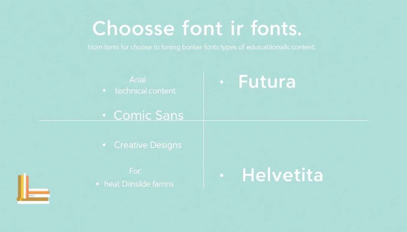
If you’re teaching something more human—case studies, stories, encouragement—I’ll often use a warmer but still readable font like Lato. And if I use something more playful (yes, like Comic Sans), it’s only for a tiny number of moments: a single quote label, a fun callout, not the entire slide body.
Creative/design courses
For design or creative topics, Montserrat or Futura can work nicely for headings. Just don’t let the heading style turn into a readability problem.
- Use expressive fonts for titles, not for paragraphs.
- Keep body text neutral (Open Sans, Roboto, Arial) so learners can focus on the ideas.
Dense slides (where learners need to navigate)
When slides are information-heavy, I treat typography like a map. Bigger headings, bold section labels, and consistent spacing help people jump to what they need quickly.
Example setup I’ve used: Helvetica Bold or Open Sans Extra Bold for section headers, paired with Open Sans or Roboto for body text. This keeps navigation clear without turning every line into a headline.
Bottom line: matching typography to content type helps the message land faster. Headings should guide attention; body text should be easy to read. That’s the whole job.
5. Why These Fonts Are Good Choices for Educational Settings
Fonts like Arial, Helvetica, and Calibri are popular in education because they’re reliable. They tend to look consistent across common school devices and presentation tools—so you’re not constantly fighting layout issues.
On the learning side, the main benefit is simple: legibility reduces the “extra work” your brain has to do. When students don’t have to decode hard-to-read text, they can focus on meaning. That’s not magic; it’s just how reading works when the visual input is clear.
If you want a more evidence-based angle, there’s solid research showing that readability and clear typography can support comprehension. A widely cited example is:
- Rello, M., & Baeza-Yates, R. (2013) — work on readability and dyslexia-friendly typography approaches (overview and related publications can be found via their research pages and summaries). ResearchGate
- W3C/WAI (WCAG) — contrast and text legibility guidance that directly impacts slide accessibility. WCAG Contrast & Accessibility
Also, fonts with clean lines and decent spacing usually perform better when you’re dealing with projectors, compressed video, or learners viewing content on smaller screens. I’ve seen it over and over: what looks “fine” on a desktop can become unreadable when it’s projected, zoomed, or shared as a recording.
From K-12 classrooms to university lectures, the right font choice helps create an environment where everyone can follow along—without your learners having to ask, “Can you make that bigger?”
FAQs
Sans-serif fonts like Arial, Calibri, and Helvetica are usually the safest bet for course slides. They’re clean, familiar, and stay readable across different screens and projectors.
A solid pairing is a serif font for body text (like Georgia) with a sans-serif for headings (like Arial or Helvetica). That contrast makes it easier to scan and follow the structure of each slide.
Pick fonts that are legible at real sizes, limit yourself to two or three font families, and avoid decorative fonts for body text. Also, test on the device you’ll actually present from—laptop and projector can look very different.
Use neutral, readable fonts for instructional text. Then reserve more stylized fonts for headings, short labels, or small callouts—so the typography supports the content instead of competing with it.