How To Use Animations In Online Courses To Improve Learning
Let’s be real: animations in online courses can feel a little childish if you overdo them. I get why you might worry that your content will look “less serious” or that learners will tune out.
In my experience, the difference is whether the animation does a job. When it’s used to clarify something people can’t easily infer from text or a static diagram, learners pay attention—and they don’t just watch, they understand. Done poorly, animations are just moving decoration. Done well, they’re a teaching tool.
Here are the practical ways I’ve found to use animations without turning your course into a cartoon.
Key Takeaways
- Use animations only at moments where learners usually get stuck (the “confusion points”).
- Keep clips short: aim for ~10–25 seconds per concept, then reset to a clean summary.
- Match animation timing to narration—if the visuals finish before the explanation, learners feel lost.
- Pair visuals with minimal text and simple narration (one idea at a time).
- Plan for replay: encourage learners to pause and rewatch specific steps when practicing.
- Add interactivity (click-to-reveal, quick checks, hotspots) so learners control the pace.
- Choose the right animation type: whiteboard for step-by-step, motion graphics for flows/data, character only when it helps.

Use Animations to Enhance Engagement in Online Courses
If you teach online, you already know attention can drop fast. Static slides are fine for reference, but they don’t always show “how it works.” Animations help because they can show change over time—what moves, what transforms, and what causes what.
In my own course build (an intermediate “data visualization for marketers” course), I noticed the biggest drop-off happened right when I explained how to read a chart. The text was accurate, but learners couldn’t “see” the logic. I replaced one long explanation with a short animated sequence: axis labels appeared first, then the data points “mapped” to the legend, and finally the takeaway statement faded in. Engagement improved immediately because learners weren’t guessing.
So here’s the rule I follow: if a learner can reasonably infer the idea from a diagram or a paragraph, don’t animate it. If they can’t, animation earns its place.
If you’re comparing platforms and want to see how well they support embedded video, captions, and interactive elements, use this guide on comparing online course platforms: comparing online course platforms.
And nope—you don’t need a massive production budget. Tools like Canva and Powtoon are totally workable for simple explainer animations, especially if your goal is clarity rather than Hollywood-level effects.
Simplify Content with Animation
Some topics are just easier to grasp visually. Think: processes, sequences, timelines, cause-and-effect, and anything with multiple steps.
Here’s what I do to keep animation from becoming “random motion.” I start with a single learning objective, then I storyboard the animation around that objective—nothing else.
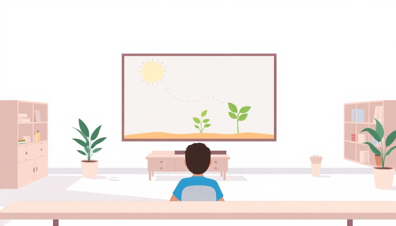
Mini case study: “Photosynthesis” (learning objective → storyboard → assessment)
Learning objective: Learners can explain how light energy becomes chemical energy in plants (in the correct order).
Storyboard outline (one animation, 20–30 seconds):
- Scene 1 (0–5s): Sunlight beams appear and point to the leaf.
- Scene 2 (5–12s): Chlorophyll “captures” the light (highlight the chloroplast region).
- Scene 3 (12–20s): A simple molecule transformation animation shows energy moving into a “sugar-building” pathway.
- Scene 4 (20–30s): A final labeled loop summary appears: light → reactions → chemical energy (sugar pathway).
Narration snippet (example): “First, sunlight hits the leaf. Chlorophyll captures that energy, and then the plant uses it to build chemical energy. By the end, the process results in sugar for growth.”
What to animate (keep it focused): energy flow, sequence order, and the “before/after” transformation. Avoid animating every tiny detail you find in a textbook.
Assessment method: After the video, give a 3-question check:
- Order question: “Which comes first?” (light capture vs chemical energy build)
- Concept question: “What is the output of the process?” (chemical energy / sugar pathway)
- Transfer question: “If sunlight is removed, what happens to the process?”
When I’ve done this kind of objective-first animation, learners don’t just remember the visuals—they can answer questions correctly because the animation matches the thinking required.
Timing rules I actually use
- One clip = one idea. If you need to teach three steps, consider three clips or a single clip with clear pauses and a recap frame.
- Target 10–25 seconds per concept. If it’s longer, you’re probably cramming multiple objectives into one animation.
- Build in a “pause moment.” Right after the key transformation, hold the final frame for 1–2 seconds so learners can register it.
- Don’t animate the text you’re reading. If learners are watching moving labels while reading, comprehension drops. Use static labels or highlight only one element at a time.
If you’re also tightening how your lessons are structured, this guide on lesson writing can help you keep the flow consistent.
Allow Replay Options for Better Learning
Replay is a huge advantage of online learning—and animations make it especially useful. Not everyone gets it on the first watch. That’s normal.
What I’ve noticed works best is giving learners a reason to replay. Instead of hoping they’ll figure it out, I tell them exactly what to look for on the second pass.
For example, after an animation of “solving a grammar rule,” I add a short instruction like: “Rewatch and pause right when the example changes. That’s the moment the rule applies.” It turns replay into purposeful practice.
Also, keep accessibility in mind. If your platform supports captions or transcripts, use them. If it doesn’t, consider providing a text summary right below the video so learners who can’t rely on audio still get the full explanation.
Want more ways to keep attention active (not just passive viewing)? Here are student engagement techniques you can pair with animation-based lessons.
Integrate Animations with Course Material
Animations should feel like part of the lesson, not an interruption. The easiest way to make that happen is to place animations at the points where your learners already hesitate.
Here’s my process:
- Find the struggle point: Where do learners ask questions, miss quiz items, or stall?
- Write the “before” sentence: What do learners think before they watch?
- Write the “after” sentence: What should they understand after?
- Animate only the difference: show what changes between “before” and “after.”
Example: if you teach photosynthesis, don’t just show a plant moving. Animate the energy capture and transformation—light → captured energy → chemical energy outcome. Then immediately connect it to the next concept (like where the plant uses the energy).
And please don’t drop random animated clips between unrelated sections. If an animation doesn’t support your objective, it becomes a distraction.
If you want your whole lesson to read smoothly around these moments, revisit lesson writing and make sure your objectives and activities line up.
Incorporate Storytelling in Animations
Stories beat lists for a reason: they create context. I don’t mean dramatic fiction. I mean a simple scenario that makes the lesson feel real.
Instead of showing “ethical principles” as separate bullet points, animate a short workplace scenario: a manager asks for something questionable, the employee weighs options, and the consequences play out.
Keep it tight:
- One character, one dilemma, one decision.
- Show cause-and-effect. If the decision changes outcomes, the animation should make that visible.
- End with an explicit takeaway. Don’t let learners guess what they were supposed to learn.
For me, the biggest win with storytelling animations is retention. Learners often remember the scenario even if they forget the exact wording of your explanation—and then they can map the scenario back to the principle.
If storytelling is new to you and you want a structure that doesn’t feel messy, see writing lesson plans for beginners.
Use Animations Sparingly for Clarity
Yes, animations can be awesome. No, you still shouldn’t use them everywhere.
I’ve sat through courses where every sentence had a new transition, and honestly? My brain stopped trying to learn and started watching the effects. That’s the danger: motion competes with meaning.
Use animations for:
- Step-by-step processes (what happens first/next)
- Flows and movement (how information or resources travel)
- Comparisons (before vs after)
- Abstract concepts that need a visual model
Skip animations for:
- Simple definitions that are already clear in text
- Lists of items (unless you’re grouping/reordering them in a meaningful way)
- Decorative “bouncy” visuals that don’t teach
Think of animation like seasoning. A little improves the dish. Too much makes everything taste the same—just not in a good way.
Explore Different Types of Animations
Different animation styles help with different learning tasks. I don’t force one style across every lesson.
- Whiteboard animations: great for step-by-step explanations and building understanding from scratch.
- Motion graphics: ideal for flows, timelines, and data-driven visuals.
- Animated infographics: best when you need to show relationships (cause/effect, categories, comparisons).
- Character animations: useful when you’re teaching with a consistent persona, but only if the character supports clarity (not just cuteness).
Here’s a simple testing approach: pick two styles for the same concept (for example, one whiteboard-style and one motion graphic) and compare quiz results. Even a small sample can tell you which style improves accuracy and reduces “I don’t get it” responses.
Combine Audio with Animations for Impact
Audio is where animations really become teaching. A calm voiceover that explains what the viewer is seeing makes everything click faster.
But timing matters. I always preview with audio before publishing, because mismatch is a quick way to lose learners.
Use sound effects only when they highlight meaning—like a “click” when a new step appears or a subtle cue when a key term is introduced. If you add constant noises, it becomes background chaos.
No fancy setup? That’s fine. Tools like Audacity can get you solid narration even if you’re brand new. The goal isn’t studio quality. It’s clarity: consistent volume, minimal noise, and pacing that matches the visual.
Include Interactive Elements to Boost Participation
Watching is passive. Clicking is active. If you can add interaction, do it—especially around animations.
Some ideas that work well in real courses:
- Click-to-reveal labels on parts of an animation (students control when they see the explanation).
- Hotspots that jump to a relevant segment or show a short hint.
- Embedded quick quizzes right after the animation’s key transformation.
- Scenario branching for storytelling animations (choose an action, see the outcome).
Example: in a history course, learners can click labeled regions on an animated map to reveal dates, causes, and outcomes.
If you need tools that support building interactive training content, this link is useful: software to create online training courses.
And if you want more ways to keep learners engaged beyond animations, these student engagement techniques are worth a look.
FAQs
Animations keep learners engaged because they make change visible. When you place animation at the exact “confusion moment” and pair it with clear narration, learners spend less time guessing and more time understanding. They’re also easier to revisit, which supports practice and retention.
In most online courses, simple formats win: whiteboard-style steps for processes, motion graphics for flows and timelines, and animated infographics for relationships and data. Character animations can work too, but only when they support the learning goal instead of distracting from it.
Interactivity gives learners control over pace and focus. When they click to reveal details or answer a quick question after a segment, they’re actively processing instead of passively watching. That usually improves accuracy and makes the learning experience feel more personal.
Use animations strategically, not constantly. A good starting point is one animation per key concept or “stuck point,” then reassess based on learner questions and quiz performance. If learners are overwhelmed, it’s usually because too many segments are competing for attention.