How to Use Heat Maps to Visualize Learner Progress in 7 Steps
I’ve been in that spot where progress tracking feels like a pile of spreadsheets, screenshots, and “quick check” data that never quite turns into a clear next step. Heat maps help because they compress all of that into something you can actually scan in seconds. If you want to see where learners are improving (and where they’re stuck) without digging through every score report, heat maps are one of the simplest ways to do it.
In this post, I’ll walk you through a practical, teacher-friendly way to build and use heat maps in about a week—plus a worked example you can copy. No fluff. Just what to collect, how to map it to colors, and what to do when you see red.
At the end, you’ll have a clear process for turning messy learner data into a visual “map” you can use for planning—reteaching, grouping, and goal-setting—without waiting for the next big assessment. Let’s get into it.
Key Takeaways
Key Takeaways
- Heat maps use a color scale (commonly red → yellow → green) to show performance levels by skill, unit, or item set—so patterns jump out fast.
- You can build heat maps from real assessment data (quiz results, rubric scores, activity completion, or mastery checks) once you organize it into a simple table.
- The real value is action: use consistent thresholds to decide when to reteach, when to offer enrichment, and when to keep the plan.
- Spreadsheets (Excel/Google Sheets) can create heat maps quickly, and student-facing views can boost ownership when you tie them to specific goals.
- Interpretation matters: don’t treat a single “red cell” as a disaster—look for clusters, trends, and whether the same skill stays red over time.
- More advanced uses include near-real-time updates during lessons, but predictions should be validated with actual outcomes before you rely on them.

1. Understand Heat Maps for Educators
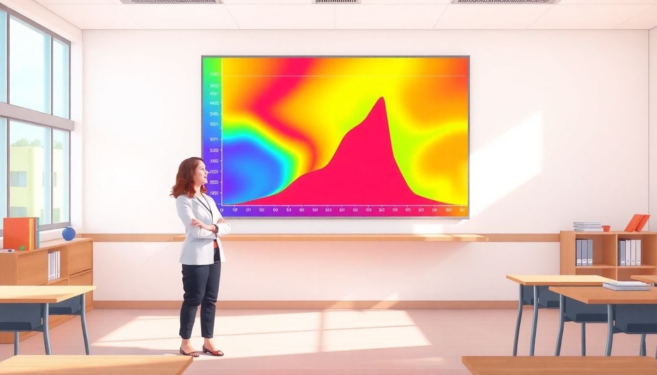
Heat maps are visual dashboards for learning data. Instead of reading a list of scores, you look at a grid: skills on one axis, learners (or time periods) on the other. Then colors do the heavy lifting.
In my experience, the best heat maps feel like a “status update.” Green means a learner is meeting the target (or has high mastery). Yellow means they’re close but not consistent. Red means they’re not there yet—and it’s time to change something.
Here’s what I mean by that “change something” part: if a whole class is red in Skill: Solving Two-Step Equations, I don’t just tell students to “practice more.” I reteach with a different representation (tables/graphs), then run a quick re-check the next day.
Before you build anything, get clear on two basics:
- What data you’re mapping (quiz item performance, rubric levels, mastery checks, completion rates).
- What the colors represent (percent correct, mastery level, growth band, or a normalized score).
If you want to make this stick, treat heat maps like a recurring routine—not a one-time project. A simple weekly update beats a perfect monthly one.
2. Learn How Heat Maps Visualize Learner Progress
Heat maps visualize progress by taking one measurement per learner per skill (or per unit) and converting it into a color.
Let me show you a worked example I’ve used for skill-based tracking.
Worked example: Skill mastery heat map (Math)
Let’s say you teach Unit 3 and you assess three skills on a quiz:
- Skill A: Solve linear equations
- Skill B: Interpret word problems
- Skill C: Check solutions
Step 1: Create a data table (this can be a spreadsheet). Use one row per learner per skill:
- StudentID
- StudentName (optional)
- Unit (e.g., Unit 3)
- Skill (Skill A/B/C)
- AssessmentDate (e.g., 2026-02-10)
- PointsEarned (e.g., 8)
- PointsPossible (e.g., 10)
Step 2: Calculate a score you can map to colors.
In a new column called Percent, use:
Percent = PointsEarned / PointsPossible
Example: 8/10 = 0.80 → 80%.
Step 3: Pick a color scale you’ll actually use (don’t overcomplicate it). For example:
- Green: Percent ≥ 0.80
- Yellow: 0.60 ≤ Percent < 0.80
- Red: Percent < 0.60
Step 4: Build the grid
- Rows: Students (or groups)
- Columns: Skills (Skill A/B/C)
- Cell value: Percent (or a calculated band like 1/2/3)
Step 5: Apply conditional formatting
If you’re using Google Sheets or Excel, conditional formatting is the easiest route. Set rules so:
- Percent ≥ 0.80 → fill green
- 0.60 ≤ Percent < 0.80 → fill yellow
- Percent < 0.60 → fill red
Step 6: Add a “trend” view (this is where heat maps become powerful)
Instead of only showing Unit 3, add columns for multiple dates (Unit 3 Quiz 1, Quiz 2, Re-check). Then you’ll see whether red is fading or staying stuck.
Now, about growth and percentiles: you can absolutely use growth measures (like growth percentiles) the same way—just be consistent. If you map growth percentiles to colors, decide what “good growth” means for your context (for example, growth percentile ≥ 50 as green). The key is that your color logic matches your instructional goals.
3. Discover the Benefits of Heat Maps in Education
The biggest benefit of heat maps is speed. You stop hunting for patterns and start seeing them.
Instead of waiting for a traditional assessment cycle, you can spot:
- Skill clusters (many students red in the same skill)
- Group patterns (certain groups consistently yellow/red)
- Stagnation (red doesn’t improve across re-checks)
- Successful strategies (green expands after a teaching change)
Here’s a real decision rule I recommend (because it turns colors into action):
- If > 40% of students are red in a skill after Unit 2, schedule a 20–30 minute reteach session the next day and include a short re-check.
- If 10–20% are red, use targeted small-group practice during class time rather than reteaching to everyone.
- If a student is red but the rest of the class is green, treat it as an individual support plan (missing prerequisite, attendance gap, or language support need).
That’s the point: heat maps aren’t just “pretty.” They’re a planning tool. And when students can see their own progress in a similar grid, it helps them set goals that are specific (e.g., “I’m yellow on Skill B, so I’ll do Skill B practice tonight and re-check on Friday”).
One limitation I’ll be upfront about: heat maps can oversimplify. If your underlying data is noisy (inconsistent scoring, too few items per skill), the colors can look dramatic even when the skill evidence is thin. That’s why you should set a minimum assessment sample—more on that later.
4. Practical Ways to Use Heat Maps in Your Classroom
If you want to start fast, don’t overhaul your whole system. Just plug heat maps into what you already do.
Here are practical ways I’d actually use them in a classroom:
- After each unit quiz: build a heat map by skill using quiz item tags (or rubric categories) and look for the biggest red cluster.
- Before re-teaching: compare Quiz 1 vs. Quiz 2 heat maps to confirm whether reteach worked (red shrinks) or didn’t (red stays put).
- Small-group planning: if only 6–10 students are red in Skill C, pull them for a targeted mini-lesson and practice set while the rest do enrichment.
- Student goal-setting: show students their own “skill grid” and ask them to pick one red skill to target for the next checkpoint.
- Weekly intervention check: update the map every Friday so intervention groups don’t run on vibes.
Consistency is the part people skip. If you update heat maps only when you remember, the colors won’t tell a reliable story. I recommend a simple cadence: weekly for core classes and after major assessments for electives.
One more thing: involve students, but keep it honest and actionable. A heat map should lead to a next step (“Here’s what to practice and when we’ll re-check”), not just a label (“You’re red”).
5. Gather the Right Tools to Make Heat Maps Work for You
You don’t need expensive software to get started. The tool is less important than the structure of your data and the clarity of your color rules.
Here are the options I see most often:
- Excel / Google Sheets: best for custom heat maps. You can build the grid, calculate percent mastery, and use conditional formatting for the color scale.
- Google Forms + Sheets: collect quiz responses, tag items to skills, and update the heat map automatically.
- Learning platforms: some dashboards already provide visual performance breakdowns by skill. Use them if the skill mapping is consistent.
- Data visualization tools (Tableau, Power BI): useful when you have larger datasets and want interactive filtering (by class, subgroup, or time).
Whichever tool you choose, keep two requirements front and center:
- Easy updating (you should be able to refresh the map in minutes, not hours)
- Clear interpretation (students and teachers should understand what red/yellow/green means)
And please don’t dump random columns into the heat map. If the data isn’t aligned to the skills you teach, the colors won’t help—they’ll confuse.
6. Top Tips for Interpreting Heat Map Data Effectively
Interpreting heat maps is where most people either get great results or accidentally misread the data.
1) Treat clusters, not single cells
A single red cell might mean the student had an off day. A cluster of red across many students in the same skill? That’s a teaching signal.
2) Look for persistence
If Skill A is red for the same students across two checkpoints, that’s not a one-off. That’s a plan change.
3) Confirm with a second data source
Cross-check your heat map with at least one other metric:
- Participation rate (are they engaging with practice?)
- Homework completion
- Rubric patterns (are errors the same type?)
4) Use growth measures carefully
If you’re using growth percentiles (for example, from MAP Growth-style reports), remember what they represent: growth relative to peers. A student can show “good growth” but still be below your mastery threshold. So don’t treat growth percentile as mastery.
In practice, I’d use a two-part rule:
- Mastery status (percent correct / rubric level) → decide reteach vs. small group
- Growth status (growth percentile/band) → decide whether your intervention is working
5) Set a minimum evidence threshold
Here’s a problem I’ve seen: skills with only 1–2 questions can swing wildly. If a skill is based on fewer than, say, 3 items on a quiz, treat the heat map as “directional,” not final.
So when you see red, ask: is there enough evidence to trust it?
7. What’s Next for Heat Maps in Education?
Heat maps are moving toward faster updates. Instead of waiting days for quiz results, some systems can update visuals during or immediately after practice—especially when learning happens in an LMS or on interactive platforms.
One practical use I expect to grow: lesson-level monitoring. For example, if students answer 10 formative questions during class, the heat map can show which items/skills are failing right away. Then you can adjust the next explanation or practice set while students are still in the lesson.
AI predictions are also starting to show up, but here’s my honest take: treat predictions like an alert, not a verdict. If a model flags “likely struggle,” validate it with real outcomes (did the student actually miss the next checkpoint?). If you don’t validate, you’ll waste time chasing false alarms.
If you want a solid next step for planning around this, you can explore courses on how to create effective lesson plans that incorporate data analysis skills.
Either way, the goal stays the same: use the map to make better decisions sooner.
FAQs
Heat maps are visual tools that display learning data with color gradients. They help educators spot patterns in learner performance and engagement quickly, so it’s easier to identify strengths and areas that need attention.
They use color intensity to represent different performance levels (for example, percent correct, mastery levels, or engagement frequency). That makes it easier to see how students are doing at a glance and how results change over time.
Heat maps help teachers and students make sense of progress patterns, identify learning behaviors that need support, and make more data-driven decisions about instruction and interventions.
You can create heat maps with tools like Google Sheets, Tableau, and learning platforms that already generate skill dashboards. The best tool is the one that lets you update the data consistently and interpret the colors clearly.