
Visual Design Principles For Online Course Materials: 11 Steps
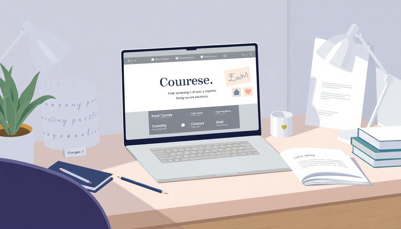
Making online course materials look good isn’t “just pick a nice background color” territory. I’ve built and redesigned course pages where the content was solid, but the visuals still made learners work too hard. And you can feel that immediately—people skim, miss key points, or bounce.
So what I try to do (and what I’m sharing here) is keep the design choices practical: readable typography, sensible color, clear layout, and accessibility that won’t quietly exclude half your audience. If you’re not a designer, don’t worry. You don’t need a design degree—you need a repeatable process.
By the end of this, you’ll have a simple visual checklist you can apply to every module, plus a few accessibility and UX checks you can run before you publish.
Key Takeaways
- Use a limited palette (usually 1 primary + 1 secondary + neutrals) and confirm contrast so text stays readable on real screens.
- Choose one primary font and one supporting font max. Stick to web-safe, clean options like Roboto, Montserrat, Open Sans, or Lato.
- Build every page on a grid (even a simple 12-column layout) so text, images, and videos line up consistently.
- Create balance with spacing: use white space intentionally so sections don’t feel cramped or overwhelming.
- Keep branding consistent across modules (colors, typography, logo placement) so students recognize your course instantly.
- Follow accessibility basics: captions, descriptive alt text, keyboard-friendly navigation, and WCAG contrast checks.
- Use mood boards to define the “tone” before you design—then translate that tone into specific colors, fonts, and spacing.
- Apply UI/UX fundamentals: clear navigation, obvious next steps, and feedback like progress indicators.
- Use design tools effectively: start with templates (Canva/Adobe Express) or use Figma grids if you’re more advanced.
- Collect feedback the right way: short surveys, quick module quizzes, and peer reviews before you lock the visuals.
- Build a portfolio with before/after examples and measurable outcomes (completion, satisfaction, or reduced confusion).
1. Understand Color Theory for Your Course Materials
If you’re making online courses, you’ve gotta nail the basics of color theory—because nothing makes learners doubt your material like harsh, clashing colors or low-contrast text.
In practice, color isn’t just “pretty.” It’s direction. It tells people where to look. Blue often reads as calm and trustworthy. Red grabs attention (but it’s also easy to overuse). Yellow can feel friendly, yet it can also get washed out on bright screens.
When I’m choosing colors, I start with a simple rule: one primary color for emphasis, one secondary color for support, and neutrals (white/gray/near-black) for the rest.
Quick example: if you look at the California Institute of the Arts’ Graphic Design course, you can see how color is used to support the learning experience rather than distract from it. The palette is consistent, and key elements stand out without screaming.
They’ve got over 21,000 reviews, which suggests the overall experience resonates with learners—color and design are part of that “feels solid” package, even when students don’t name it.
Here’s a concrete workflow I recommend:
- Pick a primary color (for buttons, links, or section highlights).
- Choose a harmony using the color wheel: complementary (high contrast) or analogous (more cohesive/soft).
- Limit saturation for backgrounds—use a more muted tint so text stays readable.
- Confirm contrast with a tool before you commit.
You can use Adobe Color Wheel or Canva’s palette tools to generate options fast. Then I always run contrast checks—because “looks good” isn’t the same thing as “meets accessibility.”
2. Choose Readable Typography
Typography is where most course creators accidentally sabotage themselves. You know the one: the font looks artsy… but you can’t read it without squinting.
Classy isn’t always readable. Your job is to make reading effortless, especially on phones.
In my experience, the safest approach is to use clean, widely available fonts like Montserrat, Open Sans, Roboto, or Lato—and then stick to one primary font + one supporting font. That’s it.
Use this quick sanity check before you publish: send a screenshot to a friend (or colleague) and ask them to read the body text. If they need to zoom in or “guess” where lines break, your typography settings are too tight.
Here are the practical settings I pay attention to:
- Font size: body text should be comfortably readable (in most course layouts, this ends up around 16px+).
- Line height: too small makes paragraphs feel dense. Give it breathing room.
- Spacing between sections: headings need separation so the page doesn’t feel like one giant block.
- Contrast: dark text on light backgrounds is usually the easiest win.
Typography directly impacts engagement, which is why keeping students engaged is already hard—so don’t make it harder with unreadable fonts.
And please, don’t use five different typefaces because “each module has its own vibe.” Consistency beats variety for learning materials every time.
3. Use Grid Systems to Organize Content
Grids sound technical, but the idea is simple: they stop your content from looking random.
A grid system helps you align text blocks, images, and videos so the page feels intentional. Chaos is distracting. Clarity is comforting.
For instance, UC Berkeley Extension’s “Visual Design Principles” course is a good example of structured materials. Even without deep digging, you can see the consistent layout patterns—headings, content blocks, and supporting visuals sit in predictable places. That predictability helps learners stay oriented.
And you don’t need expensive software to do this. Tools like Figma, Adobe XD, or Sketch already have grid options you can turn on and customize.
If you want a beginner-friendly starting point, do this:
- Pick a 12-column grid (common in web design).
- Use the same left/right margins across the whole course.
- Keep text width consistent (avoid ultra-wide paragraphs).
- Align images and callouts to the same vertical rhythm.
Even something as basic as “two columns for content + visuals” can make learners say, “Oh, I get where everything goes.” That’s the goal.
4. Achieve Balance and Composition in Design
Have you ever tried to balance too many things at once? That’s what sloppy course layouts feel like.
Balance in design means harmony between the elements: text blocks, images, buttons, and whitespace. One shouldn’t overpower the others.
If you want a quick reference for what “clean and balanced” looks like, check out Interaction Design Foundation. Their pages tend to keep content organized and readable, so learners don’t feel like they’re fighting the layout.
Here’s an easy trick that works surprisingly well: divide your page into imaginary thirds. Put your main idea in one area and supporting content in the others. It’s a fast way to avoid random placement.
Symmetry can also help, but don’t treat it like a rule. The bigger win is consistent alignment. And whitespace? Don’t be afraid of it. Empty space gives your learners a moment to “reset” visually.
5. Create Branding with Logos and Consistent Visual Identity
Branding isn’t just for big companies. Your course needs visual identity too—otherwise students can’t quickly recognize “this is my course” as they move from lesson to lesson.
You don’t need an elaborate illustration style. A simple, clean logo and consistent design language go a long way.
What I look for in a well-branded course:
- The same colors show up in the same roles (buttons, highlights, section headers).
- The same typography is used for headings and body text across modules.
- Logos and badges appear in consistent locations (not randomly shuffled).
- Templates are reused for common lesson types (slides, worksheets, quizzes).
As a reference point, Google’s UX Design Certificate (with over 4.8 million enrollments) uses consistent branding patterns across course touchpoints. Even when the content changes, the visual system stays familiar—which builds trust over time.
If you’re stuck, start with a tool like Canva or Adobe Illustrator to create a basic logo and then build templates around it. Consistency beats complexity every time.
6. Follow Web Accessibility Standards
Accessibility is one of those things people think about last… until someone points out that they can’t use your course properly.
At minimum, your course should support basic web accessibility: clear navigation, descriptive alt text, captions for videos, and color contrast that works for real users.
Here’s a quick checklist I run:
- Contrast: test text against background colors using Adobe’s Color Contrast tool.
- Don’t rely on color alone: if something is “required” because it’s red, that won’t work for everyone.
- Captions: essential for deaf or hard-of-hearing learners, and also helpful for ESL students or anyone watching without sound.
- Alt text: describe what the image is actually showing (not just “image” or “photo”).
Also, if you want a standard to anchor to, look at the Web Content Accessibility Guidelines (WCAG). You don’t need to memorize every rule—just use it as your baseline.
7. Set Visual Tone with Mood Boards and Posters
Before I design anything, I like to answer one question: “What should this course feel like?” Professional? Friendly? High-energy? Calm?
Mood boards help you lock that tone early. They’re basically a visual decision document—images, color samples, typography examples, and even a few keywords about the vibe.
And yes, recognizable visual themes matter. When a course looks consistent and intentional, learners trust it more quickly. You can see this pattern in design-forward offerings like the CalArts Graphic Design course—students can pick up on the visual messaging fast.
To build a mood board, tools like Pinterest, Milanote, or Canva are great. The key is not the tool—it’s what you produce: a clear direction you can translate into real page styles.
Once you have your mood board, write down the “translation” rules (for example: “headings use deep blue,” “buttons are high-contrast,” “backgrounds are off-white,” “spacing is generous”). That’s how you stop guessing later.
8. Apply UI and UX Principles for Better User Experience
UI/UX matters because online learning is a workflow. Learners need to move through content without friction.
UI is the interface: buttons, navigation, layout, and visual hierarchy. UX is what it feels like: do learners always know what’s next, and do they feel confident they’re progressing?
In my experience, the fastest wins come from these:
- Navigation paths: keep “back/next” behavior consistent and obvious.
- Progress feedback: progress bars, checkmarks, and clear completion states reduce anxiety.
- Clear calls to action: don’t make learners hunt for “start lesson” or “submit assignment.”
- Less clutter: if everything looks important, nothing is.
If you want examples, browse educational platforms and pay attention to where they place progress indicators, how they structure lesson pages, and how typography guides scanning. You’ll start seeing patterns immediately.
9. Use Design Tools and Software Effectively
Good visuals aren’t only about “having the best software.” It’s about using the right tools for the job without getting lost in settings.
Tools like Canva, Adobe Creative Cloud, Sketch, and Figma all work—your goal is to build a repeatable system.
If you’re a complete beginner, Canva is a solid starting point because it offers templates for course-style assets: slide decks, infographics, quiz graphics, and more.
If you already have design skills (or you’re collaborating with someone), Figma shines for reusable components and team workflows.
One more thing: don’t underestimate tutorials. YouTube is full of short, practical videos that show exactly how to set up grids, typography scales, and templates—without you wandering in circles.
My advice is simple: pick one or two tools, learn the core features, and stick with them. Switching tools constantly is a sneaky way to waste hours.
10. Gather Research and Feedback for Improvement
Your first design won’t win awards. That’s fine. The point is iteration.
What I’ve found helps most is collecting feedback in a way that connects visuals to learning outcomes. Don’t just ask, “Did you like it?” Ask questions that reveal friction.
Try:
- Short surveys after each module (2–4 questions max).
- Quick quizzes to see if learners missed key info (sometimes it’s not the content—it’s the visibility).
- Peer reviews where someone else scans the materials like a student.
- One-on-one chats for deeper insights (especially for confusing layout moments).
Some programs, like UC Berkeley Extension, emphasize mentor-led feedback because it speeds up improvement and boosts satisfaction. You don’t need the same infrastructure—just prioritize consistent review cycles.
If you can, also run small A/B tests. For example: test two heading styles or two button color treatments and measure engagement metrics (time on page, click-through to next lesson, completion rate). That’s how you move from “I think it looks better” to “it performs better.”
11. Build a Portfolio to Showcase Your Work
A portfolio isn’t only for graphic designers. If you create course visuals, you should show that work. It builds credibility fast.
What makes a portfolio strong is proof of thinking, not just final screenshots. Include:
- Before/after examples (what changed and why).
- Accessibility improvements (contrast fixes, captions added, clearer alt text).
- Design system pieces (typography scale, color palette, grid layout rules).
- Outcome notes (student feedback themes, completion improvements, fewer “where is the next step?” messages).
You can publish on platforms like Behance, Dribbble, or even use Wix or Squarespace if you don’t want to code.
If you want portfolio-ready assets quickly, you can also use this guide on how to create educational videos to produce short demo clips that show your visuals in action.
Done well, your portfolio can lead to collaborations, speaking gigs, or even new income streams from course work. It’s worth treating like a living document, not a one-time upload.
FAQs
Color theory is the study of how colors interact and how they can work together visually. In course design, it matters because it shapes readability, supports the intended mood, helps learners focus on key elements, and makes your materials feel more polished and intentional.
Typography affects how easy it is to read, how quickly learners can scan for answers, and how comfortable the content feels on long sessions. Clear font choices, good spacing, and comfortable line height reduce eyestrain and make it easier to understand what you’re teaching.
Accessibility standards help ensure your course is usable by everyone, including learners with disabilities. That includes readable contrast, clear structure, captioned media, proper alt text, and compatibility with assistive technologies—so learning isn’t blocked by design choices.
Include a range of course-related examples: color and typography decisions, layout/grid organization, branding elements like logos, accessible design practices, and how you improved based on feedback or testing. If you can, show your process (research → design → revisions) alongside the final visuals.