Build Your Email List with 7 Simple Steps Using Interactive Lead Magnets
Building an email list can feel like trying to catch butterflies—especially when you’re not sure what actually makes people stop, click, and hand over their email. In my experience, the problem usually isn’t traffic. It’s the “why should I care?” moment.
Interactive lead magnets fix that. They give visitors something to do (not just something to download), and that tiny bit of participation builds trust fast. If someone takes a 3-minute quiz and gets a personalized result, they’re way more likely to want the next step—your emails.
In this post, I’m going to walk you through 7 simple steps to build your own interactive lead magnet—quizzes, calculators, and surveys included. I’ll also share concrete examples (what to ask, what to calculate, what to put on the landing page), plus how I’d measure whether it’s working.
Key Takeaways
Key Takeaways
- Interactive lead magnets (quizzes, calculators, surveys) pull people in with participation, which usually outperforms static freebies because visitors get immediate value.
- Keep the experience simple: short questions, clear progress, and a form that doesn’t feel like a punishment.
- Match the magnet type to the user’s goal: use assessments for advice, quizzes for discovery, calculators for “show me my result.”
- Write CTAs like a human. Example: “Get your results + a 7-day plan” beats “Submit to continue.”
- Design for conversion by testing: different question sets, different lead capture placement, and different result reveals.
- Track the right metrics (not just “emails collected”): start rate, completion rate, and opt-in rate after the result screen.
- Launch something small, iterate weekly, and tighten the copy + flow until it feels effortless for the visitor.

1. Build Your Email List with Interactive Lead Magnets
Interactive lead magnets are one of those rare marketing ideas that feels helpful instead of pushy. Here’s how I think about it: you’re not “collecting emails.” You’re giving people an experience that ends with a result they actually want.
Start with a simple flow:
- Pick the interactive format: quiz, calculator, or survey.
- Offer real value: a personalized outcome, a recommendation, or a clear next step.
- Make the UI easy: fewer fields, obvious buttons, and no confusing steps.
- Place the lead capture at the right moment: usually after the result preview, not before.
- Integrate it into your funnel: landing page, blog post link, sidebar, or exit-intent pop-up.
What I’ve noticed is that interactive magnets “earn” the signup. People feel like they used something—not like they got tricked into a form.
2. Understand Interactive Lead Magnets
Interactive lead magnets are resources that require the visitor to do something. That could be selecting answers, entering inputs, or choosing options in a short decision path.
Unlike a downloadable PDF, the visitor gets feedback immediately. That feedback is what builds trust. For instance:
- Quizzes help people self-identify (“Which study routine fits you?”).
- Calculators turn your inputs into a number or recommendation (“What’s your ideal content cadence?”).
- Surveys help you gather preferences while making users feel seen.
You’ll often see marketers claim interactive content boosts conversions compared to static content. I don’t rely on random percentages without context, though. Instead, I look at the mechanics that usually drive lift: higher engagement, better relevance, and a result screen that gives people a reason to opt in.
So the real question becomes: does your tool make the visitor feel smarter or more certain in under 5 minutes? If yes, you’re on the right track.
3. Discover Types of Interactive Lead Magnets to Use
If you’re stuck choosing the right type, start with your audience’s intent. Are they trying to solve a problem, figure out what to do next, or just explore? Here’s how I’d match them up.
Quizzes (best for discovery + segmentation)
Quizzes are great when you want to sort people into buckets and tailor what you send next. A strong quiz usually has:
- 5–8 questions (enough to be useful, not enough to feel like homework)
- 3 result outcomes you can name clearly
- 1 clear promise on the result page (“Get the exact plan for your level”)
Example quiz outline (for “email list growth”):
- Q1: What are you selling right now? (course / service / product / blog)
- Q2: Where do most visitors come from? (SEO / social / ads / referrals)
- Q3: How often do you publish? (weekly / monthly / random)
- Q4: What’s your biggest list-building bottleneck? (traffic / conversion / offer / consistency)
- Q5: How quickly do you want results? (7–14 days / 30 days / this quarter)
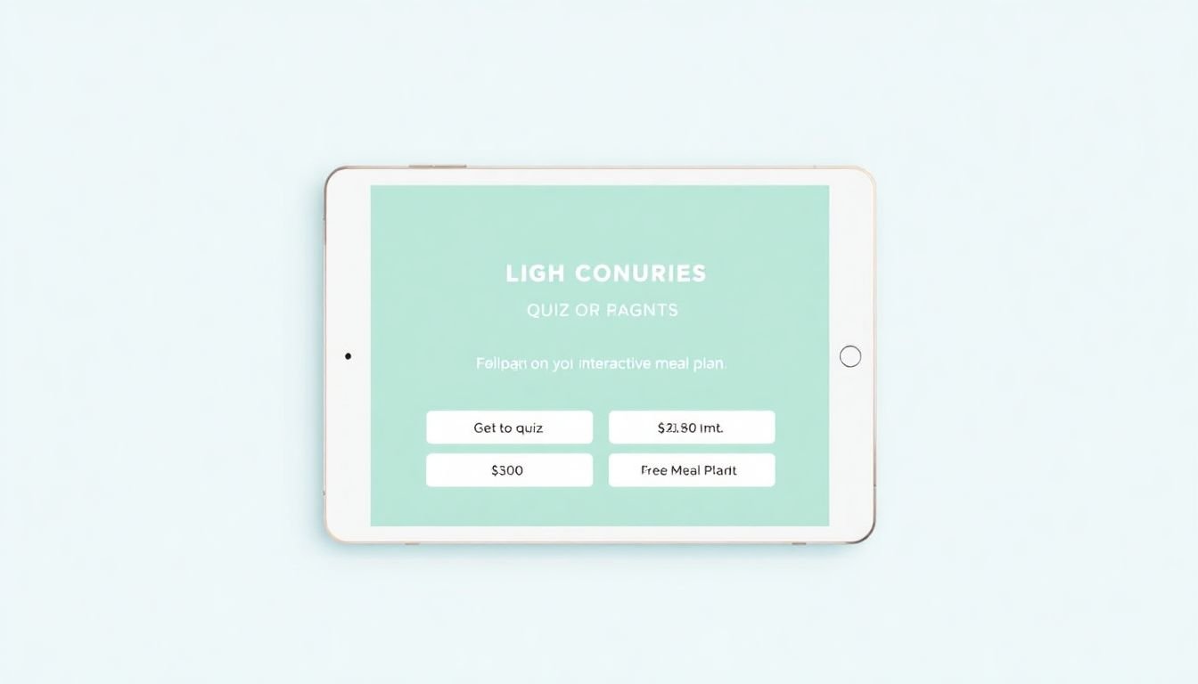
Calculators (best for personalized numbers)
Calculators work when your audience wants a “show me” answer. People love inputs because it feels like the tool is paying attention to them.
Example calculator (for “how many leads can I get?”):
- Input: monthly website visitors
- Input: current opt-in rate (%)
- Input: expected lift from your lead magnet (choose 0–20% / 20–40% / 40%+)
- Output: estimated new subscribers/month = visitors × (opt-in rate + lift)
Even if your numbers are “estimates,” the result is still valuable—because it frames the next action (“Improve your landing page CTA first” or “Add a quiz result screen”).
Surveys and polls (best for feedback + relationship)
Surveys are underrated. They don’t always convert the highest on day one, but they can build a better audience and improve your email content because you actually know what people care about.
Example survey questions:
- Which topic should I cover next? (choose 1)
- What have you tried so far? (lead magnet / ads / guest posts / nothing yet)
- What’s your skill level? (beginner / intermediate / advanced)
- What’s your biggest time constraint? (no time / no ideas / no tech setup)
Interactive assessments (best for authority)
If your niche is advice-heavy, assessments can position you as the guide. The key is to keep it focused—one problem, one outcome, one next step.
Pick the format that matches the promise you want to make. Then make sure the tool feels like it was built for your audience, not for “everyone.”
4. How to Design a High-Converting Interactive Lead Magnet
This is the part that makes or breaks your results. Picking a quiz isn’t enough. You need a conversion-ready experience.
Step-by-step design checklist (the stuff I actually look for):
- Define the promise: “Get your personalized plan” / “See your score and next steps.”
- Keep it short: aim for 3–5 minutes total completion time.
- Use simple input types: multiple choice beats long text fields.
- Write questions that map to outcomes: if the answer doesn’t change the result, remove it.
- Design a result screen: one paragraph summary + 1–3 bullet next steps.
- Reveal the “taste” before the form: show a preview result, then ask for email to get the full version.
- Place the CTA clearly: button text should match the value (“Send me my results”).
CTA copy examples you can steal:
- “Send me my results + the full 7-day action plan.”
- “Get your personalized report (takes 10 seconds).”
- “Email me the calculator results and recommended next step.”
Quick decision tree:
- If your audience needs guidance → quiz or assessment
- If your audience needs numbers → calculator
- If your audience needs preferences → survey
- If your audience needs proof → assessment with a score + recommendation
One more thing: test your flow like a visitor. Click through on mobile. If it takes more than a few seconds to understand what’s happening, you’ll lose people—and you’ll never see it in your analytics until it’s too late.
5. Analyzing Successful Interactive Lead Magnets: What Works
Instead of chasing viral examples, I like to reverse-engineer campaigns that clearly understand their audience. When you look at what works, you’ll usually see the same patterns:
- They segment well: results are specific enough to make the email feel relevant.
- The result screen is compelling: it tells you what to do next, not just what you “are.”
- They reduce friction: the form appears after the visitor gets value.
- They follow up fast: the first email delivers the promised asset immediately.
As for performance claims you might see online (like “quizzes convert at X%”), I’d treat them as direction, not gospel—because “conversion” can mean different things: landing page opt-in rate, quiz completion rate, or email signup rate after the result reveal.
Here’s a more practical way to analyze success without guessing at random benchmarks:
- Start rate: How many people click “Start”?
- Completion rate: How many finish the quiz/calculator?
- Opt-in rate: How many enter their email after seeing the result?
- Time on tool: Are people spending too long (confusion) or too little (not enough value)?
What to tweak first (my usual order):
- If completion is low → simplify questions, remove steps, shorten time.
- If opt-in is low → improve result preview + CTA wording + form placement.
- If both are decent → test follow-up email copy and subject lines.
And yes, you can learn from big names. For example, brands like HubSpot use interactive experiences to increase engagement. The real takeaway isn’t “copy their tool.” It’s noticing how they make the experience feel relevant and how the next step is obvious.
6. Wise Tips for Maximizing Lead Magnet Effectiveness
Think of optimizing your interactive lead magnet like editing a sales page. Small changes can move big numbers—especially when your tool is already close to working.
- Match branding to the promise: use consistent colors, fonts, and tone so it feels like part of your site.
- Add social sharing (only if it fits): a “Share your result” button can help, but don’t force it. Make it optional.
- Use urgency carefully: “Get your plan this week” can work, but I prefer “limited bonus” (like a checklist) tied to signup date.
- Instrument the analytics: track start, completion, and opt-in. If you only track “emails,” you’ll miss the real problem.
- Test the result reveal: try “preview result + email for full report” vs “email first, then show full result.”
- Don’t forget the follow-up: send a thank-you email immediately with the promised asset and one next action link.
Follow-up email structure (simple and effective):
- Subject: “Here are your results” (or “Your report is ready”)
- First line: confirm what they got
- Deliver the promised asset (or link)
- One “next step” CTA (like a blog post or webinar)
- Optional: ask one question to spark replies
7. Taking Action: Start Building Your List Today
If you keep waiting for “the perfect interactive lead magnet,” you’ll be stuck forever. I’d rather you launch a solid MVP and improve it after real data.
Here’s what I’d do this week:
- Pick one offer: one audience problem, one outcome.
- Create the tool: 5–8 questions for a quiz, a calculator with 3–5 inputs, or a short survey.
- Write the landing page: headline + 3 bullets on the result + one CTA button.
- CTA button ideas: “Get my results” / “Send me the report” / “Start the quiz”
- Run a small test: share to social, pin it in your newsletter, and add it to one high-traffic blog post.
- Measure what matters: start rate, completion rate, opt-in rate after results.
- Iterate: change one thing at a time—usually CTA wording or result preview first.
If you want more niche-specific ideas, you can use these resources: online course ideas and how to make a quiz for students. Even if your lead magnet isn’t a “course,” the question-building mindset transfers really well.
Start simple. Launch. Watch what people do. Then tighten the experience until it feels like the obvious next step for your visitors.
FAQs
Interactive lead magnets are tools or activities—like quizzes, calculators, or assessments—that encourage visitors to participate. They usually ask for an email so the user can receive personalized results or a tailored resource that helps them move forward.
Start with your audience’s real problem. Choose the format that matches the outcome you can deliver (quiz for segmentation, calculator for personalized numbers, survey for preferences). Then keep the experience short, make the result page helpful, and use a clear CTA that tells people exactly what they’ll get after opting in.
Common options include quizzes, assessments, calculators, polls, and interactive surveys. The best ones produce a personalized result (or a clear recommendation) so the visitor feels the signup is worth it.