
How to Create Mobile-Friendly Quizzes: 10 Essential Steps
Honestly, creating a quiz that looks good on mobile isn’t hard… but it’s easy to mess up. You’re trying to fit real questions, real answer choices, and sometimes images into a tiny screen. And if even one thing is slightly off—too much text, buttons that are too small, or a layout that jumps around—people bounce.
What I’ve noticed after building a bunch of mobile quizzes is this: the best ones feel “obvious” to take. No zooming. No hunting for the next question. No accidental taps. If you design for that from the start, you’ll get a quiz people actually finish.
Below are the steps I use to make mobile-friendly quizzes in a way that works in the real world—on iPhones, on Androids, in portrait and landscape, and even when someone’s on a slow connection.
Key Takeaways
- Pick a quiz platform built for mobile (Google Forms, Typeform, Quizlet) so you’re not fighting layouts.
- Keep text short and scannable—aim for fewer words per screen, not “novels” in each question.
- Use mobile-friendly formats (multiple choice, true/false, rating scales), and limit choices to reduce thumb errors.
- On many platforms, “responsive design” is automatic—but you still need to check how images, fonts, and spacing behave.
- Test like a normal person: different phones, portrait/landscape, slow network, and accessibility settings (larger text).
- Make navigation predictable: clear “Next”/“Submit,” a simple progress indicator, and no confusing jumps.
- Use visuals thoughtfully—optimized image sizes and captions that don’t push answers off-screen.
- Collect feedback after completion (time to finish, where they got stuck, and what felt unclear) and iterate.
10 Steps to Create Mobile-Friendly Quizzes
1) Choose the Right Quiz Platform
If you want this to feel painless, start with a platform that already handles mobile layout. I’ve seen too many “custom” quiz attempts where the content is fine on desktop but breaks into awkward wrapping on phones.
When you’re comparing options, look for:
- Mobile-ready templates (not just “it works on mobile”)
- Fast loading when you add images
- Simple question types like multiple choice and short text
- Clear navigation so users always know what to do next
For example, you can use Google Forms or Typeform. Both are popular for a reason: their mobile experience is already pretty solid, so you spend your time on the questions—not CSS battles.
2) Design with Mobile Users in Mind
Mobile isn’t just “desktop but smaller.” People answer in shorter bursts, usually with one thumb. So design around that.
Here’s what I aim for:
- One question per screen (or close to it) so users don’t scroll mid-decision.
- Short instructions that fit without wrapping twice.
- Readable font and enough spacing between answer choices.
A real scenario I ran into: on a 320px width iPhone SE, long answer options started wrapping into two lines, and the tap targets felt cramped. The fix wasn’t fancy—it was editing the choices to be shorter and using fewer words per option. If you can’t shorten the text, consider switching formats (like true/false) or adding an image to explain instead of a long sentence.
3) Optimize Question Formats for Mobile
Question format is where mobile quizzes either shine or get frustrating fast. In my experience, the “best” format is the one that minimizes thinking and tapping.
Good mobile performers:
- Multiple choice (but keep it tight)
- True/false
- Rating scales (like 1–5)
Quick practical rules I follow:
- Limit answer choices to 2–5. More than that usually means more scrolling and more mis-taps.
- Keep each option under ~60 characters if possible. If it’s longer, expect wrapping.
- Avoid “all of the above” traps. They create extra cognitive load on small screens.
- Use images for identification, not for paragraphs. If you’re adding an image, make the question text the short part.
Also, don’t cram too many questions on one page. If your platform supports pagination or sections, use them. In Google Forms, for instance, you can break quizzes into sections so users see a manageable chunk before they hit the next divider.
4) Use Responsive Design Techniques (and know when you don’t need CSS)
Let me be straight with you: if you’re using Google Forms or Typeform, you probably don’t need to worry about CSS media queries. Those platforms handle responsiveness for you.
So what should you do instead?
- Preview in mobile view (or open the live link on your phone)
- Check orientation (portrait vs landscape)
- Confirm images don’t push options off-screen
- Verify text wrapping for both questions and answer choices
If you are building a custom quiz (React, Next.js, custom landing page), then yes—responsive design matters. In that case, you’d typically use flexible layouts and breakpoints so buttons and option lists don’t overflow. But for most quiz creators, the real “responsive” work happens through content and platform settings, not code.
5) Test Your Quiz on Multiple Devices (do it like a checklist)
Testing is where mobile quizzes go from “looks fine” to “actually usable.” I always test on at least:
- 1 small phone (like an iPhone SE size or a compact Android)
- 1 larger phone (Pixel/modern Android or iPhone Pro size)
- 1 tablet if your audience might be there
Then I run through these test cases:
- Portrait + landscape: does anything overlap or get cut off?
- Slow network: do images load late and mess up the flow?
- Large text / accessibility settings: do options still fit and remain tappable?
- Back button behavior: if someone hits back, does it reset or keep their answers?
- Fast answering: can you select options without accidental taps?
And yes—get another person to take it. I ask friends to time themselves and tell me where their thumb “hesitated.” It’s not about being polite; it’s about spotting confusion points you won’t notice when you built it.
Also, keep the stakes in mind: 60% of the world’s web traffic comes from mobile devices. If your quiz is clunky, you’re losing a huge chunk of potential completions.
6) Make Navigation Easy for Users
Navigation is one of those things users don’t think about—until it’s annoying. Then it becomes the whole experience.
What I recommend:
- Clear “Next” and “Submit” buttons (no vague labels)
- A progress bar if your platform supports it
- Consistent question layout (don’t change format every other question)
I’ve found progress indicators help because they reduce uncertainty. And it’s not just a vibe: 40% of consumers abandon interactions if the app isn’t mobile-friendly. A quiz that feels predictable is easier to finish.
One more thing: avoid long redirects or heavy loading between questions. If the platform lets you keep the quiz “in one place,” do it.
7) Incorporate Engaging Visuals (without slowing everything down)
Visuals can make your quiz feel less like homework and more like a quick interaction. But there’s a tradeoff: heavy images can slow the quiz and increase drop-off.
What works well:
- One relevant image per question (when it actually helps)
- Short GIFs for context, not decoration
- Simple icons for categories or answers
In my testing, the best results came when the image explained something the text couldn’t quickly. For example, showing a relevant image with each question improved how quickly people understood what they were selecting (especially for product or style quizzes).
Just make sure visuals are optimized for mobile. If your quiz platform supports image compression or resizing, use it.
And since mobile speed matters for commerce too: 92% of smartphone searchers are likely to make a related purchase when the experience is positive. Fast, smooth quizzes help create that same “this is worth it” feeling.
8) Gather Feedback to Improve (collect the right stuff)
After people finish your quiz, ask for feedback—but don’t just ask “Was this good?” That’s too vague.
Instead, I suggest collecting 3 things:
- Time to complete (even a rough “under 1 minute / 1–3 minutes / 3+ minutes”)
- Friction points (e.g., “Which question was confusing?”)
- Usability issues (mis-taps, buttons too small, images loading slowly)
If your platform supports it, you can add a short feedback form at the end, or use an anonymous option so people don’t hold back.
Then iterate. Mobile-friendly isn’t a one-and-done thing. It’s a loop: build → test → fix → re-test.
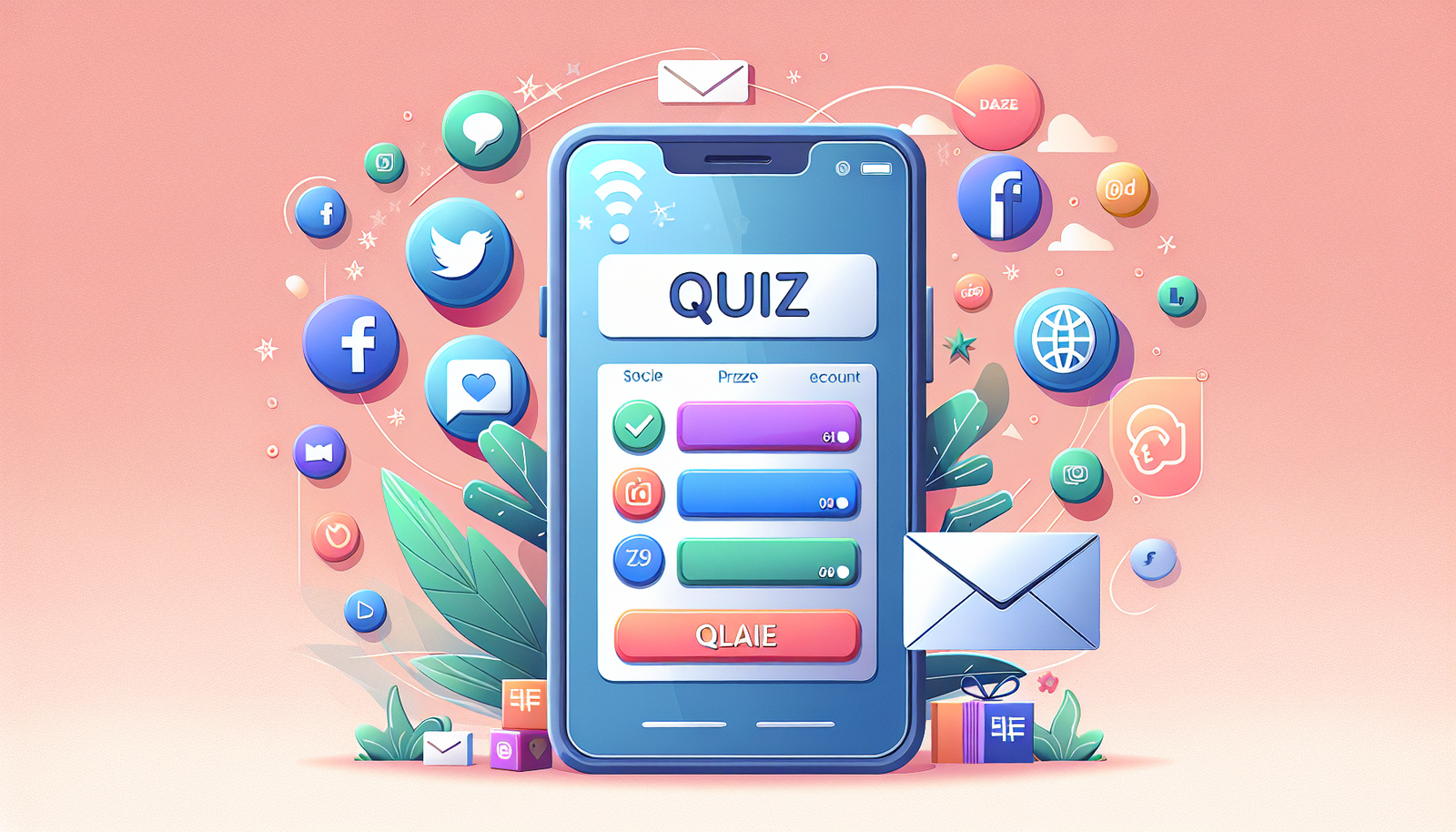
9) Promote Your Mobile-Friendly Quiz
Once the quiz is ready, don’t treat promotion like an afterthought. People won’t magically find it just because it’s good.
Here’s what I’d do:
- Share it on social media with a clear hook (what they’ll get after)
- Use short visuals like a screenshot of the first question or a 10–15 second clip
- Email your list with a direct reason to click (“Find out your learning style in 2 minutes”)
- Post in communities where your audience already asks questions (and follow the rules)
If you offer an incentive, keep it simple: a chance to win something small, a discount, or early access to the next quiz. The goal is participation, not gimmicks.
And yes—simple promotion can lead to real participation. You’re basically reducing the distance between “interest” and “action.”
FAQs
Typeform, Google Forms, and Quizlet are solid choices. They’re widely used because they handle mobile layouts well and offer easy question types (like multiple choice) that work great on phones.
Keep choices short and limit the number of answers. Multiple choice and true/false are usually the easiest on mobile. If you’re using long text, consider switching to shorter options or using an image to explain instead of a big paragraph.
Responsive design (or mobile-ready platform templates) keeps your quiz readable and tappable across screen sizes and orientations. It directly affects usability—if buttons are too small or text wraps weirdly, people won’t finish.
Share it on social media, email your subscribers, and post in relevant communities. In your message, highlight the mobile-friendly aspect and what the quiz result helps them do (learn something, find a recommendation, or get a score).