
Designing Infographics to Simplify Complex Information: 10 Tips
Infographics can feel like trying to build a map while someone keeps changing the roads. You know the information is important… but when you cram it into paragraphs, your audience just won’t stick with it.
In my experience, the fix isn’t “make it prettier.” It’s figuring out what part of the complexity matters most, then designing the graphic so people can actually use it. For example, I once worked on an infographic explaining a benefits policy that had 12 different rules. We didn’t try to show all 12 at full depth. Instead, we built it around one question—“What changes for me this year?”—and the rest became secondary details with clear labels.
So yes, you can simplify complicated topics without dumbing them down. Keep reading—these are the practical moves I use to turn messy data into something people can scan, understand, and remember.
Key Takeaways
- Start with one core message (not ten) so the infographic has a clear “job to do.”
- Define purpose and audience first—then choose the level of detail and the tone.
- Use hierarchy, contrast, and legible typography so the eye knows where to go.
- Match chart types to the question (trend vs comparison vs parts-of-a-whole).
- Plan the layout with a simple reading flow and enough spacing to prevent clutter.
- Keep visual elements consistent (type, icon style, color usage) for a polished look.
- Use negative space strategically so important content actually stands out.
- Group related information and use clear visual cues to show relationships.
- Run a quick feedback pass (and optionally A/B a layout) before publishing.
- Review for mobile readability and accuracy across devices—then refine.

1. Create Effective Infographics to Simplify Complex Information
Infographics work when they reduce effort for the viewer. Not when they dump everything you know into one image.
Here’s how I start: I write a single-sentence core message. Something like: “This policy change affects new hires’ onboarding timeline, not existing employees.” That sentence becomes the spine of the whole design.
Then I decide what kind of “complex” this is. Is it complex because of numbers (rates, comparisons), process (steps, timelines), or concepts (definitions, tradeoffs)? Once you know which one you’re dealing with, the design choices get a lot easier.
Mini playbook (use this before you design)
- When to use it: Every time you feel tempted to include “just one more detail.”
- Common mistake: Writing a core message that’s too broad. If your sentence could apply to three different topics, your infographic will feel scattered.
- Before/after example:
Before: “Here’s an overview of our compliance program.” (Too vague.)
After: “Here’s what you need to do in the first 30 days to stay compliant.” (Clear action + timeframe.)
Also, about the “more likely to be read” claims you sometimes see online—those numbers vary a lot depending on the study and the metric. Instead of chasing unverified multipliers, I focus on what’s measurable in your design: can someone understand it in 10–15 seconds of scanning?
2. Understand Your Purpose and Audience
Before I touch layout, I ask: what do I want the viewer to do after they look at this?
Are you trying to educate (teach a concept), inform (share facts), or persuade (push a decision)? That answer changes everything—how much text you can get away with, what chart types you should use, and even how bold your design should be.
I also think about their starting point. If your audience already knows the basics, you can skip the “what is X” section and jump into the “so what” part. If they don’t, you’ll need a quick primer—just not a long one.
Mini playbook (make the audience real)
- Pick one audience persona: e.g., “new managers,” “non-technical buyers,” “high school students,” “clinicians.”
- Define the reading context: are they on mobile during a meeting, or on desktop with time to study?
- Decision rule: if your audience is non-technical, avoid heavy jargon and swap it for plain-language labels (or add a “glossary” callout box).
- Common mistake: treating everyone like they’re at the same knowledge level. That’s how you end up with charts that look smart but land flat.
3. Follow Key Design Principles
Good design isn’t decoration. It’s communication.
When I’m building an infographic, I start with hierarchy: what’s the headline, what are the subpoints, and what’s “supporting detail”?
Then I use contrast to make the reading path obvious. Contrast isn’t just color—it’s also weight (bold vs regular), size (headline vs body), and spacing (grouped elements vs separated elements).
One more thing: legibility. If your infographic requires squinting, it’s not simplifying anything.
Mini playbook (hierarchy + contrast you can apply today)
- Hierarchy rule: Use only 2–3 text sizes across the whole graphic (headline, section label, body). More than that usually looks chaotic.
- Contrast rule: Don’t rely on light gray text on white backgrounds. If you can’t read it on a phone, your audience won’t either.
- Typography decision: I prefer one font family with 2 weights (regular + bold). It keeps things consistent and reduces visual noise.
- Common mistake: using multiple accent colors for every single bullet. Save your “bright” color for emphasis only.
A quick before/after check
- Before: everything is the same size and weight, so the eye bounces around.
- After: headline is distinct, section labels are bold, body text is smaller but still readable, and only key numbers are highlighted.
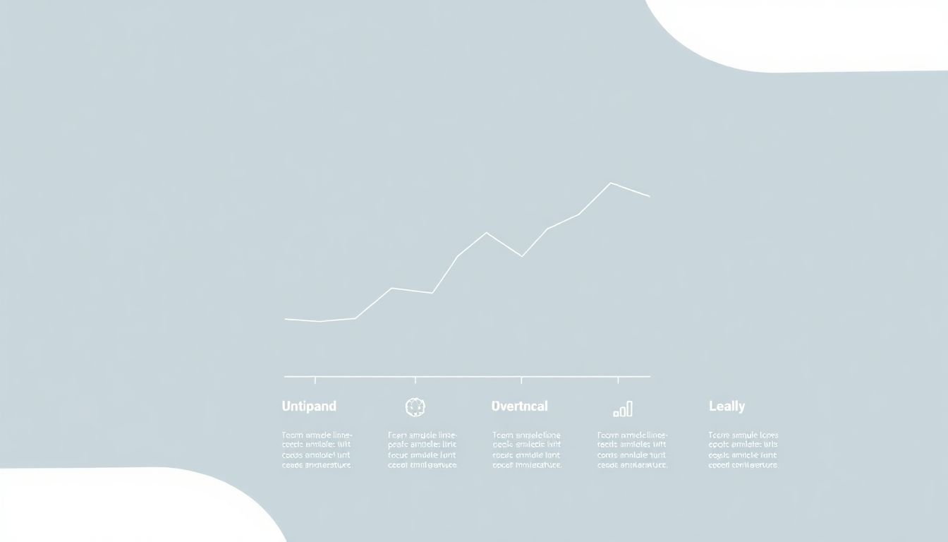
4. Apply Data Visualization Best Practices
Charts should answer a question, not just display data.
Here’s the chart-type decision rule I use:
- Line chart: use it for trends over time (month over month, year over year).
- Bar chart: use it for comparisons (Product A vs B vs C).
- Column chart: similar to bar, but often works better for vertical layouts.
- Pie chart: I only use it when there are few segments (usually 3–5). More slices and it turns into a guessing game.
Also, keep the visual “surface area” clean. If everything is emphasized, nothing is. I try to use one highlight color for the key takeaway number, and keep the rest in muted tones.
Worked example (so you can apply it)
Scenario: You have survey results: 48% agree, 32% neutral, 20% disagree.
What I’d do: A simple bar chart with three bars is usually clearer than a pie chart (especially on mobile). Label the percentages directly on the bars so people don’t have to hunt for a legend.
What I’d avoid: a pie chart with tiny labels—unless you’re keeping it to 3 slices and using large, readable text.
5. Plan Your Layout and Structure
A great infographic has a predictable path. People shouldn’t have to “figure out” how to read it.
I usually plan a top-to-bottom flow (headline → key point → supporting sections → sources). If it’s longer, I break it into labeled sections so the viewer can pause and still understand what they’re looking at.
And yes—grids matter. They’re what keep everything from feeling like it was placed randomly.
Concrete layout guidance (what I actually aim for)
- Aspect ratio: if it’s for social sharing, I often design for a ~4:5 or ~1:1 canvas. For presentations, a widescreen-friendly layout works best.
- Margins: leave consistent padding around the edges (think “at least the width of a headline character”). It prevents content from feeling cramped.
- Grid setup: I commonly use a 12-column grid when I’m working in a design tool. Even if you don’t show the grid, it keeps alignment tight.
- Spacing: group related items with tighter spacing, and separate different sections with bigger gaps.
Wireframe idea (quick mental model)
Imagine your infographic as 3 blocks: Block 1 is the headline + core message. Block 2 is one chart or diagram with 1–2 callouts. Block 3 is 3–5 bullet points (each paired with a small icon or label). That structure alone prevents the “everything everywhere” problem.
6. Choose Consistent Visual Elements
Consistency is one of those boring words that actually matters. When your icons, fonts, and colors change style every few lines, people stop trusting the graphic.
I recommend picking a limited system:
- Typography: one font family across the infographic, with 2–3 weights max.
- Color palette: 1 primary color, 1 accent color, and neutrals (grays). Use the accent only for emphasis (like the main metric).
- Icons: match stroke weight and style (outline vs filled). Don’t mix them unless you’re intentionally creating a hierarchy.
In my experience, this is the difference between “nice infographic” and “professional infographic.”
7. Achieve Balance with Negative Space
Negative space is the breathing room that makes everything readable. Without it, your infographic becomes a wall of text and shapes.
Here’s how I use it: I treat negative space like a tool for attention. More space around a section usually signals “this is important,” while tighter spacing signals “this supports the main point.”
But don’t overdo it. Too much empty space can make your infographic feel unfinished or force you to cram later.
Mini checklist
- Can you identify the main takeaway within 5 seconds?
- Do the sections feel separated (not just different colors)?
- Are callouts readable without zooming?
- Does your infographic look balanced when you squint slightly? (If it still looks messy, spacing is probably off.)
8. Organize and Present Information Clearly
The whole point is clarity, so organization is non-negotiable.
I group related points together and make the “relationship” visible. If A leads to B, I show it with arrows or a simple flow. If something is a list of steps, I label it as steps—don’t hide the structure inside paragraphs.
And I try hard not to cram too much into one area. If a section needs a paragraph, it probably needs to be split into two sections.
Decision rules (fast and practical)
- Use bullets when each item is a separate idea.
- Use numbered lists when order matters (steps, timeline, instructions).
- Use visual connectors (lines/arrows) only when they clarify a relationship. If it’s decorative, remove it.
- Limit density: if you can’t scan the section in one glance, simplify the content.
9. Implement Final Tips for Better Infographic Design
Before publishing, I do a quick “real viewer” pass. Not a perfection pass—just a reality check.
First, I make sure images and icons are crisp. Blurry assets instantly lower trust, even if the data is correct.
Second, I test with a small group. Not 200 people—just enough to catch confusing parts.
My testing approach (example)
On one infographic draft, I showed it to 8 people (mix of non-designers and one data-savvy teammate). I asked two questions:
- “What’s the main takeaway?”
- “Which section answers your question fastest?”
What I measured wasn’t fancy analytics. I timed how long it took them to answer and noted where they hesitated.
Result: the first draft had too many small labels under the chart. After increasing label size and highlighting the main metric with an accent color, most people answered the takeaway question immediately (instead of after a second scan).
Optional A/B test (if you have traffic)
- What to test: layout density (more spacing vs more compact) or headline wording.
- What to measure: time-to-understand (qualitative) or engagement metrics (clicks, dwell time, shares).
- Common mistake: changing too many things at once. If everything changes, you won’t know what worked.
And yes—always cite sources for data. It builds credibility and makes your infographic easier to share (people love “ready-to-forward” resources).
10. Review and Refine Your Infographic
After you think you’re done, take a step back. I usually revisit the draft after 24–48 hours so I’m not reading what I meant—I’m reading what’s actually there.
Here’s what I check:
- Clarity: does it communicate its message at a glance?
- Flow: does the eye move naturally from headline to supporting content?
- Readability: can someone read the text on a phone without zooming?
- Accuracy: are numbers, labels, and units correct?
- Consistency: do fonts/icons/colors match the system you chose?
Then, if you’ve shared it, iterate. Even small changes—like moving a label or reducing chart complexity—can make a big difference.
FAQs
I generally treat mobile as the minimum standard. If your infographic will be shared as an image, body text should be large enough to read without zooming—often that means aiming for something equivalent to 14–16px minimum in the final export. If your design tool lets you preview at “phone size,” use that. If you need to squint, your audience will too.
Start with the question. For percentages across categories (agree/neutral/disagree), I usually pick a bar chart and label the percentages directly. For trends over time, use a line chart. Avoid pie charts when you have many slices or small labels—on mobile, they’re harder to read and compare.
There isn’t one perfect number, but you can judge it quickly. If your sections feel cramped, increase spacing between groups. If your eye can’t easily find the main takeaway, your hierarchy likely needs work (not just “more space”). A good rule: related items should be closer together than unrelated sections, and the infographic should look readable even when you zoom out slightly.
Do it in three passes: (1) message pass—ask “Can someone state the takeaway in one sentence?” (2) readability pass—check mobile size, contrast, and label clarity. (3) accuracy pass—verify numbers, units, and source citations. If you can spare it, show it to 3–8 people and note where they hesitate.