
Designing Courses for Learners with Hearing Impairments: 7 Tips
Designing courses for learners with hearing impairments can feel overwhelming—especially when you’re juggling deadlines, content updates, and a classroom that’s already busy. I’ve been there. In my experience, the biggest stress isn’t “will I do enough?” It’s “how do I make this consistently accessible, not just occasionally helpful?”
When I’ve worked on courses for K-12 and higher ed (and yes, a few corporate trainings too), two problems kept showing up fast: students missing key instructions during audio-only moments, and video lessons that looked fine… but didn’t actually communicate clearly without sound. The good news? You can fix most of that with a few repeatable design habits.
Below are 7 practical tips I use when building accessible course content—plus what I check before the course goes live. If you want a starting point that’s more than generic advice, this is it.
Key Takeaways
- Always provide transcripts and captions for every audio/video segment, and verify caption quality (not just “uploaded”).
- Use visuals to carry meaning: structured diagrams, summary tables, and slide layouts with minimal text clutter.
- Plan both room setup and online workflows (seating, turn-taking, chat/QA routines, and breakout-room accessibility).
- Use real-time captioning and collaboration tools, but test them with your actual content and fallback options.
- Design assessments that measure understanding (multiple formats, clear rubrics, and accommodations like extended time).
- Apply UDL so learners can access content and show knowledge in more than one way.
- Collect feedback on accessibility early and often, then iterate—especially after the first cohort.

1. Create Accessible Course Content for Learners with Hearing Impairments
Accessible content is the foundation. If a learner can’t access the information in the first place, everything else (group work, tech, assessments) falls apart.
Here’s what I do first: I list every place where meaning is carried through sound. That includes lecture audio, podcasts, voiceovers in slide decks, and even “quick reminders” spoken at the start of a recorded video.
Transcripts for audio are non-negotiable. For example, if you have a 10-minute instructional audio clip, I make sure there’s a full text transcript—not just a rough summary. A transcript helps students review at their own pace and also supports screen readers.
Captions for video should be accurate enough to follow along without guessing. If your captions are off by even a few words repeatedly, students lose the thread. I’ve seen this happen when speakers use lots of names, abbreviations, or subject-specific terms.
If you want a research-backed baseline, the concept of “dual coding” (using both visual and verbal channels) is well established in learning science. For a concrete starting point on captioning benefits, see the National Center for Accessible Media (NCAM) overview: https://aem.cast.org/what-we-do/our-research and NCAM’s captioning resources via https://www.ncamftp.wgbh.org/captioning/ (they also discuss captioning quality and best practices).
Language matters. Avoid jargon unless you define it. If you have to use technical terms, put a quick definition in the same place the term appears (not 3 slides later). I also try to write captions so they match what’s on screen—no extra “filler” text that wasn’t spoken.
Support with visuals. When you mention a process (like “how to solve a quadratic equation”), don’t rely on narration alone. Add a step-by-step graphic or a simple numbered example. Even one clean diagram can prevent a whole wave of confusion.
Screen reader formatting is where a lot of teams accidentally slip. Use real heading structure (H2/H3), keep link text descriptive, and test that tables read in a logical order. If you can, run your pages through a screen reader check before publishing.
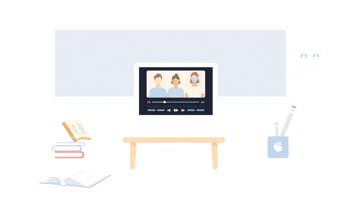
2. Use Visual Supports to Enhance Understanding
Visual supports aren’t just “nice to have.” They’re often the main channel learners use to interpret instruction when audio is limited.
I like to think in terms of structure, not decoration. A good chart or diagram should answer: “What’s the key idea here, and how do the parts connect?”
Use charts, graphs, and infographics to summarize. But don’t dump a full paragraph into an image. If you use graphics, keep the text readable and include captions/alt text where appropriate.
Concept maps work especially well for complex topics. For instance, if you’re teaching history, map causes and effects. If you’re teaching science, show variables and relationships. Then refer back to the same map throughout the lesson so students aren’t re-learning the structure every time.
Slide design: keep it clean. During live or recorded lectures, I aim for one idea per slide. If a slide has 12 bullet points, it’s usually too dense. Try: short bullets (6–8 words each), and add speaker notes or a transcript for the “how” behind the bullets.
Color contrast isn’t optional. If your infographic uses light gray text on a white background, it might look fine to you—but it can be unreadable on low-quality screens or for learners with additional visual accessibility needs. I test basic contrast and make sure key information isn’t conveyed by color alone.
Describe what matters in images. If an image shows a process diagram, the alt text should explain the purpose (and optionally the steps). “Diagram of a system” doesn’t help much. “Flowchart showing steps 1–4 for water filtration” is better.
3. Set Up Inclusive Classroom and Online Environments
Even the best content won’t help if the environment makes communication hard.
In-person seating is a quick win. Put learners where they can see both the instructor and any visual aids (slides, whiteboard, demos). If you use an interpreter, make sure the interpreter is visible—not blocked by people or equipment. I’ve learned to walk the room from the learner’s perspective before the first day.
Turn-taking rules matter. In group discussions, people tend to talk over each other. I’ve had better results when I explicitly teach a routine like: raise hand or type in chat before speaking, and wait for the facilitator to confirm who’s next.
Online setup: tools matter, but so do the settings and the workflow. For Zoom specifically, I recommend checking that captions are enabled for the meeting and that you know your captioning mode (live transcription vs. caption file options). If you’re running breakout rooms, confirm captions follow participants into those rooms and that there’s a way to capture key discussion points (like a shared doc or chat transcript).
If you’re using Google Workspace, I often pair live discussion with a shared Google Doc so students can reference what’s being said. It’s not “extra”—it’s a backup channel for comprehension.
Build a supportive culture. Encourage students to use assistive technologies and ask questions about accommodations without making it awkward. One simple move: normalize accessibility requests by saying, “If anything is hard to follow, tell me early so I can fix it.” That reduces stigma fast.
4. Incorporate Technology for Better Interaction
Technology can make interaction smoother, but only if you treat it like a system—not a magic fix.
Real-time captioning is usually the first tool people think of. If you’re using live captioning in a video call, test it with your own microphone setup and your typical speaking pace. I’ve noticed captions degrade when audio is muffled or when multiple people talk at once.
Google Meet and Zoom both offer captioning/transcription features, but they aren’t identical. The step I recommend: run a 5-minute “practice run” with a student or colleague and see if the captions are readable. If they’re not, you need a fallback (like a transcript file after the session, or a second participant typing key points).
Live chat as a communication channel helps a lot. In Zoom, for example, chat can support Q&A during lecture. Set expectations: “Write questions in chat; I’ll pause every 5–7 minutes to address them.” Otherwise, chat becomes chaotic and learners miss opportunities.
Collaborative docs are underrated. For assignments and discussions, a shared Google Doc (or similar) lets learners see contributions in real time and review later. I also like to pre-create a template with prompts so students know where to write.
Interactive content (like quizzes and guided practice) should be paired with accessible feedback. If a quiz only tells you “wrong” without context, learners can’t correct their understanding. Add explanations and show the correct reasoning steps.
One honest limitation: automated captions can struggle with names, accents, and technical terms. That’s why I recommend keeping a short list of key vocabulary and terms in your course materials—so you can manually correct captions or provide better text alternatives.
5. Design Effective Assessment Methods
Assessments should measure learning—not hearing ability.
I start by listing what the assessment is actually testing. Is it testing comprehension of concepts? Writing skill? Presentation skills? Once you know the goal, you can choose formats that match it.
Offer multiple assessment formats. For example, instead of requiring an oral presentation for everyone, allow options like:
- Written response or essay
- Video submission with captions
- Slide-based explanation with notes
- Small-group discussion with structured turn-taking
Provide clear rubrics and timelines. If students don’t know what “good” looks like, they’ll struggle regardless of accessibility. I try to include examples of strong submissions (even one annotated sample helps).
Accommodations should be built in early. Extended time, alternative formats, and quiet testing environments can make a huge difference. I’ve found it’s easier to plan accommodations when you include them in the course policy upfront rather than waiting for the last minute.
Use feedback loops. If you can, let students practice with low-stakes quizzes that are fully accessible. Then the final assessment feels less like a surprise and more like a test of skills they’ve already practiced.
6. Apply Universal Design for Learning (UDL) Principles
UDL is helpful because it pushes you to design for variability instead of retrofitting later. And honestly? It makes your course better for everyone, not just learners who are deaf or hard of hearing.
For hearing accessibility, I focus on three UDL areas:
- Multiple means of engagement: Use discussions, polls, and hands-on activities so learners aren’t stuck in one mode.
- Multiple means of representation: Provide content through text, captions, visuals, and interactive elements—not just audio.
- Multiple means of action/expression: Let learners demonstrate understanding in different formats (writing, video, annotated slides, etc.).
Here’s what I noticed when I applied this approach in a real course redesign: students who struggled with lecture audio often performed better once they had structured visuals plus captions plus an option to submit work in multiple formats. It wasn’t a “special accommodation” anymore—it was the default design.
If you want a solid reference point for UDL, CAST has practical research and guidance: https://www.cast.org/impact/universal-design-for-learning-udl.
7. Continuously Improve Based on Feedback
Accessible teaching isn’t “set it and forget it.” It’s a cycle.
I recommend you collect feedback at three points:
- Early: after the first module or week (short survey is fine)
- Mid-course: ask about what’s confusing and what feels easiest
- After completion: request specific examples (“Which video was hardest? Why?”)
Suggestion boxes work, but so do quick check-ins like: “Was anything unclear because of audio/captions?” Learners usually know exactly where the bottleneck is.
Then update your course based on what you learn. Maybe captions need manual correction for certain terminology. Maybe an image needs better alt text. Maybe your discussion format needs clearer turn-taking rules.
Also, consider joining communities where educators share accessibility strategies. You don’t have to reinvent everything—learning from other course designers saves time and improves quality.
FAQs
Provide captions for every video and transcripts for every audio clip. Keep language clear and define key vocabulary where it appears. Use visuals (charts, diagrams, step-by-step examples) so meaning doesn’t depend on sound alone. Finally, test your pages with a screen reader or accessibility checker to make sure headings, tables, and links work properly.
Visual supports reinforce and organize information. A well-designed diagram can show relationships that spoken explanations might hide—like cause/effect, timelines, or processes. I also find that summary tables and concept maps help learners review faster because they don’t have to “reconstruct” the lesson from audio.
In-person, prioritize seating so learners can see the instructor and any visual aids (and the interpreter if you have one). Online, use captioning/transcription features and set a predictable workflow for questions (chat prompts, turn-taking, and shared notes). The goal is simple: reduce the need to “catch” information in real time.
Use live captioning or speech-to-text during sessions, and combine it with chat or a shared document for questions and key takeaways. Choose tools that support visual content and allow learners to review what was said (like transcripts or downloadable notes). Just don’t assume automation is perfect—test with your course’s vocabulary and plan a fallback when captions fail.