
Data Visualization Best Practices for Education: 8 Key Steps
We’ve all seen data visualizations that make you want to rip out your hair—either they’re so cluttered you can’t find the point, or they’re “pretty” but say nothing. In my experience, educators feel that frustration even more because they’re already juggling lesson plans, grading, and deadlines. The last thing you need is a chart that students (or staff) misread.
Here’s the scenario that made this topic click for me: I once reviewed a slide deck where the author showed student performance across three quarters using a busy dashboard. The colors were different, but the labels were tiny, the legend forced you to keep flipping back and forth, and the axis started at a value that exaggerated the change. Teachers looked at it, talked for five minutes, and still weren’t sure what the “main story” was. After I rebuilt it with one clear question per visual, larger labels, and an honest axis range, the room got quiet—in a good way. People pointed to the same takeaway without me having to explain it 10 different times.
This post is my practical, classroom-friendly approach to data visualization best practices for education: how to choose the right chart, make it accessible, highlight what matters, and avoid the ethical/accuracy traps that can quietly undermine trust.
Key Takeaways
- Start with your purpose and audience. Then pick a simple chart type (bar for comparisons, line for trends) that directly answers the question.
- Choose the visualization based on the shape of your data and the decision you want to support—don’t force data into the “coolest” chart.
- Design for clarity and accessibility: readable font sizes, high-contrast color choices, direct labels, and minimal clutter. Test understanding with real people.
- Lead with the point. Put the most important message at the top using a headline, callout, or short summary line.
- Keep visuals simple and predictable: consistent chart styles, consistent scales, and whitespace so viewers can focus.
- Be accurate and ethical: use full context, avoid misleading axes, cite sources, and clearly label limitations.
- Use interactivity when it helps. Add filters/drill-downs with sensible default views so educators don’t get lost.
- Use a checklist and a quick review cycle (including a usability test) so your visuals actually inform decisions—not just decorate slides.

1. Define Your Purpose and Audience
Before I touch a charting tool, I ask two questions: what do I want people to understand, and what will they use that understanding for? If you skip this step, you’ll end up with visuals that look “data-rich” but don’t actually answer anything.
Knowing whether your goal is to show trends over time or compare groups matters because it changes the chart type. Want to compare average tuition costs across states? A bar chart or a grouped bar view usually lands better than anything fancy. Need to show how graduation rates shift year over year? Line charts are your friend.
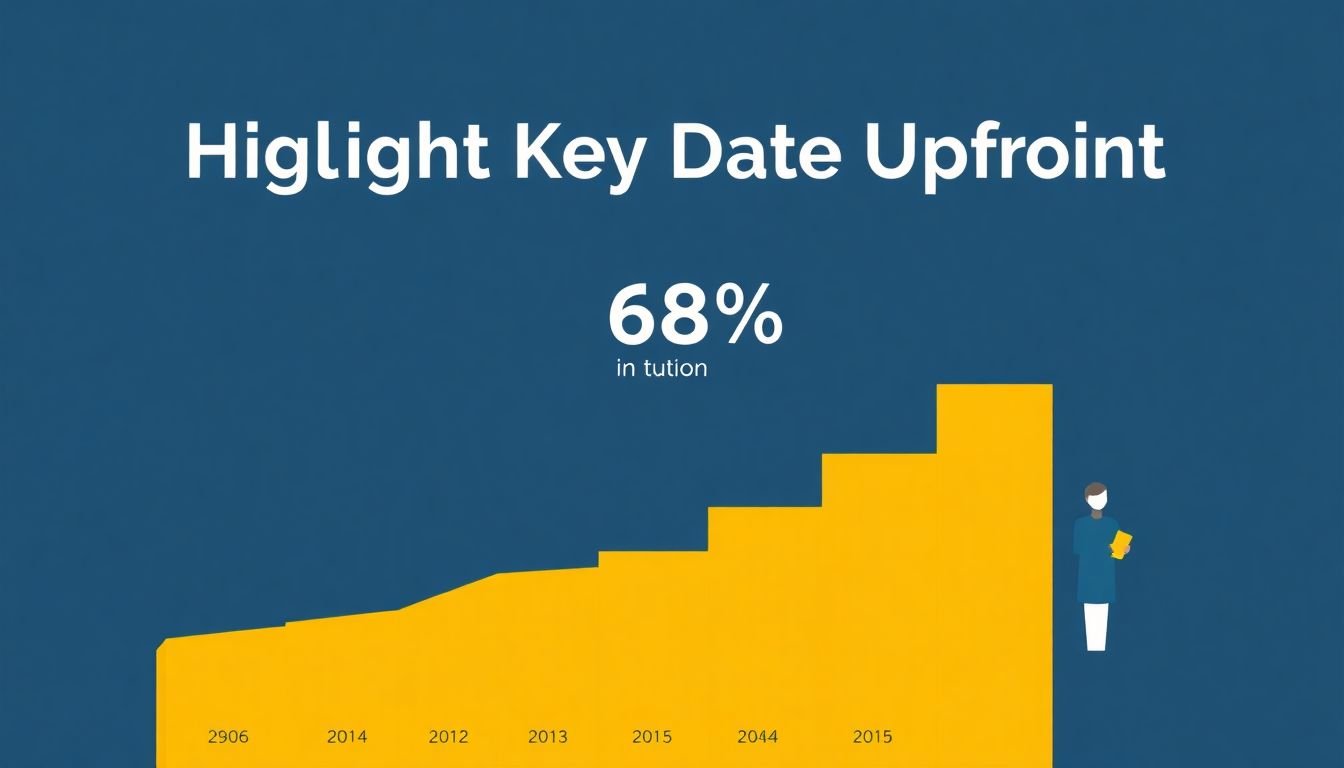
Here’s a real example you’ll see in education reporting: comparing tuition costs. If you’re using “Virginia’s 68% tuition increase between 2004 and 2015,” make sure you’re clear about what “tuition” means (sticker tuition vs. net price, in-state vs. out-of-state, and whether it’s in nominal dollars or inflation-adjusted). For the underlying data, a common reference point is the IPEDS system for tuition and pricing data, and the NCES tuition-related fact tables (you’ll want to match the exact dataset/metric used in your source).
Audience changes everything, too. Are you presenting to teachers who need quick takeaways for interventions? Or policymakers who care about cost, equity, and long-term impact? If your audience just needs quick insights, don’t bury the story inside a dashboard full of every metric you’ve ever collected.
My go-to workflow is simple: I write a one-sentence goal like “Highlight the rising cost of college tuition in Virginia compared to Minnesota” and then I build the chart to support that exact sentence. If it doesn’t serve the goal, it doesn’t make the cut.
2. Choose the Right Type of Visualization
Chart choice isn’t just style—it’s comprehension. In my experience, the fastest way to lose an audience is to pick a chart that forces them to do extra mental work.
Bar charts are great for comparisons (e.g., average tuition by state, pass rates by program, attendance rates by grade band). If you’re comparing a small number of categories, bars are usually the clearest.
Line graphs work best for trends (e.g., graduation rate changes across years, reading proficiency growth by semester). If your x-axis is time, lines usually communicate the story without drama.
Pie charts are tempting, but I try to avoid them unless you truly have a small number of proportions and they’re meaningfully different. When slices are close in size, people misread the differences.
Scatter plots are useful for correlation questions (like the relationship between attendance rate and test scores). Just remember: correlation is not causation—don’t imply causality because the dots look “close.”
When you have multiple metrics—say assessment results across reading, math, and writing—don’t cram everything into one multi-layer chart. Instead, pick one question per visual. If you need a dashboard, make the dashboard act like a menu: a few clear entry points, then deeper views.
One practical tip: before you finalize, ask, “What would someone answer if I removed all text and just left the chart?” If the answer isn’t obvious, the chart type or layout is probably wrong.
3. Design Visuals for Clarity and Accessibility
Clarity is the difference between “I get it” and “Wait… what does that mean?” And accessibility isn’t optional—education data is for everyone, including viewers who use screen readers, zoom in, or struggle with color perception.
1) Use readable type sizes (not tiny labels)
If your visuals will be viewed on a projector or laptop, I aim for:
- Chart title: 18–24 px
- Axis labels: 14–18 px
- Tick labels: 12–16 px (bigger if your audience is scanning quickly)
- Annotations/callouts: 14–18 px, with enough line spacing to avoid crowding
These aren’t hard laws, but they’re a solid baseline. If you’re designing for mobile, bump sizes up because people pinch-to-zoom less than you’d hope.
2) Meet contrast expectations
A good target is WCAG contrast—at least 4.5:1 for normal text and 3:1 for large text. If your chart uses light gray text on white backgrounds, it may “look fine” on your screen and fail for others.
3) Don’t rely on color alone
Color-blind viewers exist. Also, printed versions can flatten your palette. Instead of making meaning purely color-based, use:
- Direct labels on lines/bars (so the legend isn’t required)
- Different line styles (solid vs dashed) or marker shapes
- Optional patterns or outlines for key series
4) Keep clutter under control
If your chart has more than 3–5 series, it’s usually time to simplify. In my experience, splitting into multiple visuals beats forcing everything into one.
5) Add annotations that explain the “why,” not just the “what”
For example, if a line dips in 2012, annotate it with a short note like “Policy change / data collection method update” (whatever is true). Just keep it brief—annotations should guide, not become a second essay.
6) Test on different devices
At minimum, check your visual on a laptop and a phone. If the axis labels turn into mush when you zoom out, that’s a design issue, not a viewer issue.
A sample chart spec you can steal: For a bar chart comparing average attendance rates by grade band, use a white background, dark text (#111 or #222), bars in one primary color with one accent color for the highlight group, direct labels on each bar, and a y-axis that starts at zero unless there’s a compelling reason not to. Add one callout for the biggest difference and keep the rest of the text out of the way.
4. Highlight Key Information Upfront
People skim. That’s just reality. So put the most important data where their eyes naturally go first—usually the top-left area of a slide or the first visible region of a dashboard.
If you’re showing that Virginia’s tuition rose 68% from 2004 to 2015, make that the headline or main callout. Don’t make someone hunt for it across a legend or multiple lines.
What I do:
- Write a one-line takeaway above the chart (e.g., “Virginia’s tuition increased faster than Minnesota’s from 2004–2015”).
- Use bold labels or a different emphasis color for the key series.
- Add a callout for the exact figure and time range (e.g., “+68% (2004–2015)”).
- Use a short caption if the chart needs context (definitions, dataset notes, or what’s included/excluded).
Busy educators shouldn’t need to decode your chart to understand the point. If the main message isn’t visible in 5 seconds, you’re probably asking too much.
5. Keep Visualizations Simple and Predictable
Simple beats clever. Every time.
Use chart types your audience already expects: vertical bars for comparisons, lines for trends, and straightforward legends/labels. If you change styles midstream—like switching from a line chart to a scatter plot without warning—people lose their mental footing.
Here are the rules I follow when I want a visual to “just work”:
- Limit series count (usually 1–3 for the main chart; everything else goes in a secondary view).
- Keep scales consistent (especially across multiple charts in the same report).
- Use the same color meaning across visuals (e.g., “District A” is always the same shade).
- Leave whitespace around the chart so labels don’t feel cramped.
One small example: if you show attendance trends, stick to a consistent time scale (monthly, quarterly, or annual) and don’t randomly change granularity. If you do need to change granularity, label it clearly.
Also, don’t overload. If your chart has more annotations than data marks, it’s likely trying to compensate for a weak chart design.
6. Ensure Accurate and Ethical Data Representation
Accuracy isn’t just a “best practice.” It’s the foundation for trust. If people believe the visual is misleading, they stop using it—and then your hard work becomes noise.
Common problems I’ve seen (and fixed):
- Truncated y-axes that make small changes look huge
- Cherry-picked time ranges that hide the bigger trend
- Missing context (definitions, data collection changes, or exclusions)
- Outdated data presented as current
Let’s go back to that tuition example. If you’re claiming “Virginia’s 68% tuition increase between 2004 and 2015,” spell out what tuition metric you used and cite the source. Was it in-state tuition at public universities? Was it average tuition and fees? Was it adjusted for inflation? If you don’t clarify, the number can mean different things to different readers.
In my workflow, I do a quick “ethics check” before publishing:
- Can a reader reproduce the interpretation without me talking?
- Did I include the full range needed to understand magnitude?
- Are there any known limitations (missing data, changes in methodology)?
- Are labels clear about units and time periods?
Ethical visuals build credibility. And in education, credibility matters because decisions affect real students.
7. Enhance Engagement with Interactive and Real-Time Dashboards (Optional)
Interactivity can be great—when it reduces confusion instead of adding it.
If you’re building a dashboard for educators, interactivity should let them answer specific questions without digging through menus. For example:
- Click a district to see district-by-district graduation rates
- Filter to the grade band (e.g., 9–10 vs 11–12)
- Toggle between demographic groups (with clear definitions)
Real-time or near-real-time data can also help when you’re monitoring attendance, discipline, or intervention outcomes. But don’t pretend real-time means “perfect.” If a data refresh happens nightly (or weekly), label that refresh schedule.
Quick usability test protocol (the part people skip)
When I test interactive dashboards, I don’t just ask “Is it easy?” I run a few tasks with 5–8 users and measure success. Here’s a mini protocol you can copy:
- Participants: 5–8 educators or analysts with basic familiarity (not designers only)
- Tasks:
- Find the top 2 grade bands with the lowest attendance (time limit: 2 minutes)
- Filter to a specific district and identify the biggest change since last quarter
- Locate the definition of a metric (e.g., “chronic absenteeism”) using the dashboard’s help/caption
- Success criteria: task completion within time, correct interpretation of the key metric, and ability to find definitions
- Feedback to collect: “What were you looking for when you got stuck?” and “What did you expect to happen?”
What you’ll usually find: people understand the chart better when there’s a clear default view, obvious filter labels, and direct annotations. When those are missing, users either misinterpret or bail.
Bottom line: interactivity should support clarity. If the dashboard needs a tutorial to do basic tasks, it’s not ready.
8. Summary Checklist for Effective Education Data Visualizations
- Purpose & audience: Write your one-sentence takeaway. Who needs it, and what decision will they make?
- Chart selection: Pick the visualization that directly answers the question (bar for comparisons, line for trends, etc.).
- Clarity: Use readable labels, direct labeling for key series, and enough whitespace to avoid crowding.
- Accessibility: Aim for WCAG contrast targets (4.5:1 for normal text), avoid color-only meaning, and test readability on real devices.
- Key message upfront: Put the headline number and time range where skimmers will see it immediately.
- Simplicity: Keep series counts low, use consistent scales, and don’t switch chart logic without explanation.
- Accuracy & ethics: Use honest axes, cite sources, clarify definitions, and disclose limitations or methodology changes.
- Review with humans: Do a quick comprehension test (5–8 people). Measure whether they can state the takeaway correctly.
- Interactivity (optional): Add default views, clear filter instructions, and labels for refresh frequency if data is live.
If you want to turn these ideas into teaching content, you might also like learn more about how to create a course on Udemy or review effective teaching strategies.
A good data visualization in education doesn’t just look nice. It helps people understand faster, argue more intelligently, and make decisions with fewer misunderstandings.
FAQs
I pick the chart based on the decision I’m trying to support. Bar charts are best for comparing categories (like attendance by grade band). Line charts are best for trends over time (like proficiency growth across years). If you’re looking at proportions, use pie charts only when the differences are clear and there aren’t too many slices. Correlation questions usually call for scatter plots. If the chart doesn’t answer the question quickly, switch it.
Clarity comes from readable text, direct labeling, and a layout that doesn’t force people to hunt. Accessibility comes from contrast (WCAG targets), avoiding color-only meaning, and testing on different screen sizes. If someone can’t interpret the chart when they zoom or when they can’t rely on color, it’s not accessible yet.
Because most people skim. When you highlight the main takeaway—using a headline, bold label, or callout—you reduce misinterpretation and help viewers focus on what matters. It also makes your visual easier to discuss in meetings, since everyone is pointing at the same number.
Limit the number of series and avoid unnecessary decoration. Use consistent chart styles and colors across your report. Make sure every element earns its place—if it doesn’t help someone answer the question, it’s clutter. Keep the layout predictable so educators can interpret it quickly without re-learning your design every time.