
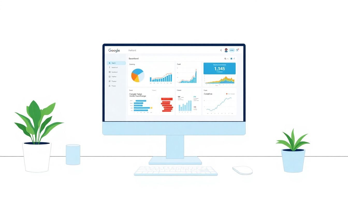
How to Build a Custom Analytics Dashboard in 6 Simple Steps
Building a custom analytics dashboard in Google Data Studio (now branded Looker Studio) can feel a little intimidating at first. I remember staring at the editor wondering, “Where do I even start?”
But once you follow a simple flow—connect data, set up a clean layout, define a few solid KPIs, then add the interactive stuff—it clicks fast. And honestly? The payoff is huge because you end up with one place where people can actually understand what’s going on with your metrics.
In the steps below, I’ll walk you through exactly how I build these dashboards and what I watch for when I test them. By the end, you’ll have a dashboard that’s ready to share and easy to use.
Key Takeaways
Key Takeaways
- Connect sources first (GA4, Google Sheets, BigQuery, etc.) and double-check permissions + credentials so your dashboard doesn’t break later when you share it.
- Set up the report structure before adding charts: pick a sensible page size (desktop vs mobile), use a consistent theme, and leave breathing room between elements.
- Define KPIs with intent. For example, I usually start with 3–5 core metrics (like sessions, conversion rate, revenue) and only add calculated fields when they directly support a KPI.
- Add interactivity in a controlled way—date range filters, dropdowns, and chart-level filters—so users can explore without you building ten separate reports.
- Schedule refreshes based on how “fresh” you truly need your data. Don’t assume the same cadence works for every connector.
- Write short notes and targets directly on the dashboard. When you annotate a metric, you save the same question from coming up every meeting.
- Design for small screens early. Test in mobile view and simplify charts so labels don’t get chopped off.
- After you launch, gather feedback and make small improvements. The “second version” is usually where your dashboard becomes genuinely useful.
Step 1: Connect Your Data Sources
Start by linking the sources you actually use—most people begin with Google Analytics 4 and Google Sheets, but you might also use BigQuery or a SQL connector.
Here’s what I do (and what I’d recommend you copy):
- Go to Looker Studio → Create → Data Source.
- Pick your connector (for GA4, select your GA4 property).
- Confirm the fields you need are available before you build charts. If you’re expecting a metric like conversion rate and it’s not there, fix it now—not after you’ve built the dashboard.
- When sharing later, make sure the connector has the right permissions. If you don’t, viewers can see the report but hit “data access” errors.
Also, don’t assume “it will update itself.” Some connectors refresh automatically, and some require scheduling. I treat refresh settings as a separate step later, but I still verify the connection works right away.
If a connection fails, the usual culprits are expired credentials, missing access to the GA4 property, or a connector limit. Reconnect first, then dig deeper.
Step 2: Create a New Report and Set Layout
Once your data source is connected, create a new report. Think of this as setting up the frame before you hang the art.
In my experience, layout is where dashboards either feel “clean and confident” or “messy and confusing.” So I start with the basics:
- Create the report → choose a layout type. I usually pick a template if I’m moving fast, but I’ll switch to freeform when the design needs more control.
- Set page size based on usage. If your team checks this on desktops, use a desktop-friendly size. If it’s for quick mobile checks, optimize for that.
- Apply a theme: pick one font pairing and keep your palette consistent. If your brand uses blues/greys, don’t randomly introduce neon colors.
- Add a clear title that includes the time context (for example, “Weekly Performance — Last 28 Days”). People notice that.
One small pro move: leave empty space. When everything is packed tightly, labels overlap on mobile. You’ll thank yourself later.
Step 3: Define Key Metrics and KPIs
This is where you decide what the dashboard is for. If you don’t nail this part, your charts will look impressive but won’t answer real questions.
I usually start by writing down three things:
- Goal (traffic growth, lead gen, ecommerce revenue, support performance, etc.)
- Audience (marketing team, leadership, product, sales)
- Decision (what action will someone take after looking at the dashboard?)
Then I pick 3–5 KPIs. For marketing dashboards, common KPI sets look like:
- Sessions (or users)
- Conversion rate
- Revenue (or leads)
- Bounce rate / Engagement rate
- Average session duration (if it’s meaningful for your site)
If you need a calculated KPI, create it as a calculated field. For example, if you have sessions and conversions in a Sheet and want conversion rate:
Calculated field idea: Conversions / Sessions
Then format it as a percentage. Simple, but it prevents people from comparing apples to oranges.
Step 4: Build Your First Widgets and Choose Chart Types
Now for the fun part—actually building the dashboard.
Here’s the order I use when I’m building from scratch:
- Top row: Scorecards for your most important KPIs (big numbers, minimal clutter).
- Middle: A time-series chart (line chart) for trend.
- Bottom/side: Breakdown charts (bar charts or tables) for “why.”
Chart selection matters more than people think. If you use the wrong chart type, the dashboard feels harder to read.
My default chart choices:
- Line chart for sessions/revenue over time (daily or weekly).
- Bar chart for breakdowns like traffic source, campaign, device category, or landing page.
- Table when you need to show top N items with multiple columns (ex: top 10 pages with sessions + conversions).
- Scorecard for “current period vs target” KPIs.
Quick example: if your KPI is conversion rate, your scorecard shows the number. Then your line chart shows whether conversion rate is trending up or down. Finally, your bar chart breaks it down by channel so you can spot which channel is driving the change.
Step 5: Apply Calculated Fields and Better Segmentation
This is where dashboards start feeling “smart.” Instead of only using what the connector provides, you create fields that directly match how you think about performance.
Two things I always do:
- Create consistent date logic (weekly vs monthly). If your dashboard is weekly, make sure your chart grouping matches that.
- Segment in a way your team talks about. For marketing teams: source/medium, campaign, channel group, landing page. For product: plan, region, device, feature usage.
Let’s say your leadership wants “Qualified Leads” and you only track “Leads” and “Qualified Rate.” I’d add a calculated field like:
Qualified Leads = Leads * Qualified Rate
Then the dashboard can show qualified lead trends without forcing everyone to do mental math.
One limitation to keep in mind: calculated fields are only as good as the underlying data. If your conversion events aren’t consistent in GA4, the math won’t magically fix it—you’ll just see the problem faster.
Step 6: Add Filters and Date Range Controls
Filters are what turn a dashboard from “a report” into “a tool.” But you don’t want to overwhelm people with 20 controls.
In Looker Studio, I typically add:
- Date range filter (so users can switch from “Last 28 days” to “Last 90 days” instantly)
- One key dimension filter (like channel, device, region, campaign)
- Optional additional filter only if it answers a common question
Practical setup tip: use descriptive filter names. “Source” is vague. “Traffic Source (Default Channel Group)” is clearer and reduces support questions.
Also, make sure your filter is actually connected to the charts you want. It’s easy to add a filter that looks right but doesn’t affect the visuals you care about.
Step 7: Use Interactive Charts and Filters
Once your basic filters are in place, you can make the dashboard feel more interactive.
Here are the behaviors I recommend testing:
- Chart interactions: click a bar in a bar chart to filter related charts (for drill-down).
- Dropdown filters: let users choose one value (like a specific campaign) without typing.
- Checkbox filters: allow multi-select when the user might want “Organic + Paid” together.
In my own dashboards, the biggest win is linking filters to specific charts so users can explore without you building separate pages. For example, if someone clicks “Paid Search” in the source breakdown, your KPI scorecards and trend chart should update immediately.
Before you share, do a quick browser test. I’ve seen interactions behave differently in mobile Safari vs desktop Chrome—not constantly, but enough that it’s worth checking.
If you want the official details on interactive controls and filtering behavior, Looker Studio’s docs are the best reference: Google Looker Studio Help.
Step 8: Set Up Scheduled Data Refreshes
Dashboards don’t stay useful if the data gets stale. So set up scheduled refreshes—but do it thoughtfully.
In Looker Studio, refresh scheduling is configured at the data source level. In practice, you’ll find it in the data source settings (often under something like Data controls).
Here’s what I check every time:
- Refresh frequency: don’t blindly pick “as often as possible.” Some connectors update more frequently than others.
- Permissions: if your credentials expire or access changes, refresh jobs can fail silently.
- Impact: if your data source is heavy (BigQuery queries or large extracts), frequent refresh can slow things down.
About frequency: the exact maximum refresh cadence depends on the connector and the data source type. Google’s documentation is the place to confirm current limits for your connector type, because these can change over time. Start here: Looker Studio Help Center and search for “scheduled refresh” or “data source refresh.”
Once it’s set, I like to add a small “Last updated” note in the dashboard (either via a field or a manual note) so users know what “fresh” means.
Step 9: Include Context with Annotations and Explanations
Here’s a lesson I learned the hard way: a dashboard without context turns into a guessing game.
What I add:
- Target notes: “Conversion rate target: 3.5%”
- Change explanations: “Spike due to campaign launch on May 12”
- Metric definitions: short labels for what “conversion” actually means in your setup
When I saw a traffic spike on a client dashboard, the chart looked “random” to everyone else. I added a quick annotation about the email campaign and suddenly the meeting became about decisions instead of troubleshooting.
In Looker Studio, you can use text and notes near charts. Keep it short. If a note needs a paragraph, it’s probably not a dashboard note—it’s documentation.
Step 10: Design for Mobile and Across Devices
I’m going to be blunt: if your dashboard only looks good on a laptop, it’s not done.
What I do before publishing:
- Preview in mobile view inside the editor.
- Check that labels don’t overlap on scorecards.
- Make sure the most important charts remain visible without scrolling forever.
Design rules I follow:
- Use fewer charts per row on mobile.
- Prefer larger fonts for KPIs.
- Avoid tiny legends—if a legend is unreadable, the chart is effectively useless on mobile.
Also, test the dashboard in a couple browsers if you can. It’s not “always different,” but enough people report oddities that it’s worth a quick check.
Step 11: Test and Gather Feedback
Don’t publish and walk away. I always run a short testing pass with 2–5 people who match your real audience.
Here’s the feedback checklist I use:
- Can they find the KPI they care about within 10 seconds?
- Do filters update the charts they expect?
- Are there any confusing terms (like “conversion rate” definition)?
- Does anything load slowly?
- Does the dashboard look okay on a phone?
When people struggle, it’s usually one of these: unclear KPI definitions, a filter that doesn’t apply to a chart, or a layout issue on mobile.
After you fix the obvious issues, run one more pass. Then schedule a walkthrough if your team needs it. A quick 15-minute session can prevent a week of “where do I click?” questions.
Bonus Tips: Keep Your Dashboards Simple and Focused
I know it’s tempting to cram everything in. But dashboards aren’t meant to be data dumps.
- One story per page: if a page is “Weekly Performance,” don’t mix in unrelated metrics like HR headcount unless that’s actually the story.
- Use the right emphasis: color should highlight movement or exceptions. If everything is bright, nothing stands out.
- Keep table columns intentional: if a table has 12 columns, users won’t read it. I aim for 4–6 columns max for dashboard tables.
- Build for comparisons: include “current period vs previous period” or “vs target” when possible. People love context.
- Save versions: I keep a “v1 baseline” and a “v2 improved” copy so I can roll back if a change makes things worse.
Simple dashboards don’t just look better. They get used more.
FAQs
The first step is to connect your data sources. Make sure the connector is set up correctly and that your permissions allow both editing and viewing. If your data can’t be accessed reliably, everything you build on top of it becomes a problem later.
Pick KPIs that match your goal, then build them into the dashboard using the simplest possible metric definitions. If you need something like conversion rate or growth rate that isn’t directly available, create a calculated field (example: Conversions / Sessions) and format it properly (percentage, currency, etc.). After that, use scorecards or big text widgets so the KPI is immediately visible.
Yes. You can share the report and collaborate depending on your permissions. Just make sure the viewers also have access to the underlying data sources (especially for GA4 properties and Google Sheets). Otherwise, they may be able to open the report but not load the data.
Start with a clean grid: scorecards first, then trends, then breakdowns. Keep fonts and colors consistent with your theme. Most importantly, test on mobile—if a label or legend gets cut off, redesign it. A layout that works on desktop but fails on phones won’t be used.
Refresh frequency depends on the connector and how “real-time” you need to be. For many business dashboards, daily or a few times per day is enough. If you truly need frequent updates, confirm the connector’s supported refresh limits in Looker Studio’s documentation for your specific data source. When in doubt, schedule refreshes based on your reporting cadence (weekly reviews vs daily monitoring).
This usually comes down to filter-to-chart interactions. In the chart settings, check that the chart is set to respond to the filter (and that you’re using the correct field/dimension). It’s also worth verifying that the chart uses the same data source fields that the filter is based on.