
Building Accessible Color Palettes for Graphics: 7 Easy Steps
I’ve been there—you're staring at a palette that looks gorgeous on your monitor, then you wonder, “Will someone else be able to read this?” That question hit me hard the first time I redesigned a graphics-heavy landing page for a client. We had a clean, modern look… and then a few weeks later we got complaints that headings and body text felt “washed out,” especially on cheaper screens and in bright rooms. After digging in, the issue wasn’t the layout—it was contrast. Some of our “safe-looking” light grays on white were barely hanging on, and a couple of accent color pairs just didn’t stand a chance for normal-sized text.
So I started building palettes with contrast in mind from the beginning—not as an afterthought. Below are the steps I use to create accessible color palettes for graphics, including a worked example with real hex values and contrast math, plus a practical testing checklist you can actually follow.
Key Takeaways
- Use WCAG contrast targets (4.5:1 for normal text, 3:1 for large/bold text) and verify with a contrast checker—don’t trust your eyes or “pretty” colors.
- Pick high-contrast pairings early (dark on light or light on dark). If a combo looks similar in brightness, it usually fails for accessibility.
- Build a small, balanced palette: primary, secondary, and neutrals. Fewer colors means fewer accidental low-contrast pairs.
- Test with tools and real-world scenarios (dark mode, different displays, zoom levels). Automated checks catch the easy failures; humans catch the rest.
- Improve usability beyond color: clear hierarchy, proper font sizes/line height, and don’t rely on color alone for meaning (use labels/icons).
- Maintain consistency with a simple color system so users instantly recognize what each color means across pages and components.
- Keep up with WCAG updates and new testing workflows—accessibility isn’t a one-and-done checkbox.
Step 1: Understand and Meet Contrast Ratio Requirements
Contrast ratio is basically a measurement of how distinguishable two colors are—usually text vs. background. It matters because “close enough” colors look fine to some people and unreadable to others. The WCAG guidelines recommend:
- 4.5:1 for normal-sized text
- 3:1 for large text (and bold large text)
When I test palettes, I treat contrast like a gate you pass before you even worry about style. If you fail contrast, styling won’t save it.
Use a contrast checker such as WebAIM’s contrast checker or Contrast Ratio. Enter your hex values for text and background, and pay attention to the exact ratio—not just pass/fail.
Also, don’t ignore “obvious” traps. Yellow on white is almost always a problem. Light gray text on white? That one is sneaky. It often looks “soft” and modern, but it can land around 2:1 or 3:1—way below the target for normal text.
Step 2: Choose High-Contrast Color Combinations
Once you know the contrast targets, you can pick colors that reliably clear them. In practice, I usually start with one of these approaches:
- Dark text on a light background (most common for web UI)
- Light text on a dark background (great for hero sections and dark mode)
Then I sanity-check the pairings. If two colors feel “similar” in brightness, the ratio is usually too low.
To speed up palette exploration, I’ll generate options in tools like Coolors or Adobe Color. The workflow I follow is simple: generate → pick a candidate pair → test contrast immediately. That way, I don’t waste time building a palette that fails on the first text/background pair.
One example I use when teaching teams: navy with white tends to work easily. But pastel green on pale yellow can look “friendly” while still failing contrast. For data visualizations, I also avoid relying only on color—use patterns, labels, or direct values on bars/slices so users aren’t forced to decode everything by color alone.
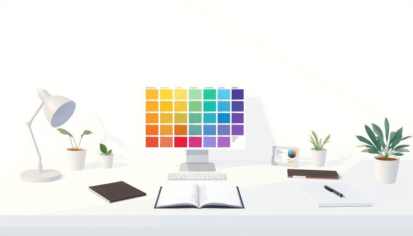
Step 3: Build a Balanced Palette
High-contrast pairings are the foundation. A balanced palette is what makes your design feel intentional. The trick is to keep roles clear: one color for headings, one for accents, and neutrals for backgrounds and body text.
Here’s the worked example I actually use to avoid the “pretty but unreadable” trap.
Worked example: a small accessible palette (with contrast math)
Goal: Build a palette for a graphic layout with readable body text and clear accent states.
Step A: Choose background and text candidates
- Background: #FFFFFF (white)
- Body text: #1F2937 (a deep slate / near-black)
Step B: Calculate contrast ratio (text on background)
Using the WCAG contrast formula, #1F2937 on #FFFFFF comes out to roughly 13:1 (comfortably above 4.5:1). That’s exactly what I want for normal-sized text.
Step C: Add accents without breaking contrast
- Primary accent (links/buttons): #2563EB (blue)
- Secondary accent (highlights): #7C3AED (purple)
- Neutral surface (cards): #F3F4F6 (light gray)
- Neutral border: #D1D5DB
Now I test accent usage the way it will be used in real UI:
- Blue text on white: #2563EB on #FFFFFF is typically around 4.5:1–5:1 depending on the exact rendering and checker. If it comes out under 4.5:1 in your tool, darken the blue slightly (even a small shift helps).
- White text on blue (button style): #FFFFFF on #2563EB usually lands well above 4.5:1, so “white-on-blue” buttons are often safer than “blue-on-white” text.
- Purple highlights: Check both text-on-background and background-on-text. Purple can be gorgeous—and still fail if it’s too light.
Sample palette (roles + hex values)
- --color-text: #1F2937
- --color-bg: #FFFFFF
- --color-surface: #F3F4F6
- --color-primary: #2563EB
- --color-secondary: #7C3AED
- --color-border: #D1D5DB
Why this works: neutrals keep the background calm, the text is dark enough for strong readability, and accents are reserved for interactive elements or highlights where you can control the pairing (like white text on a solid blue button).
If you want help generating harmonies while staying accessible, tools like Paletton or Color Designer can be handy for picking complementary hues. Still, I always validate the final text/background pair in a contrast checker.
Also, keep the palette small. For most graphics and UI screens, 5 colors or fewer (including neutrals) is usually enough. More colors often means more combinations you didn’t test.
Step 4: Use Accessibility Testing Tools and Gather Real-World Feedback
Here’s where I try not to rely on theory. Even if your palette passes contrast checks on paper, real screens behave differently.
My testing workflow usually looks like this:
- Tool check: Validate key pairs (body text, headings, link text, button text) in a contrast checker like WebAIM’s contrast checker or Contrast Ratio.
- Browser check: Use browser devtools to zoom to 200% and verify contrast still holds for the resized UI. If your design uses thin fonts, it can become a problem fast.
- Dark/light mode: Toggle system dark mode and check your “inverted” components. I’ve seen palettes pass in light mode and fail when designers forget hover/active states in dark mode.
- Device screens: Test on at least one laptop/desktop and one mobile. If you can, check on a low-brightness screen too (brightness turned down).
On one project, I ran a quick usability pass with 6 participants—two older adults, two people who reported mild vision issues, and two “regular” users. I didn’t give them a long task. I just asked them to read a headline and a short paragraph on a card, then find a link/button. What I noticed was telling: the palette “looked” fine, but two people struggled with a mid-gray text color on a light surface. The contrast checker flagged it as borderline, and once we switched from the mid-gray to a darker neutral, the feedback flipped immediately—people stopped squinting and could find the link faster.
That’s the real point of testing: it catches the stuff automated checks might miss, like state changes (hover/disabled), thin type, or UI elements that don’t get enough spacing.
Step 5: Prioritize Readability and Usability in Your Design
Contrast is necessary, but it’s not the whole story. I’ve seen designs with perfect ratios that still feel hard to use because the typography and layout fight the user.
Here’s what I focus on:
- Font sizes and line spacing: If body text is too small or lines are too tight, readability drops even when contrast is technically “okay.”
- Don’t rely on color alone: If something is “required,” “success,” or “error,” pair the color with an icon and/or text label. People who can’t perceive color differences still need meaning.
- Reduce visual noise: Busy gradients, heavy patterns behind text, and cluttered backgrounds can make even high-contrast text feel unstable.
- Make the hierarchy obvious: Headings should stand out. Buttons and links should look clickable without guessing.
In my experience, usability testing is also where you catch “micro” issues: underlined links that are faint, hover states that don’t change enough, or text over images where contrast changes depending on the image area.
Step 6: Use Accessible Color Systems and Maintain Consistency
A color system is what keeps you from re-inventing colors every time you add a new component. When teams don’t have a system, they end up with random shades that weren’t tested together. Consistency isn’t just branding—it’s accessibility maintenance.
To build a solid system:
- Avoid too many shades of the same hue (it’s easy to create “almost the same” colors that fail contrast in some states).
- Use roles, not random colors: “text-primary,” “bg-surface,” “border,” “accent-primary,” “link,” “button-bg,” etc. That way, designers know what each color is supposed to do.
- Test the role pairings: It’s not enough that colors look good individually. You need to test common pairings like button background + button text, link + surrounding background, and disabled states.
- Keep a consistent mapping across pages: If blue means “primary action” on one screen, it should mean the same thing everywhere.
If you want a starting point, tools like color palette generators can help you produce a consistent set quickly—but don’t skip contrast validation after you generate. Generators are great for speed; your checker is what keeps you honest.
Step 7: Keep Learning and Stay Updated on Accessibility Standards
Accessibility standards evolve, and new tooling shows up all the time. I try to review WCAG guidance periodically by checking updates from the W3C and their WCAG documentation. It helps you avoid outdated assumptions.
Also, keep an eye on practical changes that affect color work:
- New browser behavior for contrast and color rendering
- Better testing tools for color blindness simulation
- Design system best practices for dark mode and component states
Once you build a repeatable workflow for contrast + testing, accessibility stops feeling like a “special project.” It becomes part of how you design.
FAQs
A contrast ratio of at least 4.5:1 is the usual target for normal-sized text. If you’re working with larger/bold text, 3:1 is often acceptable.
Start with a strong text/background pairing (dark on light or light on dark), then check the contrast ratio in a tool. If you’re unsure, darken the text or deepen the accent color until you hit the target.
Common options include the WebAIM Contrast Checker, Adobe Color, and contrast-focused tools like Stark. I still recommend validating the exact pairings you use in your UI (text on background, button text, link states), not just a couple random swatches.