Automating Slide Design with AI Tools: 7 Simple Steps to Better Presentations
Let’s be honest—slide design is one of those tasks that looks simple until you’re 45 minutes deep and still moving boxes around. You’ve got the content, sure. But making it look “right”? That’s where the time disappears.
In my experience, AI tools don’t magically fix weak ideas. What they do is remove the boring parts: alignment, spacing, picking a layout, and turning your rough notes into something that looks like a real deck. You still control the story. You just stop wrestling with design.
Below is the workflow I actually use to automate slide design with AI—plus what I’ve noticed when the results are great (and when they’re not).
Key Takeaways
- AI can cut prep time fast when you start from a rough outline. In my tests, the biggest time savings come from layout + formatting, not from writing the content.
- Most tools follow a similar pattern: you paste text → the AI proposes a layout → you tweak. You’ll get better results when you give it slide-by-slide prompts or headings, not a single huge blob.
- Top AI slide tools in 2025: Beautiful.ai, Canva, PowerPoint Copilot, and Visme. Each one shines in a different workflow (brand control, ease of use, Office integration, or data viz).
- Better visuals improve clarity—and clarity tends to speed up decisions. When slides are easier to scan, meetings move along instead of getting stuck on “wait, what does this mean?”
- Common problems are fixable: generic images, odd spacing, and slides that look “template-y.” Plan to review every deck before you present.
- Brand consistency is the real win: once you lock fonts/colors/logos, AI becomes much more useful for keeping everything consistent across dozens of slides.
- The best results come from constraints: clear input, a template you like, and a quick pass where you adjust hierarchy (headlines vs. bullets vs. charts).

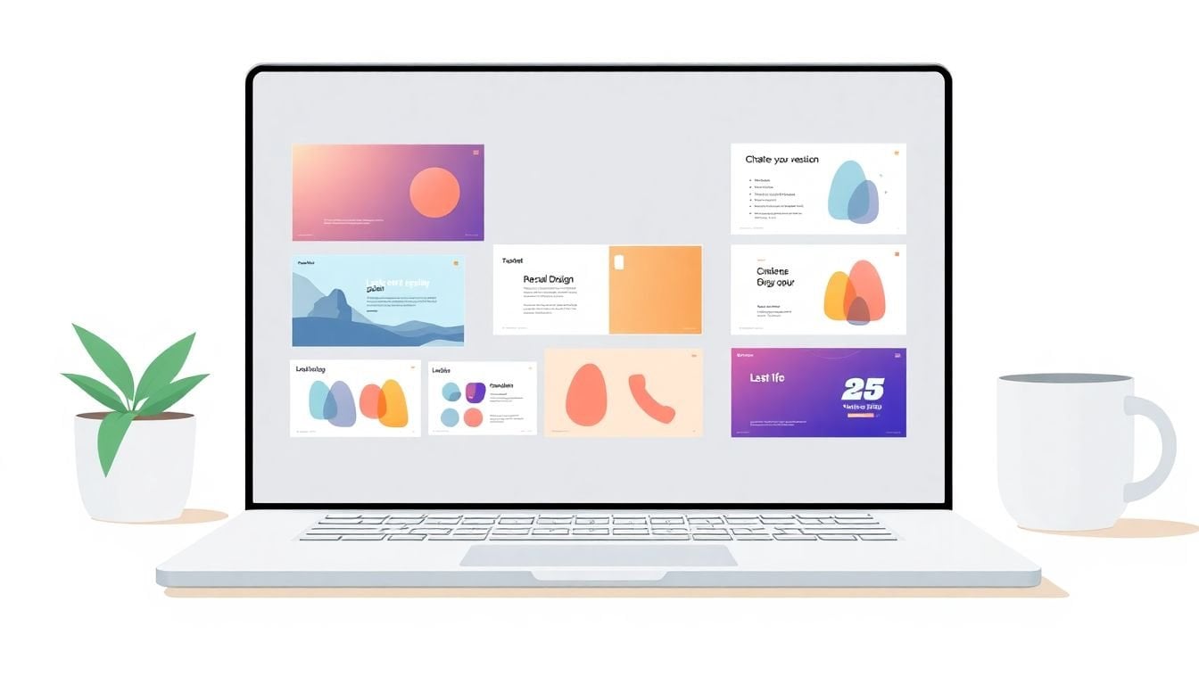
1. Automate Slide Design Instantly with AI
I’m not going to pretend AI replaces your brain. But it does a great job with the stuff that usually wastes time—layout, spacing, and “what goes where.”
Here’s the workflow I use when I need a deck quickly (like a pitch update or an internal training refresh):
- Start with slide-by-slide headings. Instead of pasting one long essay, I write something like: “Slide 1: Problem,” “Slide 2: Why now,” “Slide 3: Solution,” “Slide 4: Proof,” “Slide 5: CTA.”
- Paste 1–3 bullets per slide. If a slide needs 7 bullets, I usually split it into two slides first. AI handles structure better when the inputs are small.
- Generate a draft deck. Then I review and fix hierarchy (headline size, bullet length, chart labels).
- Do one pass for brand. Logos, fonts, and colors should be locked early. Otherwise you’ll spend time “re-styling” later.
In my tests, the biggest time savings come after the first generation—when you’re not manually aligning text boxes across 20+ slides. If you’re using a tool like Beautiful.ai, you can feed it your outline and let it apply its layout rules, then tweak individual slides only where it matters.
Quick example (pitch deck): I input “Problem: Teams waste time on manual reporting (3 points),” “Solution: Automated dashboards (3 points),” and “Impact: Faster decisions (1 chart).” The AI drafted consistent sections and formatting. The only real edits I had to do were tightening wording and updating the chart values.
2. How AI Presentation Makers Work
Most AI slide tools aren’t “thinking” like a designer—they’re pattern-matching with a lot of guardrails.
Here’s what I’ve noticed in practice:
- They parse your input. Text, headings, and sometimes tables get mapped to slide elements like titles, bullets, callouts, and charts.
- They pick a layout template. If your slide looks like “process steps,” the tool tends to use step layouts. If it’s “metrics,” you’ll often get KPI cards or a chart.
- They apply design constraints. Things like spacing rules, font pairing, and color harmony are usually baked into the platform.
- They suggest (not guarantee) visuals. Some tools propose icons or images that fit the topic. You still need to check licensing and relevance.
One thing I like: you can often get a better result just by changing how you prompt. For example, instead of “Make a slide about our product,” I’ll use: “Create a 1-slide comparison: Product A vs Product B. Include a 3-row table and a short takeaway sentence.” That’s a much clearer target.
Also, no—AI doesn’t always “get” your brand voice. If you care about tone, you’ll still want to edit the copy after the layout is done.
3. Top AI Tools for Slide Design in 2025
There are a lot of options, but they don’t all work the same. Here’s how I’d choose based on the kind of deck you’re making.
Beautiful.ai — best for fast, consistent layouts
Why I like it: it’s built around layout rules, so you don’t have to micromanage everything.
- Use case: pitch decks and internal updates where you want “clean and consistent” quickly.
- What I do: paste a slide outline, generate a draft, then adjust only the content and a few visual elements.
- Example: For a “3-step workflow” slide, it typically picks a steps layout automatically and keeps spacing tidy when text changes.
Canva — best for beginners + brand kits
Why I like it: it’s easy to edit once the AI draft is in place, and brand tools are pretty straightforward.
- Use case: training decks, marketing presentations, and anything that needs lots of visuals.
- What I do: set brand colors/fonts first, then generate slides from your content and swap visuals as needed.
- Example: I’ll generate a “feature overview” slide, then replace generic stock images with a closer match from the Canva library (or my own assets) before publishing.
PowerPoint Copilot — best if you live in Microsoft 365
Why I like it: it fits into a workflow that teams already use.
- Use case: corporate decks, client updates, and situations where stakeholders expect .pptx.
- What I do: draft slides in PowerPoint, ask Copilot to help structure content, then apply your existing theme.
- Example: For a meeting recap, I’ll paste bullet points and ask for a “summary + next steps” layout. Then I refine the wording and ensure charts match the actual data.
Visme — best for data-heavy slides
Why I like it: it’s strong when you need charts, diagrams, and more “visual explanation” than pure bullet slides.
- Use case: reports, analytics presentations, and anything that needs graphs and infographics.
- What I do: generate a draft structure, then build charts/visuals using your data so it doesn’t end up looking generic.
- Example: If I’m turning a spreadsheet into a “Q1 vs Q2 performance” slide, I’ll use the chart tools and make sure labels and units are correct (AI sometimes guesses formatting).
One limitation to keep in mind: AI outputs can look “template-based” if you don’t adjust the design choices. That’s not a dealbreaker—but it means you should plan a quick review pass.
4. Real Impact and Business Results of AI Slide Design
I’ll say it plainly: AI slide design helps when it improves clarity. And clarity usually leads to faster alignment.
Instead of leaning on shaky stats, here’s what I’ve seen in real work:
- Meetings get shorter. When slides are easier to scan, people ask fewer “wait—what does that mean?” questions.
- Decisions move faster. If your “problem → solution → proof → ask” flow is visually obvious, stakeholders spend less time debating structure.
- Presentations become more reusable. Once you lock your brand and slide structure, you can regenerate updated versions without starting from scratch.
If you want a credible foundation for why visuals matter, look at research on how people process visual information. For example, the Nielsen Norman Group discusses how visual design impacts usability and comprehension—basically, when information is easier to parse, users move faster.
Practical example: I once redesigned a 12-slide internal pitch by using AI to generate a clean layout draft, then I focused my edits on: (1) headline clarity, (2) consistent chart formatting, and (3) removing long bullet lists. The result wasn’t “prettier for the sake of it.” It was fewer questions during the meeting and faster sign-off.
5. Common Challenges and How to Overcome Them
AI is helpful, but it’s not flawless. Here are the issues I run into most—and the fixes that work.
1) Generic visuals
Sometimes the images/icons feel like they came from a default library. That’s when you swap them.
- Use your own screenshots, product photos, or charts whenever possible.
- If you’re using stock images, pick ones that match the specific use case (not just “technology vibes”).
2) Copy gets too long
AI might squeeze content into the slide, but it doesn’t automatically know your audience’s attention span.
- If a bullet is longer than ~1 line, I rewrite it.
- I aim for “scan first, read second.”
3) Layout breaks with real data
Charts and tables are where things can get messy—especially if your values change.
- After generating, re-check: axis labels, units, legend placement, and number formatting (%, $, decimals).
- If the chart looks cramped, simplify: fewer categories, larger font, or move details to an appendix slide.
4) Brand inconsistency
This is the one I care about most. If your fonts/colors/logos aren’t set, AI will “choose” something.
- Set your brand kit first (colors, fonts, logo).
- Then generate slides so the tool works within your constraints.
5) Team adoption
If your team isn’t used to AI decks, you’ll get feedback like “this looks weird” or “can we make it more like our old style?”
- Create a one-page internal checklist: brand kit set, chart labels verified, and final copy edited.
- Do one shared test deck together so everyone knows what “good” looks like.
6. Future Trends in AI-Powered Slide Design
What’s coming next is pretty exciting—and also pretty practical.
- More “intent-based” generation: instead of asking for a slide, you’ll describe the goal (“convince leadership to fund this,” “teach the onboarding steps”) and the tool will propose structure accordingly.
- Voice and conversational creation: more platforms will let you generate drafts from spoken instructions (and then refine through chat).
- Smarter media suggestions: expect better suggestions for diagrams, icons, and animations that match the message—not just random visuals.
- Better brand awareness: the tools will get better at staying consistent with your brand system, especially if you feed them your brand kit and style rules.
- More automation: I expect more integrations where decks update from sources (docs, spreadsheets, CRM notes) so you’re not copy-pasting every quarter.
And yes, this is likely to reduce how much time people spend building slide decks from scratch—freeing time for strategy, storytelling, and actually rehearsing.
7. Final Tips for Making the Most of AI Slide Tools
If you want results that look intentional (not like “AI made this”), here are the steps I’d recommend:
- Write inputs like a template, not a paragraph. Use headings + short bullets per slide. AI handles structure way better.
- Pick a template style you actually like. Don’t let AI decide everything. Choose a base you’d be happy with even before edits.
- Generate once, then refine with a checklist. I do: headline clarity, spacing, chart readability, and brand colors/fonts.
- Use AI for the first draft of visuals. Then replace or adjust anything that needs accuracy (especially charts and data).
- Keep text scannable. If it won’t fit on the slide cleanly, split it. Your audience can’t “scroll” during a presentation.
- Don’t ignore exports. If you need to send .pptx to a client, test export early so you don’t get surprised by font substitutions or layout shifts.
Bottom line: treat AI like an assistant that drafts the deck and handles layout speed. You’re the one who makes it honest, accurate, and persuasive.
FAQs
Most AI slide tools take your text (headings + bullets) and map it to slide components like titles, bullet blocks, icons, and charts. Then they apply layout rules (spacing, font sizing, alignment) to generate a draft you can edit—so you’re not manually formatting every element.
Give AI slide-by-slide structure (one heading + 1–3 bullets per slide), set your brand kit first (fonts/colors/logo), and plan a quick “design pass” after generation. The pass is where you fix hierarchy (shorter bullets, clearer headlines) and replace any visuals that feel off.
It depends on your deck type. Beautiful.ai is great for fast, consistent layouts. Canva is beginner-friendly and strong for brand kits. PowerPoint Copilot fits teams already working in Microsoft 365. Visme is a solid pick when your slides need charts and more data-driven visuals.
AI can help draft chart layouts and suggest visual formats, but you should still verify accuracy—especially units, labels, and number formatting. In my workflow, I generate the slide structure with AI, then I rebuild or confirm the chart using the actual numbers from my spreadsheet or report.